noticeCOVID-19 UPDATE ASO World entire team is working remotely. we expect no disruptions in our ASO services.
Browser close
50% OFF FIRST ORDER
Referral Program
bonusprogram
50% OFF FIRST ORDER
Referral Program
bonusprogram
logo
  • App Promotion
    Keyword Installs
    Package (Direct) Installs
    Ratings & Reviews
    Guaranteed Reviews Service
    Guaranteed Keyword Ranking Service
    ASO Service
    Customized Solution
    More Services
  • ASO Tools
    Free ASO Tools
    Keyword Research Tools
  • Solutions
    By vertical
    Sports
    HOT
    AI
    Health & Fitness
    Ecommerce
    Fintech
    HOT
    Gaming
    Education
    Dating
    HOT
    Entertainment
    Travel
    Social Media
    Restaurant & Foodtech
    Productivity
    Lifestyle
    Music
    Utility
    Photo & Video
    Casino
    Business
    News
    NEW
    By Performance
    App Reputation & Negative Reviews Management
    NEW
    Boost App Rankings & User Acquisition
    NEW
    Improve Organic Conversions & User Experience
    NEW
    Mobile App Launch Marketing
    Increase Keyword Rankings & Organic Downloads
    solution-suffix
    Customer Stories
    Explore inspiring Customer Stories to see how businesses like yours have successfully leveraged ASO World to create powerful mobile apps.
  • ASO Academy
    Blog
    Case Studies
    Guides & Insights
    FAQs
    Glossary
  • Pricing
Login Register
logo
  • App Promotion
    Keyword Installs
    Package (Direct) Installs
    Ratings & Reviews
    Guaranteed Reviews Service
    Guaranteed Keyword Ranking Service
    ASO Service
    Customized Solution
    More Services
  • ASO Tools
  • Solutions
    By vertical
    Sports
    AI
    Health & Fitness
    Ecommerce
    Fintech
    Gaming
    Education
    Dating
    Entertainment
    Travel
    Social Media
    Restaurant & Foodtech
    Productivity
    Lifestyle
    Music
    Utility
    Photo & Video
    Casino
    Business
    News
    By Performance
    App Reputation & Negative Reviews Management
    Boost App Rankings & User Acquisition
    Improve Organic Conversions & User Experience
    Mobile App Launch Marketing
    Increase Keyword Rankings & Organic Downloads
  • ASO Academy
    Blog
    Case Studies
    Guides & Insights
    FAQs
    Glossary
  • Pricing
Important Notice
Important Notice:Beware of scams using ASOWorld's name for part-time recruitment or ASO earning app activities. ASOWorld is not hiring any part-time staff. Trust only official information posted by ASOWorld.
Close the Important Notice

How to Design a Powerful App Icon That Drives Downloads in 2026

Your app's first impression matters. Learn the proven strategies, platform guidelines, and psychological principles behind high-converting app icons that stand out in crowded app stores.

Posted: Today
Home Guides & Insights How to Design a Powerful App Icon That Drives Downloads in 2026

How to Design a Powerful App Icon That Drives Downloads in 2026


Why Your App Icon Is the Most Important Visual Asset

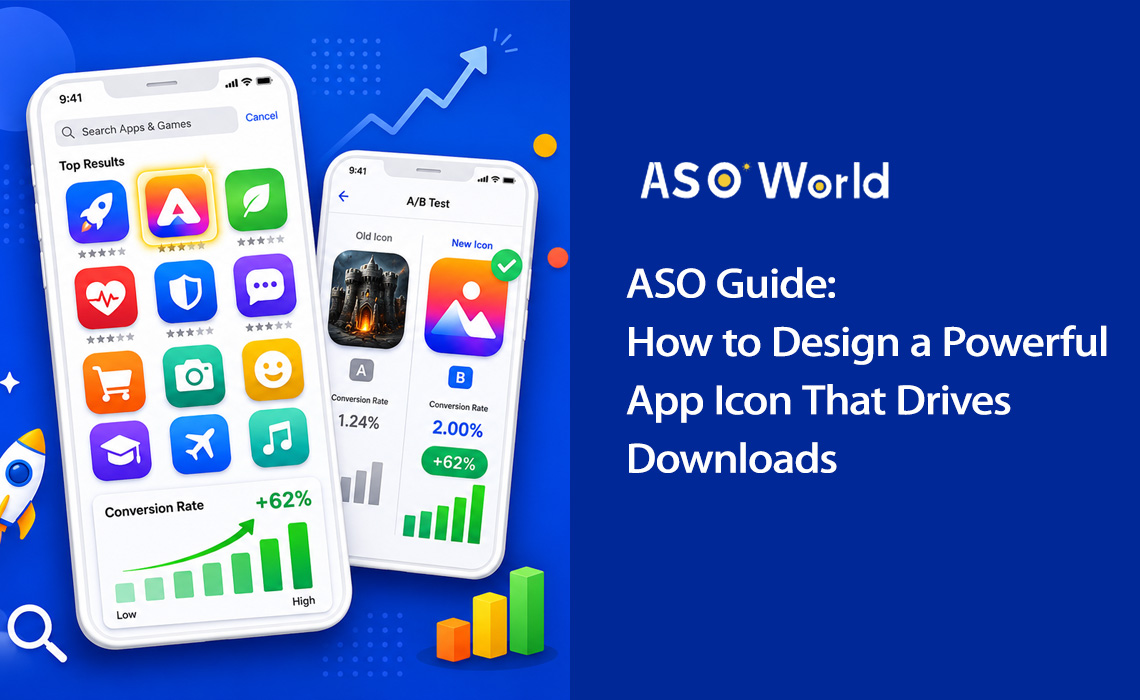
Think about the last time you browsed an app store. How long did you spend looking at each result? Research shows that users spend less than 3 seconds scanning app listings before making a decision. In that split-second window, your app icon is doing all the heavy lifting.


Your app icon isn't just a pretty picture — it's a conversion machine. It's the first visual element users encounter in search results, top charts, and editorial features. It communicates your app's purpose, quality, and brand identity before a single word of your description is read.


+100%
Install increase from icon redesign (Azur Games)
90%
Snap judgments based on color alone
+62%
Conversion lift from simplified icon design
3 sec
Average time users scan each listing


The data is clear: icon optimization is one of the highest-ROI activities in App Store Optimization (ASO). A well-executed icon redesign can double your installs without changing a single line of code or spending an extra dollar on user acquisition.


Real-world case study: A productivity app simplified its icon from a complex to-do list illustration to a single checkmark with a blue-to-purple gradient. The result? Conversion rate jumped from 4.2% to 6.8% — a 62% increase that translated into roughly 35,000 additional monthly installs.


Icons with distinctive silhouettes achieve 34% higher recognition rates, and icons that clearly communicate app functionality have a 49% higher click-through rate compared to abstract designs. This means that strategic icon design isn't optional — it's essential for any serious app marketing strategy.


💡 Want to see how your current icon stacks up against competitors?
→ [Run a Free ASO Audit on ASOWorld]
   Get keyword rankings, conversion benchmarks, and competitor icon analysis in minutes.


5 Core Principles of High-Converting App Icon Design

Great app icons share a set of fundamental design principles. Whether you're designing for a fitness app or a mobile game, these five pillars will guide you toward an icon that converts.


5 Core Principles of High-Converting App Icon Design


1. Scalability: Design for Every Size

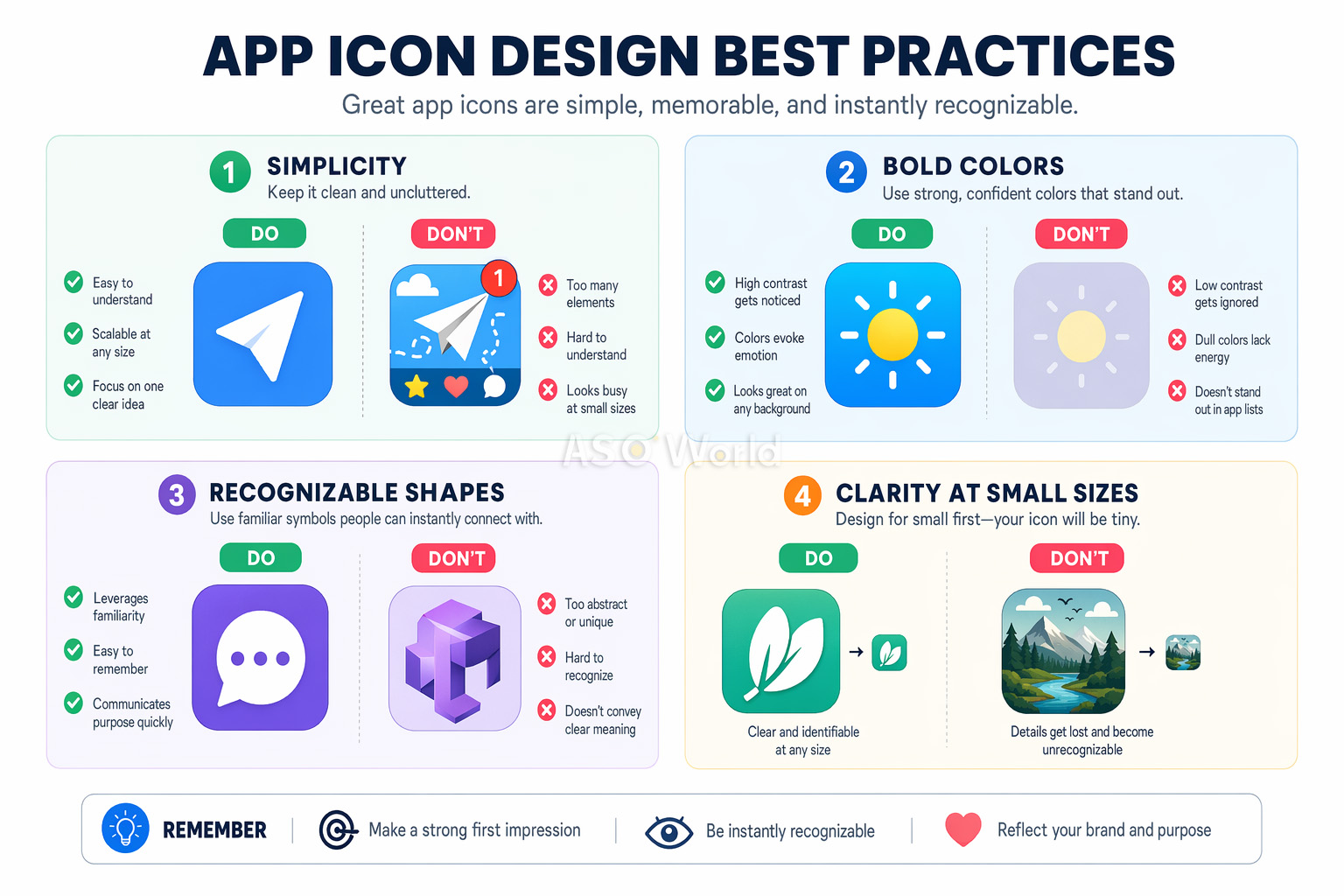
Your icon must look sharp and recognizable at every size — from a tiny 29×29px notification badge to a 1024×1024px App Store listing. This is the most common oversight among developers. An icon that looks stunning on your design canvas may become an unreadable blob on a phone screen.


  • Start your design at the smallest display size (around 60×60px) and work upward
  • Test your icon on actual devices at all sizes before finalizing
  • Avoid fine details, thin lines, and small text that disappear at small scales


2. Simplicity: One Focal Point

The most successful app icons use a single, bold symbol as their focal point. Think of Instagram's camera glyph or Spotify's three curved lines. Simplifying an overcomplex icon has been shown to improve conversion by up to 27% in A/B tests.


Cognitive load theory explains why: complex icons create "decision fatigue" during browsing. When users are scanning dozens of search results, the simplest, clearest icon wins attention.


3. Recognizability: Stand Out in the Crowd

Your icon needs to be instantly identifiable — both in app store search results and on a cluttered home screen. This means choosing distinctive shapes, unique color combinations, and visual metaphors that immediately communicate your app's purpose.


Research your competitors' icons and deliberately differentiate. If every to-do app in your category uses a blue checkmark, that's your cue to try something different.


4. Consistency: Match Your Brand

Your icon should feel like a natural extension of your app's interface. Color palette, design language, and visual style should all be harmonious. This consistency increases product satisfaction, user retention, and brand recall.


5. No Text: Let the Visual Speak

Text in app icons is almost always a mistake. It's unreadable at small sizes, doesn't support localization, and adds visual clutter. Icons with text show 26% lower engagement according to Nielsen Norman Group research. Your app name already appears directly below the icon in every app store — there's no need to repeat it.


Pro tip: The only exception to the no-text rule is when text IS your brand symbol (like the "f" in Facebook). Even then, keep it to a single letter or monogram.


The Psychology of Color in App Icon Design

Color is the single most powerful element in your icon's design toolkit. The University of Winnipeg found that up to 90% of snap judgments about products are based on color alone. For app icons, this means your color choice can make or break your conversion rate.


The Psychology of Color in App Icon Design


What Each Color Communicates

  • Blue — Trust, reliability, professionalism. Dominant in finance, productivity, and social media apps. Financial apps using blue tones show 24% higher conversion than those using other colors.
  • Red — Energy, urgency, excitement. Popular in gaming, food delivery, and entertainment apps.
  • Green — Health, growth, nature. Natural fit for fitness, wellness, and sustainability apps.
  • Orange/Yellow — Optimism, energy, warmth. Effective for social apps and marketplaces.
  • Purple — Creativity, premium quality, innovation. Common in design tools and creative apps.
  • Black/Dark — Sophistication, luxury, power. Used by premium and pro-tier apps.


Strategic Color Differentiation

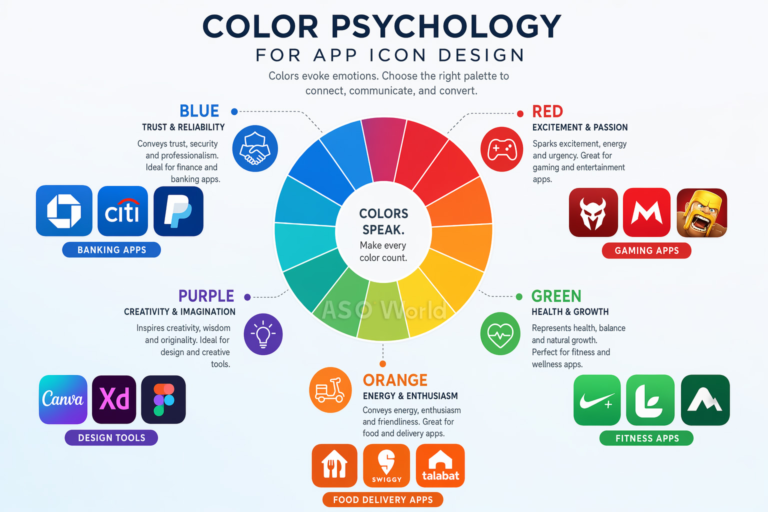
Here's a tactic many developers overlook: study your category's color patterns and break them. When 72% of fitness apps use blue or green, switching to an orange-to-red gradient can dramatically increase visibility.

Case study: A fitness app changed its icon from blue to orange-red, breaking from the category norm. The result: +31% tap-through rate and +24% category browse discovery. Standing out from the sea of blue-green competitors drove significant incremental installs.

This "category zigging" approach is one of the most underused tactics in ASO. For a deeper dive into how competitive differentiation works across your entire listing — not just the icon — read: How to Conduct a Competitor ASO Analysis That Actually Moves the Needle.


Color Best Practices

  • Use no more than 2-3 dominant colors for visual clarity at small sizes
  • Vibrant gradients outperform flat colors — they show 28% better performance in crowded search results
  • Test your icon against both light and dark wallpapers and app store backgrounds
  • Ensure sufficient contrast between your icon's elements for readability


iOS vs. Android: Platform-Specific Icon Guidelines

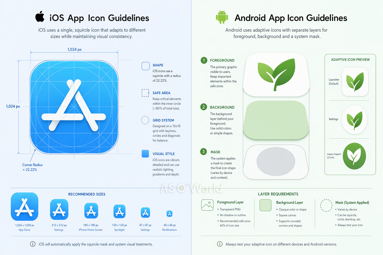
While the core design principles are universal, iOS and Android have significantly different technical requirements for app icons. Getting these wrong can result in rejection, visual glitches, or a subpar user experience.


iOS vs. Android: Platform-Specific Icon Guidelines


iOS Icon Specifications (2025+)

  • Size: Submit a single 1024×1024px PNG. The system auto-generates all smaller variants (180px for iPhone, 167px for iPad Pro, etc.).
  • Shape: Design on a square canvas. iOS automatically applies its signature "squircle" mask with ~20% corner radius. Do NOT manually round corners — this will create visible artifacts.
  • Layers: Starting with iOS 18, icons support layered design (background + foreground layers) with Liquid Glass effects including specular highlights and translucency. Use Apple's Icon Composer tool (included with Xcode) to create layered icons.
  • Appearance modes: Must support default, dark, clear, and tinted variants.
  • Color space: sRGB or Display P3. No transparency/alpha channels on the background layer.


iOS product page strategy goes well beyond icon specs. Apple's algorithm increasingly rewards listing completeness and creative diversity — including in-app events, promotional text, and localized assets. Get up to speed with our App Ranking Factors in 2026: What to Expect from the iOS App Store Algorithm Updates.


Android Icon Specifications

  • Adaptive Icons: Three-layer system (background, foreground, system mask). The mask shape varies by device manufacturer — circle, squircle, rounded rectangle, etc.
  • Size: 108×108dp total canvas, with a 72×72dp safe zone (inner 66%) for foreground content. Google Play Store icon: 512×512px.
  • Format: PNG with transparency for foreground; vector drawables (XML) recommended for scalability.
  • Material Design: Use bold, vibrant colors, consistent top-left lighting, and consistent visual weight.


Quick Comparison

Aspect iOS Android
Shape Squircle (system-applied) Varies by device (adaptive)
Base Size 1024×1024px 108×108dp / 512×512px (Play Store)
Layer System Background + Foreground (Liquid Glass) Background + Foreground (Adaptive)
Safe Zone Centered content Inner 66% of icon
Dark Mode Required variants (iOS 18+) Not required

Cross-platform tip: Design a single core concept, then optimize separately for each platform. A gaming app that used platform-specific optimization (3D rendering for iOS, adaptive layers for Android) saw a +38% increase in Android conversion while maintaining iOS performance.


Platform-specific thinking is a hallmark of mature ASO strategy. If you're expanding to Android or optimizing both stores simultaneously, our guide on cross-platform ASO strategy covers how to prioritize resources across iOS and Google Play without duplicating effort.


A/B Testing Your App Icon: The Data-Driven Approach

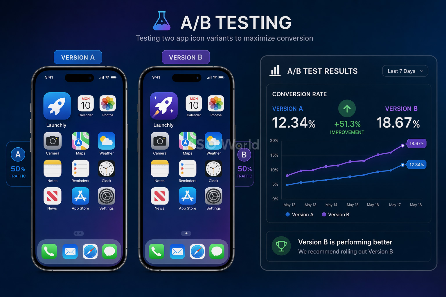
Designing a great icon is only half the battle. The other half is proving it works through rigorous A/B testing. Even seasoned designers are frequently surprised by test results — what looks best to your team often isn't what converts best with real users.


A/B Testing Your App Icon


Three Testing Methods

1. Google Play Store Experiments (Free)

Google's native A/B testing tool lets you test up to 5 icon variants against your current icon. It tests all traffic (organic + paid) and requires no app update. The limitation: confidence intervals can be weak with low-traffic apps.


2. Apple Product Page Optimization / PPO (Free)

Apple's equivalent lets you test up to 3 treatments against your original. Tests can run up to 90 days. Key limitation: icon variants must be included in your app binary before testing.


3. Third-Party Tools (GeekLab, SplitMetrics, StoreMaven)

These create "look-alike" store pages and drive controlled traffic for pre-launch testing. Ideal for marketability research before development or major redesigns.


A/B Testing Best Practices

  • Run each test for a minimum of 7 days (in multiples of weeks) to capture weekday/weekend behavior patterns
  • Make bigger, bolder changes between variants — subtle tweaks need enormous traffic volumes to detect reliably
  • Consider a test successful only at a minimum 5% improvement with high statistical confidence
  • For critical assets like icons, run verification tests (B/A reversal) to confirm results
  • With limited traffic, test only 2 variants (control vs. challenger)
  • Isolate a single variable per test for actionable insights (e.g., test color only, or shape only)
+8%
Peak Brain Training conversion lift from icon test
+3%
Simply Piano conversion increase from icon optimization
7 days
Minimum test duration for reliable results

Common pitfall: Don't stop a test early because one variant looks like it's winning. Early results are unreliable. Statistical significance requires adequate sample sizes, and weekly patterns (weekday vs. weekend users) can dramatically shift results.


10 Common App Icon Mistakes (And How to Avoid Them)

After analyzing thousands of app store listings, these are the most frequent icon design mistakes that hurt conversion rates:

  1. Adding text to the icon — Unreadable at small sizes and shows 26% lower engagement. Your app name already appears below the icon.
  2. Too much detail and complexity — Fine details become indecipherable at 60px. Keep it simple with a single focal point.
  3. Using photos or screenshots — These rarely work at small sizes and look cluttered across different appearance modes.
  4. Ignoring platform guidelines — Pre-rounding corners on iOS (the system does it), using transparency incorrectly, or ignoring safe zones on Android.
  5. Copying competitors — Using the same colors and symbols as everyone else in your category makes you invisible, not credible.
  6. Not testing on real devices — Designing only at 1024×1024px without checking how it renders at notification or Spotlight sizes.
  7. Embedding UI components — Using navigation bars, tab bars, or system UI elements inside your icon confuses users and violates guidelines.
  8. Including hardware imagery — Using Apple or Google device images in your icon is a policy violation and grounds for rejection.
  9. Ignoring dark mode — Icons that look great on white backgrounds may become invisible on dark surfaces.
  10. Confusing logos with icons — Your brand logo and your app icon serve different purposes and have different constraints. An icon optimized for a business card won't necessarily work at 29px on a phone screen.


Quick fix: Print your icon at actual device size, stick it on a phone screen among real apps, and step back 3 feet. Can you instantly identify it? If not, simplify.


Best Tools for App Icon Design in 2026

You don't need an expensive design agency to create a professional app icon. Here are the best tools available today:


Choosing the right tools is a strategic decision, not just a technical one. The best ASO teams build their stack around their testing velocity goals and team size — not around feature lists. Before evaluating tools, it helps to understand what a mature ASO workflow looks like at scale so you know what gaps you're actually filling.


Design Tools

Tool Best For Price
Figma Collaborative vector design, prototyping, team workflows Free tier available
Adobe Illustrator Professional vector graphics, complex illustrations Subscription
Sketch Mac-native icon design, extensive plugin ecosystem $10/month
Apple Icon Composer Creating layered iOS icons with Liquid Glass effects (new in 2025) Free (with Xcode)
Canva Quick prototyping for non-designers Free tier available


Templates & Resources

  • appicontemplate.com — Free PSD/Sketch/Figma templates by Michael Flarup with all required icon sizes pre-configured
  • Apple Design Resources — Official icon grids, production templates, and SF Symbols
  • Android Asset Studio — Google's tool for generating adaptive icon assets in all required configurations


A/B Testing Platforms

  • Google Play Store Experiments — Free, native testing for Android apps
  • Apple Product Page Optimization — Free, native testing for iOS apps
  • GeekLab / SplitMetrics / StoreMaven — Third-party tools for pre-launch and advanced testing


ASO Intelligence

For comprehensive keyword research, competitor analysis, and tracking your icon's impact on conversion rates, ASOWorld's free ASO tools provide the analytics you need to make data-driven design decisions.


Conclusion: Your App Icon Checklist

Your app icon is the hardest-working asset in your entire marketing stack. It appears in search results, top charts, home screens, notifications, and settings — thousands of impressions per user per day. Getting it right is one of the most impactful things you can do for your app's growth.


Here's your final design checklist before you submit:

  • Single focal point — One clear symbol or visual metaphor
  • 2-3 colors maximum — Bold, distinctive palette that differentiates from competitors
  • No text — Let the visual speak for itself
  • Scalability tested — Looks crisp from 29px to 1024px
  • Platform-compliant — Follows iOS and Android guidelines precisely
  • Dark mode ready — Works on both light and dark backgrounds
  • Competitor-differentiated — Stands out in your category's search results
  • A/B tested — Validated with real user data, not just team opinions


Remember: the best app icon isn't the one your team likes most — it's the one that converts most. Design with intention, test with data, and iterate continuously.

Table of contents
    Start Your Store Ranking Acquisition Capability Detection
    Step by step to measure all of your app store optimization efforts with our ASO tools.

    Get a good start for your app optimization with practical ASO guideline!

    Want to get the latest Guides & Insights from ASOWorld?

    Related posts

    cardImg

    Competitor Keyword Analysis for ASO: How to Uncover Gaps in Keywords, Screenshots, and Reviews

    tag
    ASO Beginner Guidelines

    May 18, 2026

    cardImg

    App Store Search Algorithm 2026: What Actually Decides Your Keyword Ranking

    tag
    ASO Beginner Guidelines

    Apr 24, 2026

    cardImg

    The Ultimate App New Version Launch ASO Checklist 2026: 30+ Steps to Maximize Visibility and Downloads

    tag
    ASO Beginner Guidelines

    Apr 9, 2026

    cardImg

    App Store vs Google Play: How Each Platform Weighs Ratings & Reviews

    tag
    ASO Beginner Guidelines

    Apr 1, 2026

    Promote now, and start your App adventure!
    Whether you are a big company or a small startup, we can help you to promote your app in Google Play, App Store, Galaxy Store and RuStore with a lower price.
    Promote now, and start your App adventure!
    • ASO
    • Email [email protected]
    • Contact Contact Us
    • twitter facebook linkedin instagram
    • SERVICE
    • Keyword Installs
    • Package (Direct) Installs
    • Ratings & Reviews
    • Guaranteed Reviews Service
    • Guaranteed Keyword Ranking Service
    • ASO Service
    • More Services
    • ASO Academy
    • Blog
    • Case Studies
    • Guides & Insights
    • FAQs
    • Glossary
    • Marketing News
    • COMPANY
    • Why ASO World
    • About Us
    • Contact Us
    • Reseller Program
    ASO World © 2020-2026 All Rights Reserved
    Privacy Policy Terms of Service

    We use cookies on our website to give you the most relevant experience by remembering your preferences and repeat visits. By clicking "Accept", you consent to the use of ALL the cookies.