Google has finally decided to change the look of the Play Store's website version after keeping the same, old design for years now. A redesigned Google Play Store has now been spotted, offering a clean look, which is in line with how the Play Store app appears.
The Google Play website is getting a long-overdue redesign. Android Police was the first to spot the dramatic new look. It's not exactly official yet but is rolling out to several people.

Click "
Learn More" to drive your apps & games business with ASO World app promotion service now.
Long-awaited redesign
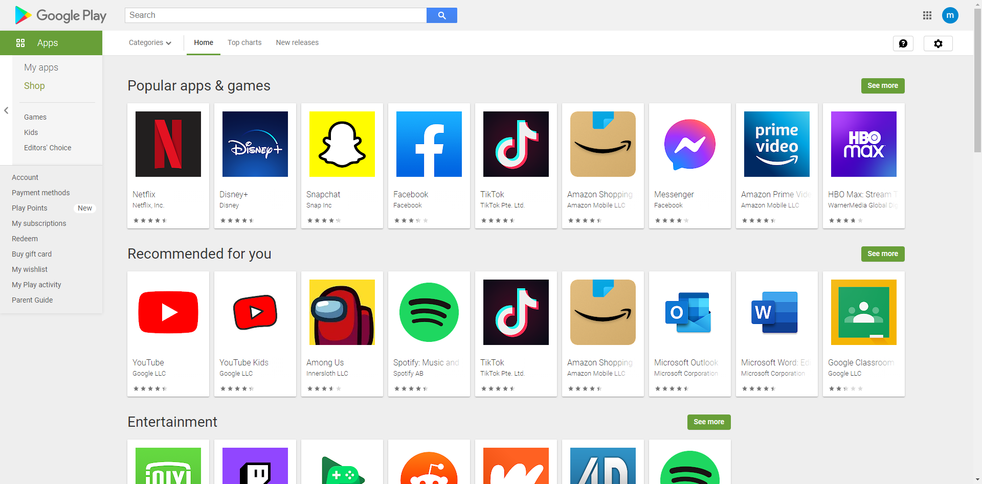
While the Play Store app on Android devices is continually updated, the website has mostly been forgotten. The current Google Play website design dates back to 2013.
The site has had some small tweaks since then, but the bones of the site are still eight years old, and it presents content in a card motif that Google has moved on from. The new website looks just like the Android app. That means lots of whitespaces and a layout focused on app icons and video thumbnails.
Even though the Play Store application for Android has gone through many design iterations over the years, the Play Store website has been frozen in time. For years, it has had the same early Material Design look, but that is finally changing. Google is now testing a new Play Store site design in some regions, which seems like a substantial improvement from the current layout.
Cleaner but not greener
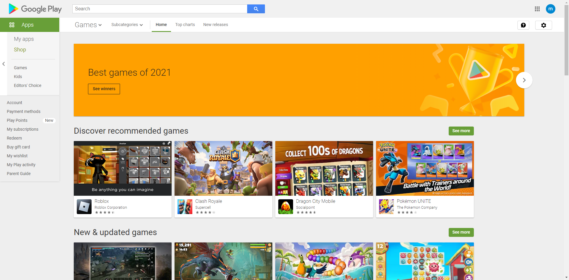
The new design (via Android Police) is seemingly only rolled out in a few regions so far, such as Korea and Taiwan, and it varies by user account. Content is more stretched out, instead of locked inside a horizontally-centered row. The page background is now white, icons are larger, and some app listings (like Netflix) have a header image that stretches across the top of the screen.
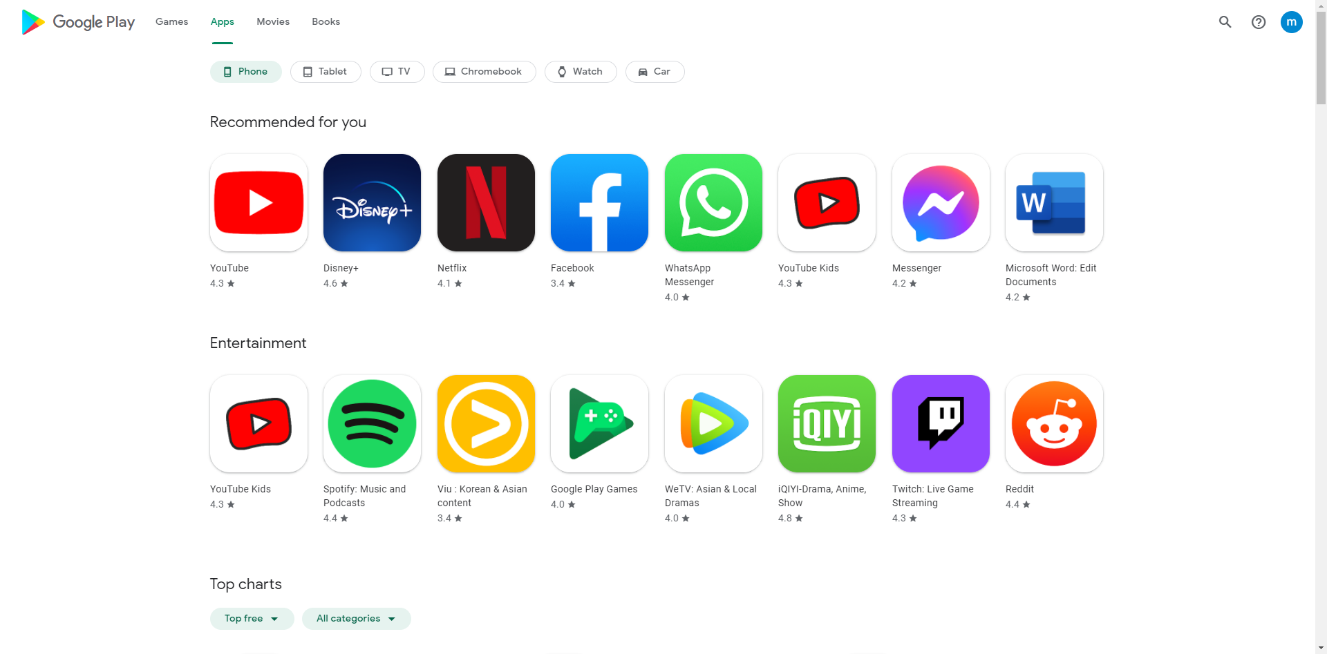
Everything is roughly in the same place, but a few important elements have moved. The side menu, which included links to check purchased content, Play Points, and other information is now only visible when you click your profile picture in the top-right. Having that menu pinned to the left or right of the screen on wider displays (like the old site) would be helpful, but it's not the end of the world.
The new Play Store will recommend apps specifically for the user under a "Recommended for you" section (not to be confused with the paid advertisement recommendations that it'll also offer under the similar-sounding "Suggested for you" label).
According to Google, and confirmed by various Reddit users, the new Play Store should be rolling out now. It doesn't seem like there's a dark mode for the bright new design, so you might want to bring a pair of shades just in case.
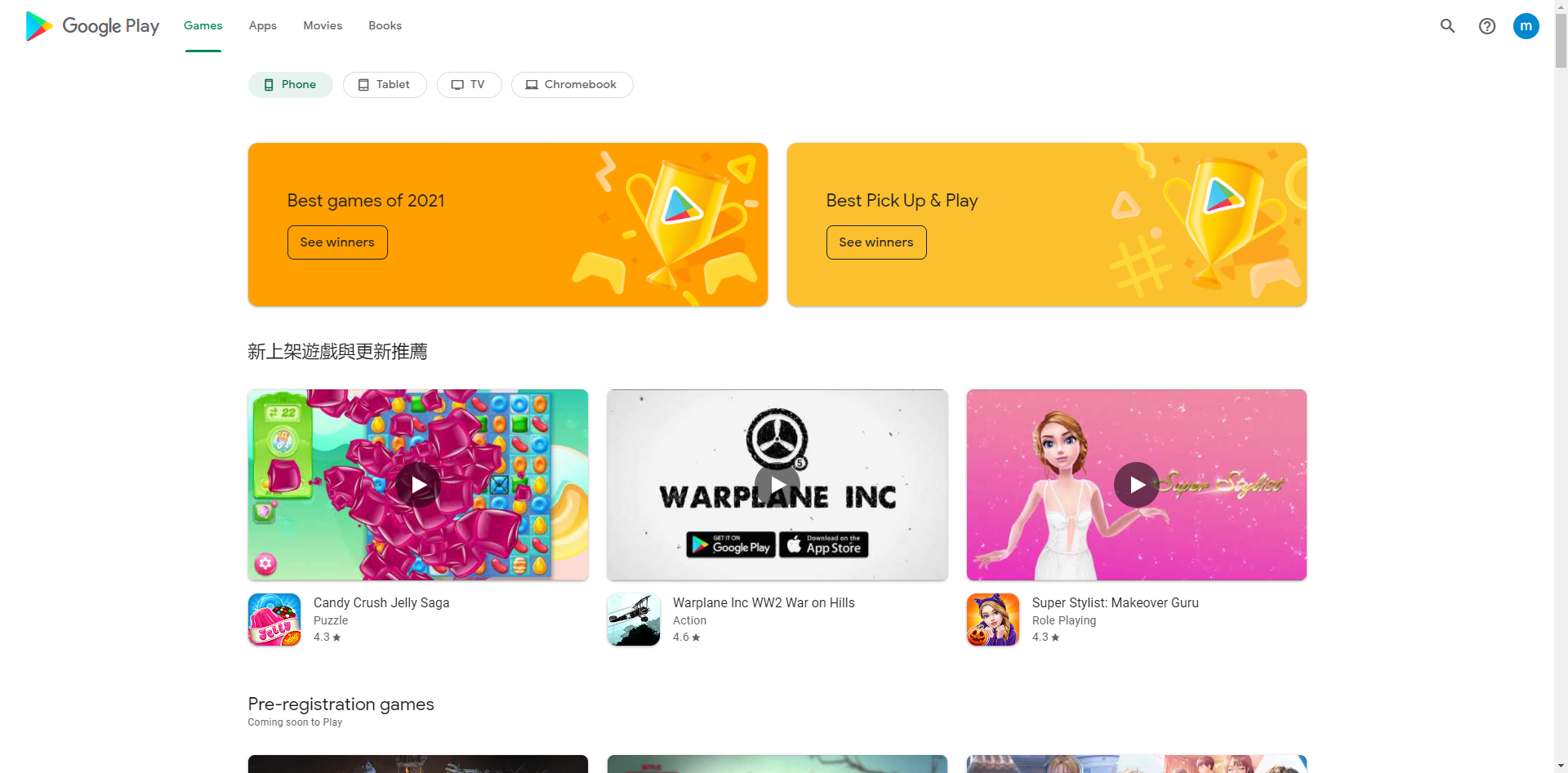
There are also a few minor functional improvements over the previous design. The screenshot/media gallery on app pages finally has a scrollbar, so you can see everything without holding down your mouse on the left and right arrow buttons — why Google ever thought that was good design, I will never know. The main 'Apps' and 'Games' pages also now have buttons at the top for quickly filtering between phone, tablet, TV, Chromebook, Wear OS, and car applications.
It seems that some regional variations of the Play Store web client have success in enabling the new design, but it's a lottery. It seems to have been able to get the client using the Korean (
https://play.google.com/store/apps?gl=kr), Taiwan (
https://play.google.com/store/apps?gl=tw) and Hong Kong (
https://play.google.com/store/apps?gl=hk) Play Store.
 COVID-19 UPDATE