Today's mobile phone users can choose two modes when using the mobile phone: dark mode and light mode. According to the study, among more than 2,500 participants, "81.9 percent of Android Authority readers use dark mode on their phones." 10 percent of participants said they used both modes at the same time, periodically switching from light mode to dark mode, and only 8 percent said they never used dark mode.
From these numbers, you can see how popular dark mode is. From ASO's perspective, the rework study confirms the importance of considering both dark and light modes when optimizing your app's visual metadata. Since dark mode is so popular, the visuals of your app's page should consider how to better capture the user's attention in dark mode.

Click "Learn More" to drive your apps & games business with ASO World app promotion service now.
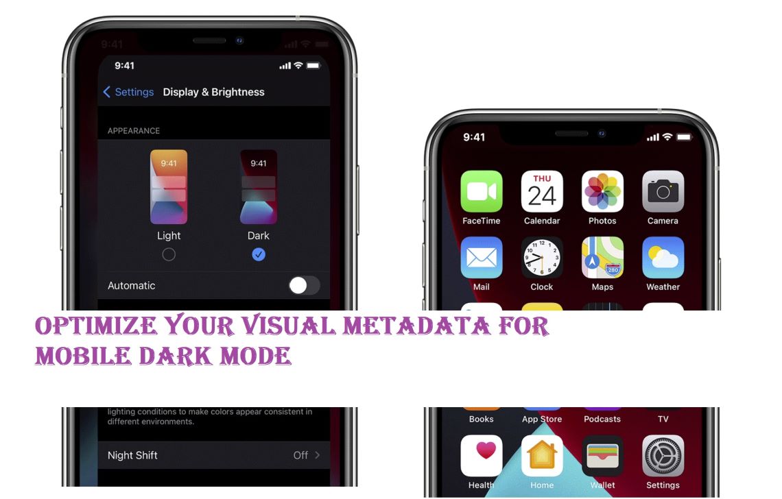
Optimize your creative assets for dark mode
One might think that dark mode simply inverts the current color and style on the display. But there's more. The Design Dark Mode setting gives designers the opportunity to highlight visual cues by using contrast and depth, focusing on important app content rather than the frame around it.
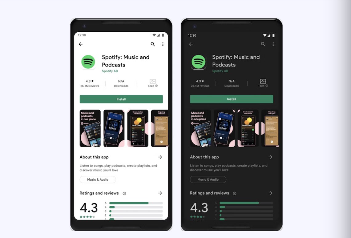
When designing your app's creative assets, keep in mind that they should look as good in dark mode as they do in light mode. For example, you should use contrasting colors in both modes – in general, you want your icons to stand out from a white or black background. Another important tip for Android is to use a transparent background in the icon, as shown in Spotify below, so that it adapts to the user's preferred mode.
Before submitting your app to the store, you can use the store's page preview, check how your creative looks in light and dark mode, and even upload several different icons and screenshots to test which version looks better in both modes.
Best practices for optimizing app creatives in dark mode
Users primarily use dark mode on their phones because they say it's easier for the eyes, especially when looking at the phone in bed or late at night. If users often use your app late at night, special care should be taken to avoid using bright colors so as not to irritate the user's eyes in dark mode.
Given how the black UI in dark mode compares to the different types of creatives, you'll want to consider the following design approaches:
- Test your design in both looks and adjust to fit each
- Softens the color of the white background to prevent it from glowing and contrasting strongly with the dark screen around it
- Notice the black design that blends in with the App Store UI
- Vibrant text helps maintain good contrast in text on darker backgrounds
Overall, it's crucial to test how any changes to your creatives perform in light and dark modes. This may require adjusting the design or colors to find a good balance, as a mode that works well in one mode may not perform well in another. Developers can run A/B tests to see if the overall conversion has changed, or even run focus groups to see how users react.
* Grow with our app growth solutions - choose guaranteed app ranking service for TOP 5 app ranking acquirement, and maximize your app traffic.
Or click the "Promote Now" above (for increase app installs, or keyword installs and app reviews and ratings service for app visibility.
In general, app creatives should follow App Store Optimization (ASO) best practices. When designing screenshots or icons, developers need to research the market and determine which trends will drive conversions well. There may be some color palettes, design elements, messaging, etc. that the user reacts well to.
Other best practices include:
- Highlight different aspects of your app with each screenshot, starting with core functionality or value
- Include highly visible labeled text associated with each image
- Include top-ranked keywords in the callout text so users can see how their search relates to the app
- Use each of the ten allowed screenshots
- Remember that the first three screenshots are most important for conversions to search results, and the remaining images are important for search ads creative sets
As you may already know, dark mode is not the ultimate solution for every mobile app or situation. So why not give your users the freedom to decide. The easiest way is to implement a switch that allows them to change from light mode to dark mode at any time.
With dark apps only, you may lose loyal customers as they will be deprived of the opportunity to influence their own user experience. A properly designed mobile app in dark mode will improve the overall user-friendliness of your app, its popularity among its customers, thus taking your business to another level.
How could ASOworld help you?
Here are some suggestions on how to optimize your app's pages in dark mode, and the previous methods for optimizing visual metadata are still applicable, and it's critical to determine the core value of your app to generate the most effective screenshots, icons, videos, and featured graphics. It's much easier to make the best visuals for your listing if you start by asking the following questions:
- What fundamental purpose does my app serve?
- How to express the purpose of my app in a simple, straightforward way?
- Who is my target market? What are their needs and expectations?
- Visually, what are my competitors doing? How do I shift the focus of my target market to my app?
Of course, good visual metadata optimization is a good start for your app optimization, but not enough. Whether it's dark mode or light mode, metadata optimization is required for app promotion. If you try to combine it with off-metadata optimization (increase app downloads, get more positive app reviews and more 4~5 app ratings), you will find amazing changes in your app growth.
Let's recap together? Is it still bothering you or is it easy for you? Of course, you can also directly choose our ASO service, let a professional team to help you complete this series of optimization works, and gain more time to harvest the organic traffic of the app store.
 COVID-19 UPDATE