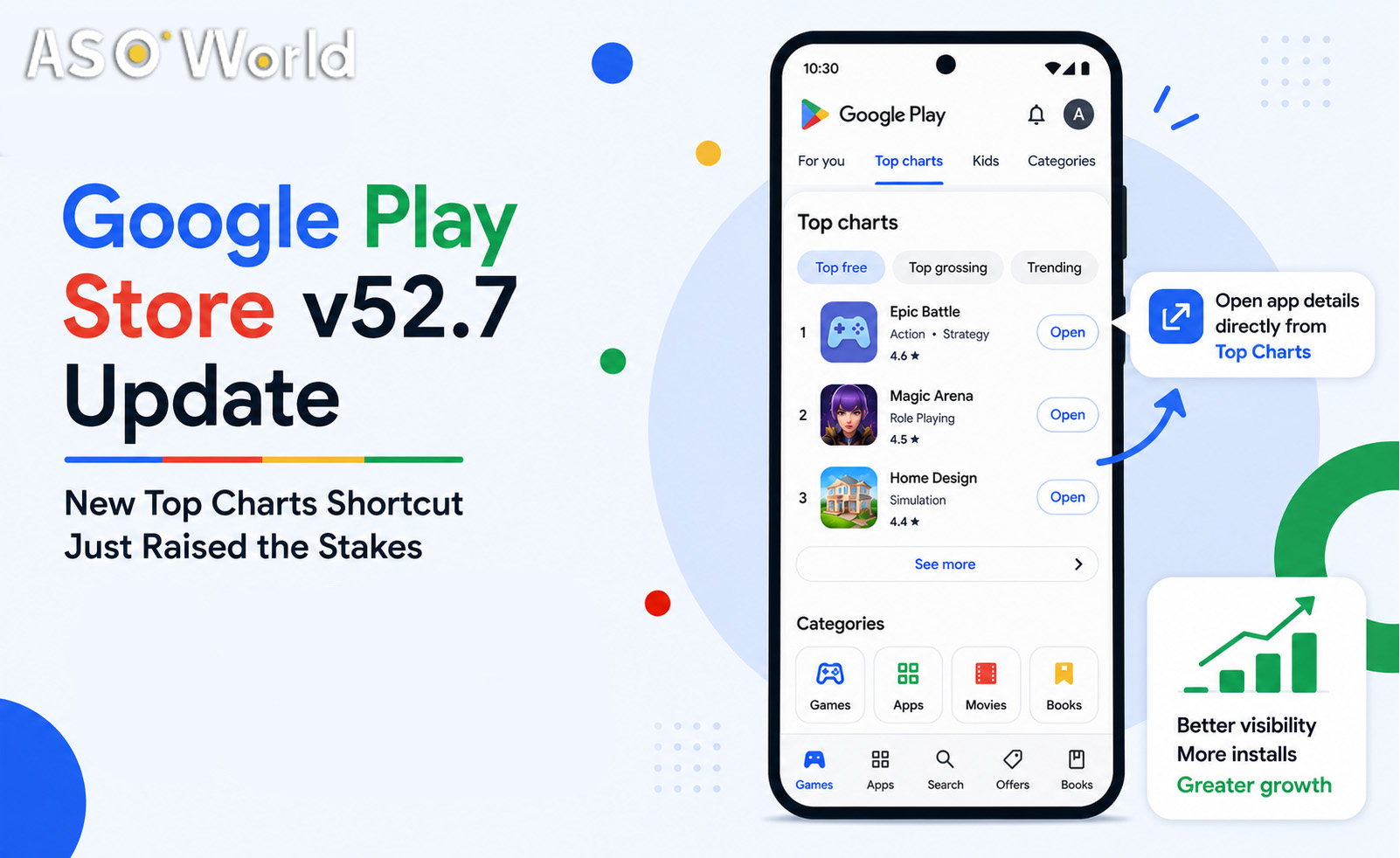
On August 10, 2026, Google Play shipped version 52.7 with a change that reads like a minor phone-and-tablet tweak: "You can now open app details pages from the Top Charts page on large screens." One line in a release note. Easy to scroll past.
But look at what it actually does. Until now, a user browsing the Top Charts on a large screen had a step between seeing your rank and evaluating your app — a tap that navigated away, a moment of hesitation, a chance to lose interest. That buffer is gone. A shopper can now open your full product details page directly from the chart, in place, without leaving the ranking context. The distance between "ranked exposure" and "conversion decision" just collapsed.
That is the whole story, and it matters more than it looks. When the gap between exposure and decision shrinks, two things get more valuable at once: whether you can break into the Top Charts at all, and whether your icon, screenshots, and star rating can survive a three-second glance once you are there. This is an opportunity window opening — the apps that treat these three links in the chain as one connected system will capture the upside; the ones that treat ranking, creatives, and reviews as separate chores will watch the traffic pass them by.
Below we break the new entry point into the three moments it actually creates, and what each one demands of you. If you want the wider context first, our complete guide to ASO best practices & strategies in 2026 maps how discovery, ranking, and conversion are converging across both stores.
1. First You Have to Get In: Ranking Is the Price of Admission
Here is the uncomfortable truth about this update: if your app cannot rank into the Top Charts, none of this applies to you. A shorter, faster path from chart to product page is worth exactly nothing to an app that never appears on the chart. The value of the new entry point is tightly coupled to rank position — the higher you sit, the more of this newly frictionless exposure you inherit.
And the exposure is not evenly distributed. The top handful of chart positions absorb a wildly disproportionate share of taps; visibility decays sharply as you scroll down. So when Google makes chart exposure easier to convert, it is effectively amplifying whatever rank you already hold. Rank 3 just got more valuable. Rank 80 got almost nothing. The gap between "on the chart" and "buried" widened.
This is why chart placement has to be treated as a deliberate objective, not a hoped-for byproduct. Category and Top Charts positions on Google Play are driven by download velocity, keyword-driven install volume, engagement, retention, and ratings working together — it helps to understand how these inputs interact before you spend against them. Our breakdown of the Google Play ranking algorithm walks through the factors that actually move chart position and which ones you can influence directly.
Understanding the algorithm is step one; reliably landing a position is step two. That is precisely what our Guaranteed Keyword Ranking Service is built for — driving targeted, high-intent keyword installs to push your app into the top positions on Google Play and the iOS App Store, with fixed pricing and guaranteed results. Think of it as buying your ticket to stand in the exact spot this update just made more valuable. Without the rank, the rest of this article is theory. With it, the next two sections decide whether that exposure turns into installs.
2. Then You Have to Hold Them: Your Product Page Is the Decider
Fewer steps to reach your product page sounds like pure good news. It comes with a catch: fewer steps also means a shorter decision window. When a user had to navigate away from the chart to see your details, there was a natural pause — a page transition, a re-orientation, a beat of consideration. That friction actually gave your app time. Now the details page opens in context, the user is still half-anchored in the ranking they were scanning, and the evaluation happens in a blink.
In that compressed window, the weight of your above-the-fold assets goes up sharply. The elements that get scanned in the first seconds — your icon, your first one or two screenshots, the opening two lines of your description, and your star rating — now carry almost the entire conversion decision. Anything below the fold, anything that requires scrolling or reading, is effectively optional to the user. If your first frame does not communicate what the app is and why it is worth it, the shorter path just means they bounce faster.
The icon deserves special attention because on a large-screen chart it is doing double duty — it is both a ranking-list thumbnail and the anchor of the product page that now opens beside it. A cluttered or generic icon leaks conversions at both touchpoints. Our practical guide to app icon optimization covers the design principles that consistently lift tap-through and install rates.
Beyond the icon, the whole first screen has to be engineered to answer "what is this and why should I care?" instantly. Ranking brings the exposure; creatives decide whether that exposure becomes an install. If you want a systematic approach to store-listing conversion — screenshot hierarchy, message framing, first-impression testing — start with our guide to app conversion rate optimization, then apply it to your top screenshots and description opener first, because those are the assets this update just put under the brightest light.
3. Beyond Creatives, Your Rating Is the Fastest Trust Signal in a 3-Second Decision
Creatives tell the user what your app is. Your star rating tells them whether to believe you — and it does so faster than anything else on the page. In a compressed decision window, the eye does not read; it scans for shortcuts. A star rating is the ultimate shortcut: a single glanceable number that compresses thousands of other people's judgments into one instantly legible signal. On the newly in-context product page, that rating sits right in the first visual sweep, often as the very first trust cue a user locks onto.
The problem is that a rating is just as fast at working against you. A 3.4 next to a 4.7 competitor is an instant disqualifier — the user does not need to read a single review to swipe past you. As decision time shrinks, the penalty for a weak rating grows, because there is no longer room for a hesitant user to dig deeper, read the description, and give you the benefit of the doubt. The rating becomes the filter, applied in a fraction of a second.
That makes your rating simultaneously the signal most likely to silently kill your conversion and the one you can most directly manage. Volume matters as much as the average: a 4.6 backed by a few thousand ratings reads as far more credible than a 4.8 from twelve people, and recency matters too, since Google Play weights fresh sentiment. Our App Ratings & Reviews service helps you build a steady base of authentic 4–5 star ratings and positive reviews — strengthening both the trust signal users scan first and the ratings input that feeds back into your ranking. In a world where the chart-to-page path is one tap, that first glanceable number is not a vanity metric; it is the gatekeeper.
Putting the Three Pieces Together
The Top Charts shortcut in Google Play 52.7 is not an isolated feature — it is a signal about where the store is heading, and it rewards apps that treat exposure and conversion as one connected chain rather than three separate tasks:
- Rank gets you onto the chart and into the newly frictionless entry point. No rank, no game — secure the position first.
- Creatives convert the shortened attention window into a serious look. Your icon, first screenshots, and opening description lines carry the message.
- Ratings are the trust filter applied in the first second — the fastest way to be chosen, and the fastest way to be skipped.
Fix one link and leave the others weak, and the chain still breaks. Rank into a chart with a poor rating and you funnel more people toward a fast "no." Nail your creatives but never crack the Top Charts and almost no one sees them. The apps that win from this update are the ones that close all three gaps at once — and that is exactly the sequence to work through: position, page, proof.
Frequently Asked Questions
Does this update mean Google changed how ranking weight is calculated?
No. This is an interaction-layer change — how users navigate from the Top Charts to a product page on large screens — not a change to the ranking algorithm itself. The factors that determine where you sit on the chart have not been re-weighted by this release. What has changed is the monetization efficiency of a given rank: because the path from chart to product page is now shorter, each unit of chart exposure converts more readily. In other words, your rank is worth the same in the algorithm but more in practice.
My app is not in the Top Charts. Should I even care about this?
Yes — indirectly, and it is a reason to act now rather than later. Every time Google makes chart-based exposure more valuable and more frictionless, it is signaling that it will keep investing in ranking-driven discovery surfaces. That is a strong argument to start building toward chart-worthy positions today, so you are already in place when the next surface upgrade lands. Revisit the ranking-factor breakdown and the conversion and ratings guidance covered in the sections above, and start closing those gaps before your competitors do — the apps that lay the groundwork now are the ones that will already be on the chart when the following upgrade arrives.
Which of the three — ranking, creatives, or ratings — should I fix first?
Work in the order a user experiences them. First secure enough rank to appear in the chart, because that is the prerequisite for any of the new exposure. Then make sure your above-the-fold creatives can survive the shortened decision window. Then reinforce your rating so the first-glance trust check works in your favor. Fixing them in that sequence means every improvement compounds on the one before it instead of being wasted on traffic that never arrives.

 COVID-19 UPDATE