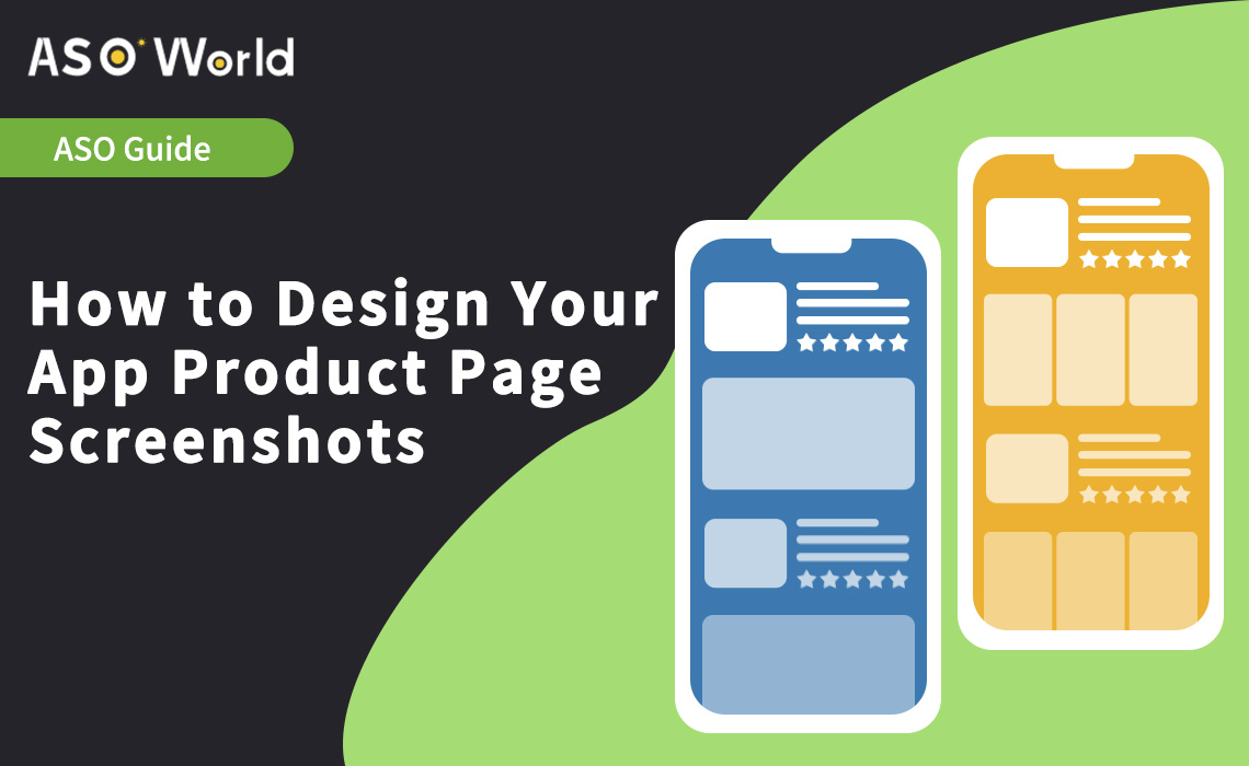
The first page of your app's story is its app store page. Your screenshot design is one of the most important factors in making your story stand out in the overcrowded app marketplace. We discovered that some design approaches work better than others after testing hundreds of screenshot sets for a variety of apps. This article will go over common pitfalls as well as best practices for creating app store screenshots that convert.
Screenshots are an essential component of ASO strategies. They're an important part of app store conversions and app product pages. However, there are some guidelines to follow. Today in this blog we will show how to design it, ensuring they have a positive impact on downloads and are memorable and clear enough to persuade users to try your app or game.
Guidelines for the App Store & Google Play
However, to reap the benefits of well-thought-out screenshots, you must follow Apple and Google's guidelines.
Google Play Store prerequisites
The screenshots on the Play Store must meet the following criteria:
● Minimum dimension: 320px
● Maximum dimension: 3840px (The maximum dimension of your screenshot can’t be more than twice as long as the minimum dimension)
● Aspect ratio: 16:9 or 9:16
● Minimum of two app screenshots (and maximum of 8)
● You can upload different screenshots for tablet devices
● Maximum size of 8MB per screenshot
● Should be JPEG or PNG (with no alpha)

Click "
Learn More" to drive your
apps & games business with the
ASO World app promotion service now.
To be eligible for Play Store recommendations, you must have:
● At least 4 screenshots for apps and 3 screenshots for games and they must demonstrate actual in-game or in-app experience
● Don’t use a call to action
● Do not include information about the rating, awards, performance, etc. (with descriptors like best, #1, top, discount, etc.)
● Localize your screenshots
● Make sure your screenshots' text is readable, taglines shouldn't cover more than 20% of the screenshot
Related reading:11 Tips for Getting Your Game Featured on Google Play in 2022
Apple Store prerequisites
Apple's App Store screenshots must meet the following criteria:
● Minimum of one app screenshot and maximum of 10
● You can only use images taken within your app
● The screenshots must be in flattened JPEG or PNG RGB file format with 72 dpi resolution
● The aspect ratio and dimensions are device dependent and can be checked on Apple's dedicated page however 3 screenshots sizes are mandatory. Three screenshot sizes are default and mandatory:
- 6.5-inch iPhone screenshots with corresponding portrait and landscape sizes
- 5.5-inch iPhone screenshots with related portrait and landscape sizes
- 12.9-inch iPad screenshots for 2nd and 3rd generation with related portrait and landscape sizes
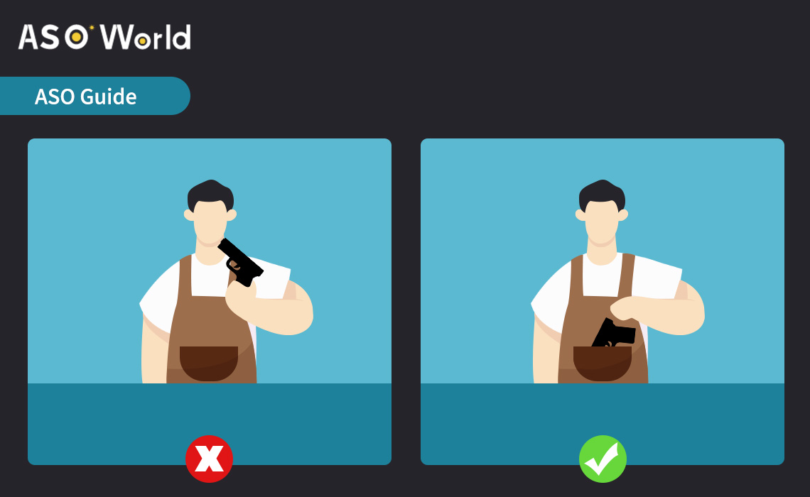
Furthermore, Apple prohibits the use of certain types of artwork in store creatives:
1. Murder or assault with blood.
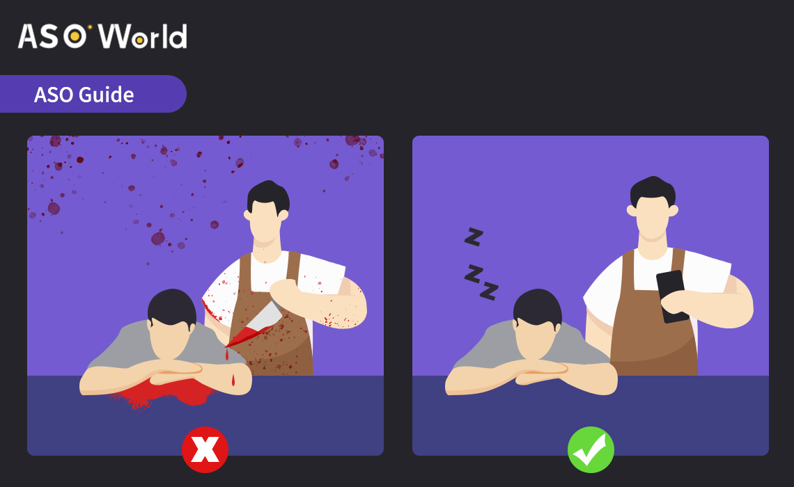
2. Sex, illegal drugs, obscene themes, smoking, alcohol, nudity, or profanity are all prohibited.
3. A real-life gun. Fantasy guns are permitted if they are in a passive position (in a holster, for example) and are not aimed/firing at the user; this also applies to non-gun weapons.
4. No mention of pricing
5. There will be no devices, hardware, or electronic products.
6. There will be no sensitive cultural references or discrimination.
Related reading:How to get featured on the App Store?
What makes a good app screenshot?
When creating app screenshots, there is a lot to consider. Should you use landscape or portrait orientation, for example? Using your app or game's inclination is not required, but it is always recommended because it helps set users' expectations.
Just keep in mind that if you choose to landscape, users will only see one screenshot at a time and will have to scroll to see the others, whereas if you choose a portrait, they will see the first three (unless there is a preview video, in which case only two screenshots will be visible without scrolling in the Gallery).
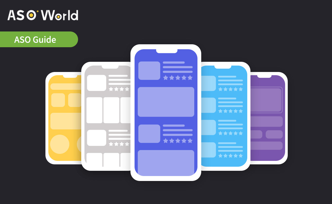
It's critical to organize the information and features you want to highlight and include the most important ones in the first screenshots. They have the highest number of views.
It's also important to remember that the main purpose of screenshots (and creative assets in general) is to inform the user about what the app or game can do for them. Because only a small percentage of users read the description, they will rely on visual assets to understand the app.
As a result, they must be clear and simple to understand. To avoid overwhelming the viewers, avoid showing too much information in one screenshot. A good strategy is to show one piece of information or feature per screenshot. Unless you're targeting Japan, in which case, according to Simon Thillay, more cluttered screenshots are preferable.
* Grow with our app growth solutions - choose a
guaranteed app ranking service for the
TOP 5 app ranking acquirement, and maximize your app traffic. Or click the "
Promote Now" above (to
increase app installs service for app visibility).
*
What Is the Keyword Guaranteed Ranking Service? What Is the Advantage of It?However, it is always critical to ensure that the information is conveyed. Sometimes simply increasing the font size can make a big difference.
Screenshots should also be consistent and related to one another. They shouldn't be too different from one another; otherwise, viewers may have difficulty understanding your product.
Strive for clarity while infusing enough of your brand identity to ensure a lasting impact, particularly with colors. For example, roughly 40% of apps on both stores use white as a background color for screenshots, and bright colors are rarely used; they can help you stand out, but you must be careful with their use and ensure that your text can be read easily.
Conclusion
App store screenshots could be the most important factor in converting visitors to users. So make them lovely! Better yet, make them unstoppable in their conversion. Try out some of these app store page design best practices and let us know how it goes. Play around with your app store visual creatives to see what works - trial and error is the best way to learn. What are your favorite designs for screenshots? Please share in the comments.
 COVID-19 UPDATE