Today's topic is about app store creative design optimization, App Icons optimization, which is based on one of ASOWorld cilents' cases a few days ago.
The story is that a mature game already has its organic traffic as nearly 100 downloads and 5000 impressions every day, meaning lots of valuable searching keywords ranked well on the app store.
And the challenge here is that its organic downloads dropped sharply from 100 to 10 recently. We did some analytics about this game as below:
● The keywords coverage condition;
● The keywords ranking condition;
● The keywords searching volume on the app store recently;
● The main users localization condition and seasonal factors.
All right, the data about all of these factors we checked on the Appannie platform are stable, with no big changes. Then we talk about the competition research, the factors may impact your app downloads on the app store list by impression. Let's view an image below on the app store:
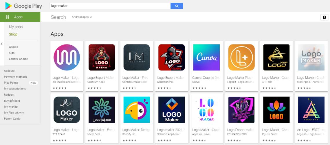
You can easily be attracted by some great apps or games by their icons with amazing design and powerful expressiveness as you can feel on the image above.
Let's focus on App Icons optimization and how to improve your icons to improve your apps & games impression downloads conversion rate as below. To start your apps or games promotion with app creative design for your app icons, the best practices, style variations, the colors your targeted users like, and its expressive content.
Why are app icons important in ASO?
Icon is the only element that appears throughout the user journey. It doesn't matter if that journey takes the user directly from the featured display location to your app, from the search results page, or even from an ad on Facebook. The icon is the only visual element that stays with the user after they install the app, just as it does on their home screen; therefore, it also affects engagement/app opening.
Imagine you're opening the App Store to find a new app you might like - a few keywords in the search bar, a quick scan - then a choice - and you're on the selected app page to decide whether to download it. What catches your eye and determines your choice? Considering that the human brain processes visual information much faster than text, the appearance of mobile icons must be the dominant factor in ASO.

Click "Learn More" to drive your apps & games business with ASO World app promotion service now.
App Store & Google Play Store
No matter how well thought out your icon is, it must meet the technical requirements set forth by Apple or Google. Both companies have described in detail their expectations for the right mobile icon, from size to overall user experience. Let's take a look of their guide from official website.
Apple
Embrace simplicity. Find a single element that captures the essence of your app and express that element in a simple, unique shape. Add details cautiously. If an icon's content or shape is overly complex, the details can be hard to discern, especially at smaller sizes.
Provide a single focus point. Design an icon with a single, centered point that immediately captures attention and clearly identifies your app.
Design a recognizable icon. People shouldn't have to analyze the icon to figure out what it represents. For example, the Mail app icon uses an envelope, which is universally associated with mail. Take time to design a beautiful and engaging abstract icon that artistically represents your app's purpose.
Keep the background simple and avoid transparency. Make sure your icon is opaque, and don't clutter the background. Give it a simple background so it doesn't overpower other app icons nearby. You don't need to fill the entire icon with content.
Use words only when they're essential or part of a logo. An app's name appears below its icon on the Home screen. Don't include nonessential words that repeat the name or tell people what to do with your app, like "Watch" or "Play." If your design includes any text, emphasize words that relate to the actual content your app offers.
Don't include photos, screenshots, or interface elements. Photographic details can be very hard to see at small sizes. Screenshots are too complex for an app icon and don't generally help communicate your app's purpose. Interface elements in an icon are misleading and confusing.
Don't use replicas of Apple hardware products. Apple products are copyrighted and can't be reproduced in your icons or images. In general, avoid displaying replicas of devices, because hardware designs tend to change frequently and can make your icon look dated.
Don't place your app icon throughout the interface. It can be confusing to see an icon used for different purposes throughout an app. Instead, consider incorporating your icon's color scheme.
Test your icon against different wallpapers. You can't predict which wallpaper people will choose for their Home screen, so don't just test your app against a light or dark color. See how it looks over different photos. Try it on an actual device with a dynamic background that changes perspective as the device moves.
Keep icon corners square. The system applies a mask that rounds icon corners automatically.
Google Play Icon Design Guidelines
Don't add shadows: Google will automatically add shadows to your icon design after it is uploaded to their system. Don't do it yourself.
Don't round corners: Google will also automatically add a rounded radius to all uploaded icons. Said radius will be equal to 20% of the icon size.
Avoid badges: Google does not recommend adding embedded badges to icons, as they can affect the artwork and do not scale well.
Mastering Icon Design Principles
Whether you are designing icons for Google Play or the Apple App Store, there are four principles that should always be followed.
Scalability: Your icons will appear in a variety of places and on a variety of devices - Facebook ads on desktop computers, search results on mobile devices, and so on. Make sure your icons look good in different scenarios.
Recognizability: Is your icon immediately recognizable? If not, you need to redesign it so that it is. Your icon will be competing for attention with a sea of other games and applications. The best way to do this is to make sure it is easily recognizable no matter where you are.
Consistency: Next, make sure your icons are relevant to the actual experience of using your application. For example, if your user interface is black and white, consider using a similar color palette for your icons to ensure uniformity.
Uniqueness: As mentioned thousand times before, there are many apps in the app store competing for attention. You should make sure your icons look different from other apps in your category.
Getting Started with Mobile Icon Optimization
First, you can simply look at some of the best-performing apps in your category to find styles you can try in your mobile app icon design. Using your target and relevant keywords, you can help you see where the app is in the search. Look at its main competitors and see what elements are included in those icons. This can provide guidance and inspiration, while determining which audiences also respond well. From there, you can incorporate the elements they identified in their current design to stand out from the crowd.
Here're some elements you should be careful with:
Features
Before you begin, you should ask yourself: Does your icon tell a story and sell the unique features of your app?
It's critical to ensure that users understand the message behind your mobile icons. For example, if we look at selfie app icons, we find that the vast majority have a camera, lens, or lens-like visual effect. Music app icons contain notes, sound waves, or equalizers. In the culinary business, the apron, or chef's hat appears in the recipe app icon respectively.
If your brand is already visible in your target market, it is essential to use it in the icon. It will give credibility to the application and increase the trust of the users.
Brands
If your brand is already visible in your target market, it is essential to use it in the icon. It will give credibility to the application and increase the trust of the users. For example, if you search for "racing", you will notice that the results contain some icons with a large publisher logo in the corner.
Icon colors and styles
Choosing your icon style and color is close to a comprehensive branding decision. The problem is that mobile icons actually represent your company in the App Store, and serious discrepancies between app design and your corporate identity can even discourage loyal customers. When you create an app, you definitely know who you are creating it for. The age, gender, location, language and other characteristics of your potential customers affect the app design. The same rule applies to mobile icons; the more precise your targeting, the more installs you can expect. Obviously, the icon style for children's games will be very different from the icons for accounting applications in terms of color and composition.
Best performing Colors
Many companies are recognized by their colors. The same applies to apps. That's why choosing colors for your mobile icons is so important. What colors work best? Unfortunately, there is no right answer. While most colors have a meaning or at least an association, these may guide you in your decision.
Blue is a popular color for many large companies (Facebook, Twitter, Visa, etc.). It has actually come to represent trust, honesty, loyalty, security and peace of mind. This color is often used for logos and icons of products intended for international use, as it does not have any negative cultural interpretation.
Green is mainly associated with money and nature, which is why it is favored by developers of 2 application categories: financial services; and environmental behavior promoters.
Purple is more of feminine color. Red is bold and energetic, orange is cheerful, yellow is warm and green is peaceful, so you can choose red for sports apps and green for some health trackers.
However, it is important to be careful and take into account all possible associations and cultural interpretations associated with the chosen color.
Choosing the right icon design style
There are four styles in particular that you should pay attention to.
Flat Icons: You got it, this icon design style is completely flat. It's a basic style that gives potential users a sense of simplicity and practicality. This is an excellent choice for practical applications that help users accomplish a specific goal.
Anthropomorphic icons: This icon design style mimics real-world objects. It's not as popular today as it used to be, but depending on your audience, it may still be a solid choice. For example, applications that want to remind users of certain things in real life can benefit from anthropomorphic design.
Illustrated icons: This style of icon design uses illustrations to catch the eye of potential users. This is a great choice for games, especially those that take place in a fantasy world. But it also works well for practical applications that want to convince users of the user-friendly features and pleasing user interface of their tools.
3-D icons: Finally, we have the 3-D icon design that "pops up" to the user. This design style can be quite beautiful. For games with 3D gameplay, this is a good choice.
Icon optimization tips
Keep icon simple
Trying to put too many images into a single icon can cause it to look cluttered. Focus on the essentials, rather than including everything at once. Even if an icon looks good at design time, developers should check how it looks at low resolution. When viewed at screen size, important details may be lost or compete for space.
Try different colors
There are many beautiful color combinations in the world, and your designer certainly knows them well. The hard question is which of these nice combinations drives the installation. Test and see if a soft pastel background highlights the main icon elements and promotes conversions better than a bold contrast.
Don't overuse text
Text should be used correctly. Text must be simple and easy to read at low resolution and not compete with other elements of the icon. Using bold text or captions can work, but there is no room on the icon for a poem. It's just not readable and takes up space on a small icon.
Of course, many applications successfully use words or letters (sometimes branded, sometimes not) in their mobile icons. If you want to join the "words" club, don't forget to test if the extra letters on the icons translate better than the graphic language. If you choose to use only one meaningful letter related to your brand, it can make a good application icon. Although using it as a logo in context is still not recommended.
Add a border
Test borders for your application icons, which can outline your icons against any background and increase their visibility and appeal.
Dark mode
It is also important to examine how icons appear in dark mode. Just as screenshots should be designed to look good in both light and dark modes, icons should be designed with both in mind. If the icon blends in with the dark mode background, users may ignore it, and too strong a clash may act as a deterrent.
Test the performance of your icons
Even a well-designed icon based on your branding rules is no guarantee that you will win millions of apps in the app store. Once app store visitors get to the product page, they stop paying attention to the icons. That's why the easiest way to improve your icons is to run a series of category tests on the App Store and choose the version that performs best in a highly competitive environment.
Only a data-driven approach, testing and optimizing different elements of your icons (colors, backgrounds, graphics, composition, etc.) will allow you to increase your app downloads and make the most of your mobile icons.
Steps to run icon test
Assumptions: Choose a clear, strong assumption that you can act on. Changing the icon background from red to blue is not a strong hypothesis. So, suppose your users prefer blue icons, now what? Test yellow once? What about someone who doesn't like blue and green? What about hundreds of other colors? How can this test help you better understand your users?
Design: Create a design brief based on the assumptions you make. Think about how these assumptions are reflected in your creative assets and start designing different variants of the icon.
Traffic Strategy: Test as successful as the traffic you direct to be part of that test. Knowing your audience and understanding exactly who to target (based on the assumptions you make) is critical to the success of the test.
Run tests: Set up ASO tests for App Store and Google Play pages using a testing platform by creating replicated versions of these pages and sending live traffic using banners on Facebook/Instagram/Adwords or other digital channels.
Make sure that the selected test variants are significantly different. Minor variations such as shadows or different angles of graphics are not suitable for split testing, as they are unlikely to show any serious conversion differences.
Developers can compare competitors' icons to see common repeating themes such as color palettes, icon borders, and characters or images used.
Developers can also test icons to determine which elements result in the most conversions. As with any creative element, changing test variants through iterations can help developers understand what users respond well to. Each test provides more insight into what works, whether it's certain color schemes, characters, or text placement.
Analyze the results: When your traffic strategy is in place and the tests have run, it's time to carefully analyze the results.
Start over: It doesn't end there. Now you can come up with new hypotheses based on the results and insights from your tests, and run more tests to help improve your CVR, which we are constantly working to improve!
 COVID-19 UPDATE