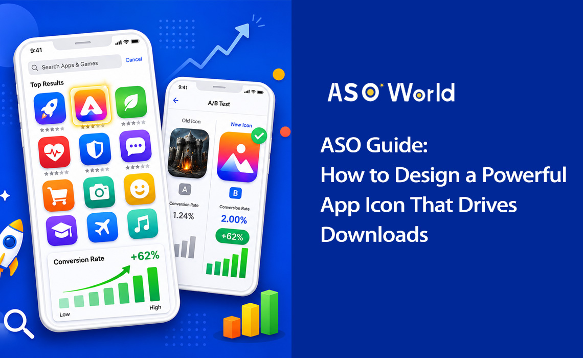
Почему иконка вашего приложения — самый важный визуальный актив
Вспомните, когда вы в последний раз просматривали магазин приложений. Сколько времени вы тратили на оценку каждого результата? Исследования показывают, что пользователи тратят менее 3 секунд на просмотр списка приложений перед принятием решения. В эту долю секунды ваша иконка выполняет всю самую тяжелую работу.
Иконка вашего приложения — это не просто красивая картинка, это машина для конверсии. Это первый визуальный элемент, с которым сталкиваются пользователи в результатах поиска, топ-чартах и редакторских подборках. Она передает назначение вашего приложения, его качество и идентичность бренда еще до того, как прочитано хоть одно слово из описания.
+100%
Увеличение числа установок после редизайна иконки (Azur Games) |
90%
Мгновенных решений принимается только на основе цвета |
+62%
Рост конверсии благодаря упрощенному дизайну иконки |
3 сек
Среднее время просмотра каждого результата выдачи |
Данные говорят сами за себя: оптимизация иконки — это одно из действий с самым высоким показателем окупаемости (ROI) в Оптимизации для магазинов приложений (ASO). Грамотно выполненный редизайн иконки может удвоить количество число установок без изменения единой строчки кода или дополнительных затрат на привлечение пользователей.
Реальный кейс: Приложение для повышения продуктивности упростило свою иконку со сложной иллюстрации списка дел до одной галочки с градиентом от синего к фиолетовому. Результат? Коэффициент конверсии подскочил с 4,2% до 6,8% — это рост на 62%, что вылилось примерно в 35 000 дополнительных установок ежемесячно.
Иконки с отчетливыми силуэтами достигают на 34% более высокой узнаваемости, а иконки, четко передающие функционал приложения, имеют на 49% более высокий показатель кликабельности (CTR) по сравнению с абстрактными вариантами. Это означает, что стратегический дизайн иконки не просто желателен, он жизненно необходим для любой серьезной стратегии маркетинга приложений.
💡 Хотите узнать, как ваша текущая иконка смотрится на фоне конкурентов?
→ [Проведите бесплатный ASO-аудит на ASOWorld]
Получите позиции по ключевым словам, бенчмарки конверсии и анализ иконок конкурентов за считанные минуты.
5 главных принципов создания иконки с высокой конверсией
Отличные иконки объединяет набор фундаментальных принципов дизайна. Разрабатываете ли вы дизайн для фитнес-приложения или мобильной игры, эти пять столпов помогут вам создать иконку, которая конвертирует.
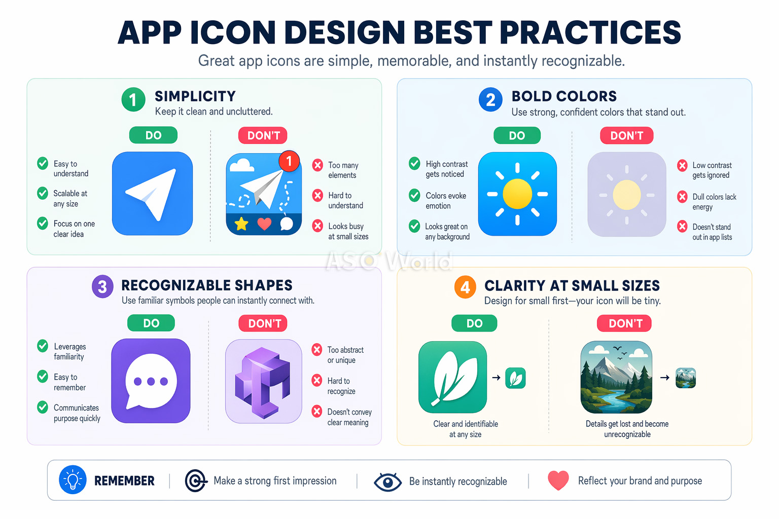
1. Масштабируемость: дизайн для любого размера
Ваша иконка должна выглядеть четко и узнаваемо в любом размере — от крошечного бейджа уведомлений 29×29px до изображения 1024×1024px на странице App Store. Это самое частое упущение разработчиков. Иконка, потрясающе выглядящая на холсте дизайнера, может превратиться в нечитаемое пятно на экране смартфона.
- Начинайте дизайн с самого маленького размера дисплея (около 60×60px) и двигайтесь вверх по размерной сетке.
- Тестируйте иконку на реальных устройствах во всех размерах перед финальным утверждением.
- Избегайте мелких деталей, тонких линий и мелкого текста, которые исчезают при уменьшении.
2. Простота: один фокус внимания
Самые успешные иконки используют один четкий символ в качестве визуального центра. Вспомните значок камеры Instagram или три изогнутые линии Spotify. Как показывают A/B-тесты, упрощение перегруженной деталями иконки может повысить конверсию на целых 27%.
Теория когнитивной нагрузки объясняет, почему это происходит: сложные иконки вызывают «усталость от принятия решений» при поиске. Когда пользователи просматривают десятки результатов, самая простая и понятная иконка выигрывает борьбу за их внимание.
3. Узнаваемость: выделяйтесь из толпы
Ваша иконка должна мгновенно идентифицироваться — как в результатах поиска магазина, так и на загроможденном главном экране устройства. Это означает выбор нестандартных форм, уникальных цветовых комбинаций и визуальных метафор, которые сразу сообщают о назначении вашего приложения.
Изучите иконки конкурентов и сознательно отстройтесь от них. Если каждое приложение-задачник в вашей категории использует синюю галочку, это ваш явный сигнал попробовать что-то другое.
4. Согласованность: соответствие вашему бренду
Ваша иконка должна ощущаться как естественное продолжение интерфейса приложения. Цветовая палитра, язык дизайна и визуальный стиль должны гармонировать. Такая согласованность повышает удовлетворенность продуктом, удержание пользователей пользователей и запоминаемость бренда.
5. Никакого текста: позвольте говорить визуалу
Текст на иконках почти всегда является ошибкой. Он нечитаем в маленьком размере, не поддерживает локализацию и добавляет визуального шума. Согласно исследованиям Nielsen Norman Group, иконки с текстом показывают на 26% более низкую вовлеченность. Название вашего приложения и так отображается прямо под иконкой в любом сторе — нет нужды его повторять.
Совет от профи: Единственным исключением из правила «без текста» является ситуация, когда текст И ЕСТЬ символ вашего бренда (как буква "f" у Facebook). Но даже в этом случае ограничьтесь одной буквой или монограммой.
Психология цвета в дизайне иконок приложений
Цвет — самый мощный инструмент в арсенале дизайна иконки. Исследование Университета Виннипега показало, что до 90% мгновенных решений о продуктах принимаются исключительно на основе цвета. Для иконок это означает, что выбор цвета может как улучшить, так и разрушить ваш коэффициент конверсии.
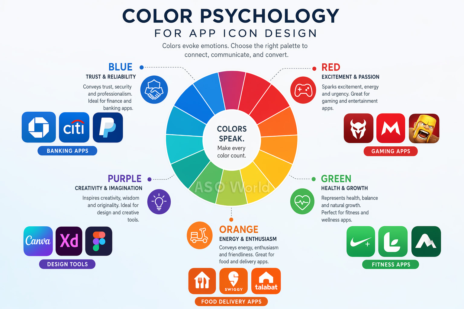
Что означает каждый цвет
- Синий — Доверие, надежность, профессионализм. Доминирует в финансах, продуктивности и социальных сетях. Финансовые приложения, использующие синие тона, показывают конверсию на 24% выше, чем использующие другие цвета.
- Красный — Энергия, срочность, воодушевление. Популярен в играх, доставке еды и развлекательных приложениях.
- Зеленый — Здоровье, рост, природа. Естественный выбор для фитнеса, велнеса (оздоровления) и экологичных продуктов.
- Оранжевый/Желтый — Оптимизм, энергия, тепло. Эффективен для социальных приложений и маркетплейсов.
- Фиолетовый — Креативность, премиум-качество, инновации. Часто встречается в дизайн-инструментах и творческих приложениях.
- Черный/Темный — Изысканность, роскошь, сила. Используется приложениями премиум и pro-уровня.
Стратегическая цветовая дифференциация
Вот тактика, которую многие разработчики упускают: изучите цветовые паттерны в вашей категории и нарушьте их. Когда 72% фитнес-приложений используют синий или зеленый цвет, переход на градиент от оранжевого к красному может резко повысить видимость.
Кейс: Фитнес-приложение изменило иконку с синей на оранжево-красную, нарушив норму категории. Результат: +31% click-through rate (кликабельность) и +24% обнаружений при поиске по категории (category browse discovery). Выделение на фоне массы сине-зеленых конкурентов принесло значительный дополнительный прирост установок.
Этот подход игры на контрастах (category zigging) является одной из самых недооцененных тактик в ASO. Чтобы глубже погрузиться в то, как конкурентная отстройка работает для всей вашей страницы (а не только для иконки), прочитайте: Как провести ASO-анализ конкурентов, который действительно приносит результаты.
Лучшие практики работы с цветом
- Используйте не более 2-3 доминирующих цветов для визуальной чистоты на малых размерах.
- Сочные градиенты превосходят плоские цвета — они показывают эффективность на 28% лучше в переполненной результатами поисковой выдаче.
- Тестируйте свою иконку как на светлых, так и на темных обоях устройств и фонах магазинов приложений.
- Обеспечьте достаточный контраст между элементами иконки для хорошей читаемости.
iOS против Android: Руководства по иконкам для платформ
Хотя базовые принципы дизайна универсальны, iOS и Android имеют совершенно разные технические требования к иконкам. Ошибки в этих вопросах могут привести к отклонению (реджекту), визуальным глитчам или ухудшению пользовательского опыта.
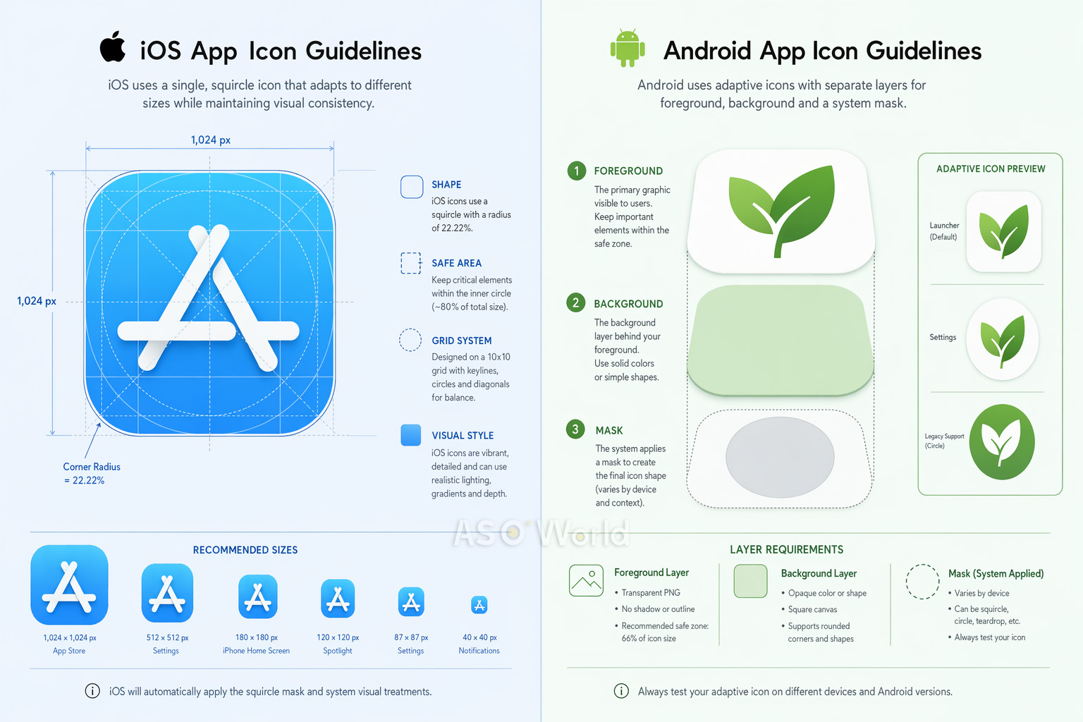
Спецификации иконок iOS (2025+)
- Размер: Загрузите один PNG-файл размером 1024×1024px. Система автоматически сгенерирует все уменьшенные варианты (180px для iPhone, 167px для iPad Pro и т.д.).
- Форма: Создавайте дизайн на квадратном холсте. iOS автоматически применяет свою фирменную маску суперэллипса «squircle» со скруглением углов ~20%. НЕ СКРУГЛЯЙТЕ углы вручную — это создаст видимые артефакты.
- Слои: Начиная с iOS 18, иконки поддерживают многослойный дизайн (фон + передний план) с эффектами "жидкого стекла" (Liquid Glass), включая блики и полупрозрачность. Используйте инструмент Apple Icon Composer (поставляется с Xcode) для создания многослойных иконок.
- Режимы отображения: Иконка должна поддерживать стандартный (default), темный (dark), прозрачный (clear) и тонированный (tinted) варианты.
- Цветовое пространство: sRGB или Display P3. Никакой прозрачности/альфа-каналов на фоновом слое.
Стратегия оформления страницы продукта в iOS выходит далеко за рамки технических спецификаций иконки. Алгоритм Apple все больше вознаграждает полноту описания и креативное разнообразие — включая события внутри приложения (in-app events), промо-тексты и локализованные материалы. Будьте в курсе с нашим руководством Факторы ранжирования приложений в 2026 году: чего ожидать от обновлений алгоритма iOS App Store.
Спецификации иконок Android
- Адаптивные иконки (Adaptive Icons): Трехслойная система (фон, передний план, системная маска). Форма маски зависит от производителя смартфона — круг, суперэллипс (squircle), прямоугольник со скругленными углами и т.д.
- Размер: Общий размер холста 108×108dp, с безопасной зоной 72×72dp (внутренние 66%) для содержимого переднего плана. Иконка для Google Play Store: 512×512px.
- Формат: PNG с прозрачностью для переднего плана; векторные элементы (XML) рекомендуются для идеального масштабирования.
- Material Design: Используйте яркие, насыщенные цвета, согласованное освещение сверху слева (top-left lighting) и равномерный визуальный вес.
Краткое сравнение
| Аспект |
iOS |
Android |
| Форма |
Squircle (суперэллипс, применяется системой) |
Варьируется от устройства (адаптивная) |
| Базовый размер |
1024×1024px |
108×108dp / 512×512px (Play Store) |
| Система слоев |
Фон + Передний план (Liquid Glass) |
Фон + Передний план (Адаптивная) |
| Безопасная зона |
Контент отцентрирован |
Внутренние 66% иконки |
| Темная тема |
Обязательны варианты (iOS 18+) |
Не обязательна |
Совет для кросс-платформ: Разработайте единую базовую концепцию, затем оптимизируйте ее отдельно для каждой платформы. Игровое приложение, применившее оптимизацию под конкретную платформу (3D-рендеринг для iOS, адаптивные слои для Android), получило прирост конверсии +38% на Android, сохранив при этом производительность на iOS.
Мышление с учетом специфики платформ — это признак зрелой ASO-стратегии. Если вы выходите на Android или оптимизируете оба магазина одновременно, наше руководство по кросс-платформенной ASO-стратегии подскажет, как распределять свои ресурсы между iOS и Google Play, без дублирования усилий.
A/B-тестирование вашей иконки: подход на основе данных
Разработка классной иконки — это лишь половина дела. Вторая половина — доказать ее эффективность с помощью тщательных A/B-тестов. Даже опытные дизайнеры часто удивляются результатам тестов — то, что больше всего нравится вашей команде, очень часто конвертирует хуже для реальных пользователей.
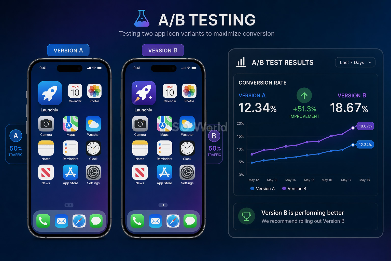
Три метода тестирования
1. Эксперименты на странице приложения в Google Play (бесплатно)
Нативный инструмент A/B-тестирования от Google позволяет вам тестировать до 5 вариантов против текущей иконки. Он оценивает весь трафик (органический + платный) и не требует обновления приложения. Ограничение: доверительные интервалы (confidence intervals) могут быть слабыми для приложений с низким трафиком.
2. Apple Product Page Optimization / PPO (бесплатно)
Эквивалент от Apple позволяет вам тестировать до 3 вариантов против оригинала. Тесты могут идти до 90 дней. Главное ограничение: варианты иконок должны быть включены в сборку (binary) приложения до тестирования.
3. Сторонние инструменты (GeekLab, SplitMetrics, StoreMaven)
Эти сервисы создают «клоны» (look-alike) страниц в магазинах и направляют строго контролируемый трафик для тестирования до официального запуска (pre-launch). Идеальны для исследования рынка перед разработкой или крупными редизайнами.
Лучшие практики A/B-тестирования
- Проводите каждый тест не менее 7 дней (кратно неделям), чтобы захватить поведенческие изменения пользователей в будние и выходные дни.
- Вносите более масштабные и смелые изменения между вариантами — незначительные корректировки требуют гигантских объемов трафика для надежного определения разницы.
- Считайте тест успешным только при улучшении на 5% и более с высокой статистической достоверностью.
- Для критически важных ассетов, таких как иконка, проводите проверочные тесты (B/A тесты с обратной сменой), чтобы подтвердить результаты.
- При ограниченном трафике тестируйте только 2 варианта (контрольная версия vs претендент).
- Изолируйте одну переменную на каждый тест для получения точных инсайтов (к примеру, тестируйте только цвет или только изменение геометрической формы).
+8%
Увеличение конверсии Peak Brain Training после теста иконки |
+3%
Рост конверсии Simply Piano после оптимизации иконки |
7 дней
Минимальная длительность теста для надежных результатов |
Распространенная ловушка: Не останавливайте тест досрочно, потому что один вариант вроде как начинает побеждать. Ранние результаты ненадежны. Статистическая значимость требует достаточного размера выборки пользователей, а недельные колебания (будни/выходные) могут кардинально поменять итоговый результат.
10 частых ошибок при создании иконок (и как их избежать)
После анализа тысяч страниц приложений в сторах, вот список самых частых ошибок в дизайне иконок, которые убивают конверсию:
- Добавление текста на иконку — Не читается в малом разрешении и снижает вовлеченность пользователей на 26%. Название вашего приложения и так видно под иконкой.
- Слишком много деталей и сложности — Мелкие элементы превращаются в кашу при размере 60px. Будьте проще, используйте единый фокус.
- Использование фото или скриншотов — Они редко работают при малых размерах и выглядят некрасиво при разных режимах отображения дисплея.
- Игнорирование рекомендаций платформ — Заранее скругленные углы в iOS (система сама делает это), неправильное использование прозрачности или игнорирование безопасных зон (safe zones) в Android.
- Слепое копирование конкурентов — Использование тех же цветов и символов, что и все остальные в вашей категории, делает вас невидимым, а не заслуживающим доверия.
- Отсутствие тестов на реальных устройствах — Проектирование только при масштабе 1024×1024px без проверки того, как иконка рендерится в панели уведомлений или через поиск Spotlight.
- Встраивание UI компонентов в иконку — Использование навигационных баров, вкладок или других системных элементов UI внутри иконки запутывает пользователей и нарушает все правила.
- Использование изображений устройств — Размещение на иконке фото iPhone или Android-смартфонов — это прямое нарушение политики магазинов, ведущее к реджекту.
- Игнорирование темной темы (Dark mode) — Иконки, отлично выглядящие на белоснежном фоне, могут почти полностью стать невидимыми на темных экранах.
- Путаница логотипа компании с иконкой — Логотип вашего бренда и иконка приложения служат разным целям и имеют разные ограничения. То, что круто смотрится на визитке, не обязательно сработает в размере 29px на девайсе.
Быстрый фикс: Распечатайте иконку в реальных размерах телефона, прилепите ее на экран смартфона среди других приложений и отойдите на метр. Вы можете мгновенно идентифицировать ее? Если нет, то упрощайте.
Лучшие инструменты для дизайна иконок в 2026 году
Вам вовсе не обязательно нанимать дорогое дизайнерское агентство, чтобы создать профессиональную иконку. Вот подборка лучших инструментов, доступных сегодня:
Выбор правильных инструментов — это стратегическое, а не просто техническое решение. Лучшие ASO-команды выстраивают свой рабочий стек вокруг темпов тестирования гипотез и размера команды — а не просто смотря на список фич. Прежде чем принимать решение о покупке, полезно понимать, как выглядит зрелый рабочий процесс ASO на больших масштабах, чтобы вы знали, какие именно пробелы закрываете.
Инструменты для дизайна
| Инструмент |
Лучше всего для |
Цена |
| Figma |
Командный векторный дизайн, создание прототипов, групповая работа |
Доступен бесплатный тариф |
| Adobe Illustrator |
Профессиональная векторная графика, сложные иллюстрации |
Подписка |
| Sketch |
Нативный Mac дизайн, огромная экосистема плагинов |
$10 / мес. |
| Apple Icon Composer |
Создание слоистых иконок iOS с эффектами Liquid Glass (новинка 2025 года) |
Бесплатно (вместе с Xcode) |
| Canva |
Быстрое создание прототипов для тех, кто не является дизайнером |
Доступен бесплатный тариф |
Шаблоны и ресурсы
- appicontemplate.com — Бесплатные PSD/Sketch/Figma шаблоны от Майкла Фларупа со всеми заранее настроенными требуемыми размерами
- Apple Design Resources — Официальные сетки иконок, производственные шаблоны и SF Symbols (векторная иконография системных символов)
- Android Asset Studio — Инструмент Google для генерации адаптивных ресурсов иконок во всех требуемых конфигурациях
Платформы для A/B-тестирования
- Google Play Store Experiments — Бесплатное, нативное тестирование для приложений Android
- Apple Product Page Optimization — Бесплатное, нативное тестирование для iOS-приложений
- GeekLab / SplitMetrics / StoreMaven — Сторонние инструменты для тестирования перед запуском (pre-launch) и продвинутых тестов
Аналитика ASO (ASO Intelligence)
Для всестороннего подбора ключевых слов, глубокого анализа конкурентови отслеживания того, как ваша иконка влияет на коэффициенты конверсии, бесплатные ASO-инструменты от ASOWorld предоставляют аналитику, необходимую для принятия дизайнерских решений, которые опираются на точные данные.
Заключение: чек-лист по иконке вашего приложения
Иконка вашего приложения — самый трудолюбивый актив во всем вашем маркетинговом арсенале. Она появляется в результатах поиска, попадает в топ-чарты, размещается на главных экранах, в пуш-уведомлениях и системном меню настроек — она получает тысячи показов на каждого пользователя каждый день. Сделать ее правильно — это один из самых эффективных шагов, которые вы вообще можете предпринять для роста вашего приложения.
Вот ваш финальный чек-лист перед загрузкой:
- Единый визуальный фокус — Один четкий символ или наглядная визуальная метафора
- Максимум 2-3 цвета — Уверенная, смелая палитра, которая отличает вас от конкурентов
- Никакого текста — Пусть изображение говорит само за себя
- Масштабируемость проверена — Выглядит четко и сочно от 29px до 1024px
- Совместимость с платформой — Строго в соответствии с официальными гайдлайнами iOS и Android
- Готовность к темной теме (Dark mode) — Бескомпромиссно сбалансировано как на светлом, так и на темном фоне
- Отстройка от конкурентов — Мгновенно выделяется в поисковой выдаче вашей категории
- A/B-тесты пройдены — Эффективность подтверждена реальными данными пользователей, а не только личными мнениями членов команды
Помните: лучшая иконка приложения — это не та, которая больше всего нравится вашей команде, а та, которая приносит больше всего конверсий. Проектируйте осознанно, тестируйте на реальных цифрах и непрерывно улучшайте.

 COVID-19 UPDATE