COVID-19 UPDATE

重要なお知らせ:ASOWorld の名前を騙ってパートタイムの採用や ASO 収入アプリ活動を行う詐欺にご注意ください。ASOWorld はパートタイムのスタッフを募集していません。ASOWorld が投稿した公式情報のみを信頼してください。

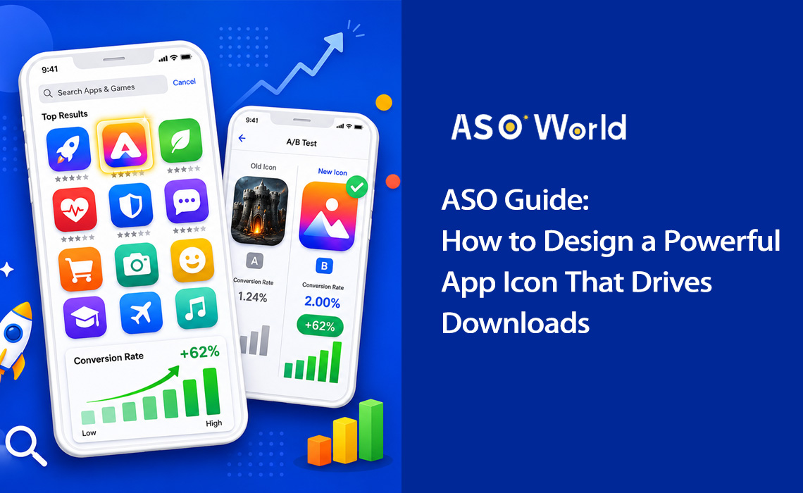
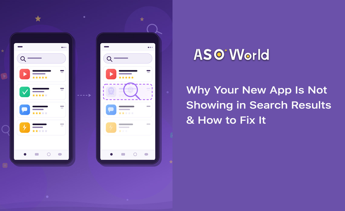
最後にアプリストアを閲覧した時のことを思い出してみてください。1つの検索結果を見るのにどれくらいの時間をかけましたか?調査によると、ユーザーがインストールを決定する前にアプリのリストをスキャンする時間は3秒未満だと言われています。その一瞬の間に、あなたのアプリアイコンは全ての重要な役割を担っているのです。
アプリアイコンは単なる綺麗な画像ではなく、コンバージョンを生み出すマシンです。検索結果、トップチャート、エディトリアルのおすすめ機能などでユーザーが最初に目にするビジュアル要素であり、説明文が1文字も読まれる前に、アプリの目的、品質、そしてブランドアイデンティティを伝えます。
| +100% アイコン刷新によるインストールの増加(Azur Games) |
90% 色だけに基づく瞬時の判断の割合 |
+62% シンプルなデザインによるコンバージョンの向上 |
3秒 各リストをユーザーがスキャンする平均時間 |
データは明確です。アイコンの最適化は、アプリストア最適化(ASO)において最も投資対効果(ROI)が高い施策の1つです。 適切にアイコンをリニューアルできれば、コードを1行も変更せず、ユーザー獲得(UA)に余分な費用をかけることもなく、インストール数を倍増させることが可能です。
実際のケーススタディ: ある仕事効率化アプリは、複雑なToDoリストのイラストから、青から紫へのグラデーションを背景にしたシンプルなチェックマークへとアイコンを変更しました。その結果、コンバージョン率は4.2%から6.8%へと跳ね上がり、62%の増加を記録しました。これは月間約35,000件の追加インストールに相当します。
特徴的なシルエットを持つアイコンは、抽象的なデザインと比較して34%高い認知度を獲得し、アプリの機能を明確に伝えるアイコンは49%高いクリック率(CTR)を達成します。つまり、戦略的なアイコンデザインはオプションではなく、本格的なアプリマーケティング戦略において不可欠な要素なのです。
💡 現在のアイコンが競合と比べてどう評価されるか確認してみませんか?
→ [ASOWorldで無料のASO監査を実行する]
数分でキーワードランキング、コンバージョンのベンチマーク、競合アイコンの分析を取得できます。
優れたアプリアイコンには、一連の基本的なデザイン原則が共通しています。フィットネスアプリであれモバイルゲームであれ、以下の5つの柱がコンバージョンに繋がるアイコン作成の指針となります。
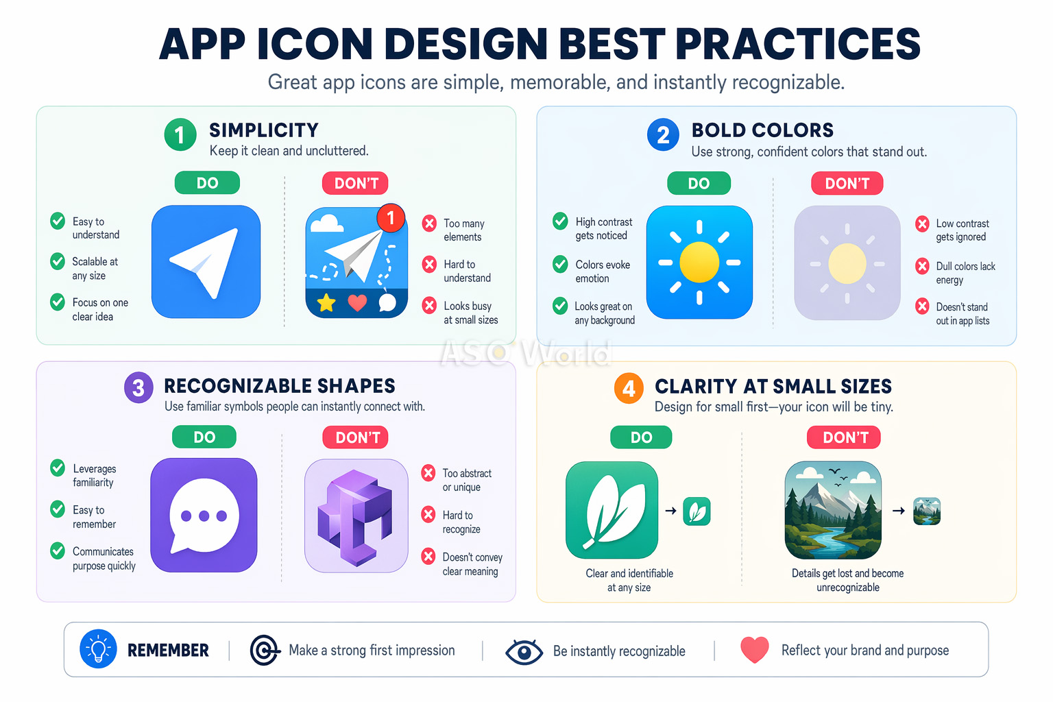
アイコンは、29×29pxの小さな通知バッジから、1024×1024pxのApp Storeリストに至るまで、どのサイズでも鮮明で認識可能でなければなりません。これは開発者にとって最も見落とされがちな要素です。デザインキャンバス上では美しく見えるアイコンでも、スマートフォンの画面サイズでは読解不能な塊になってしまうことがあります。
最も成功しているアプリアイコンは、1つの大胆なシンボルを焦点として使用しています。Instagramのカメラの絵文字や、Spotifyの3本の曲線を思い浮かべてみてください。複雑すぎるアイコンをシンプルにした結果、A/Bテストでコンバージョンが最大27%改善したというデータもあります。
認知負荷理論(Cognitive load theory)がこの理由を説明しています。複雑なアイコンは、閲覧中の「決断疲れ」を引き起こします。ユーザーが数十の検索結果をスキャンしている時、最もシンプルで明確なアイコンが注意を惹きつけるのです。
あなたのアイコンは、アプリストアの検索結果や、アプリがひしめき合うホーム画面の両方で瞬時に識別できる必要があります。つまり、特徴的な形状、ユニークな色の組み合わせ、アプリの目的を即座に伝える視覚的メタファーを選ぶということです。
競合他社のアイコンを調査し、意図的に差別化を図りましょう。もしあなたのカテゴリーのToDoアプリが全て青いチェックマークを使用しているなら、それが違うアプローチを試す合図です。
アイコンは、アプリのインターフェースの自然な延長線上にあるように感じられるべきです。カラーパレット、デザイン言語、視覚的スタイルがすべて調和していなければなりません。この一貫性が、プロダクトに対する満足度、ユーザーの定着率、そしてブランド想起を高めます。
アプリアイコンにテキストを含めるのは、ほぼ間違いなく失敗につながります。小さなサイズでは判読できず、ローカリゼーションにも対応できず、視覚的なノイズを増やすだけです。ニールセン・ノーマン・グループの調査によると、テキストを含むアイコンはエンゲージメントが26%低いことが分かっています。アプリ名はすでにすべてのアプリストアでアイコンのすぐ下に表示されているため、繰り返す必要はありません。
プロのヒント: テキスト禁止ルールの唯一の例外は、テキスト自体があなたのブランドシンボルである場合(Facebookの「f」など)です。その場合でも、1文字やモノグラムに留めましょう。
色は、アイコンデザインのツールキットにおいて最も強力な要素です。ウィニペグ大学の調査によると、製品に対する瞬時の判断の最大90%が色のみに基づいていることがわかっています。アプリアイコンにおいて、これは色の選択がコンバージョン率を左右することを意味します。
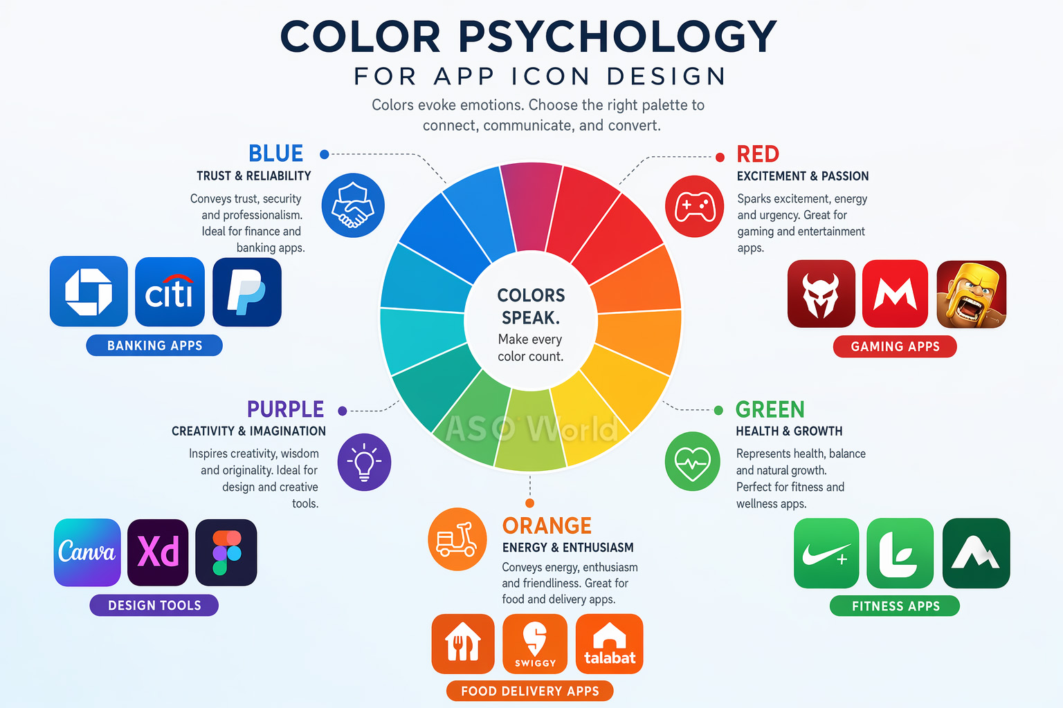
ここで、多くの開発者が見落としている戦術を紹介します。カテゴリー内の色のパターンを研究し、それを打ち破るのです。 フィットネスアプリの72%が青や緑を使用している場合、オレンジから赤へのグラデーションに変更することで、可視性を劇的に高めることができます。
ケーススタディ: あるフィットネスアプリは、カテゴリーの常識を破り、アイコンを青からオレンジ・赤に変更しました。結果は、タップスルー率 +31%、カテゴリーブラウズ経由の発見 +24%となりました。青緑色の競合他社の海から抜け出すことで、大幅な追加インストールを獲得したのです。
この「カテゴリーの逆を行く」アプローチは、ASOにおいて最も過小評価されている戦術の1つです。アイコンだけでなく、リスティング全体で競合との差別化をどのように機能させるかについてさらに深く知りたい場合は、以下をお読みください:実際に成果を上げる競合ASO分析の進め方。
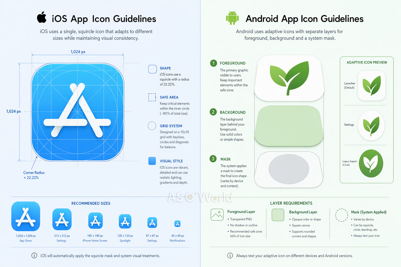
核となるデザイン原則は共通していますが、iOSとAndroidではアプリアイコンに関する技術的要件が大きく異なります。これを間違えると、審査の拒否(リジェクト)、視覚的な不具合、または低品質なユーザー体験につながる可能性があります。
iOSのプロダクトページ戦略は、単なるアイコン仕様の枠をはるかに超えます。Appleのアルゴリズムは、アプリ内イベント、プロモーションテキスト、ローカライズされたアセットなど、リスティングの完全性とクリエイティブの多様性をますます評価するようになっています。詳しくは、こちらの2026年のアプリランキング要因:iOS App Storeアルゴリズムのアップデートで期待されることをご確認ください。
| 項目 | iOS | Android |
|---|---|---|
| 形状 | スクワークル(システムが自動適用) | デバイスごとに異なる(アダプティブ) |
| 基本サイズ | 1024×1024px | 108×108dp / 512×512px (Playストア用) |
| レイヤーシステム | 背景 + 前景 (リキッドグラス) | 背景 + 前景 (アダプティブ) |
| セーフゾーン | コンテンツを中央に配置 | アイコン内側の66% |
| ダークモード | 専用バリエーション必須 (iOS 18以降) | 必須ではない |
クロスプラットフォームのヒント: 1つのコアなコンセプトをデザインし、各プラットフォームに合わせて個別に最適化しましょう。プラットフォームごとの最適化(iOS用には3Dレンダリング、Android用にはアダプティブレイヤー)を採用したあるゲームアプリは、iOSのパフォーマンスを維持したまま、Androidでのコンバージョンが+38%増加しました。
プラットフォーム特有の思考は、成熟したASO戦略の証です。Androidへの展開をお考えの方や、両方のストアを同時に最適化したい方は、無駄な労力をかけずにiOSとGoogle Playにリソースを配分する方法を解説したクロスプラットフォームのASO戦略ガイドをご一読ください。
素晴らしいアイコンをデザインすることは戦いの半分に過ぎません。残りの半分は、厳格なA/Bテストを通じてそれが機能することを証明することです。経験豊富なデザイナーでさえテスト結果に驚かされることは多々あります — チームにとって最も良く見えるものが、実際のユーザーで最もコンバージョンを獲得できるとは限らないからです。
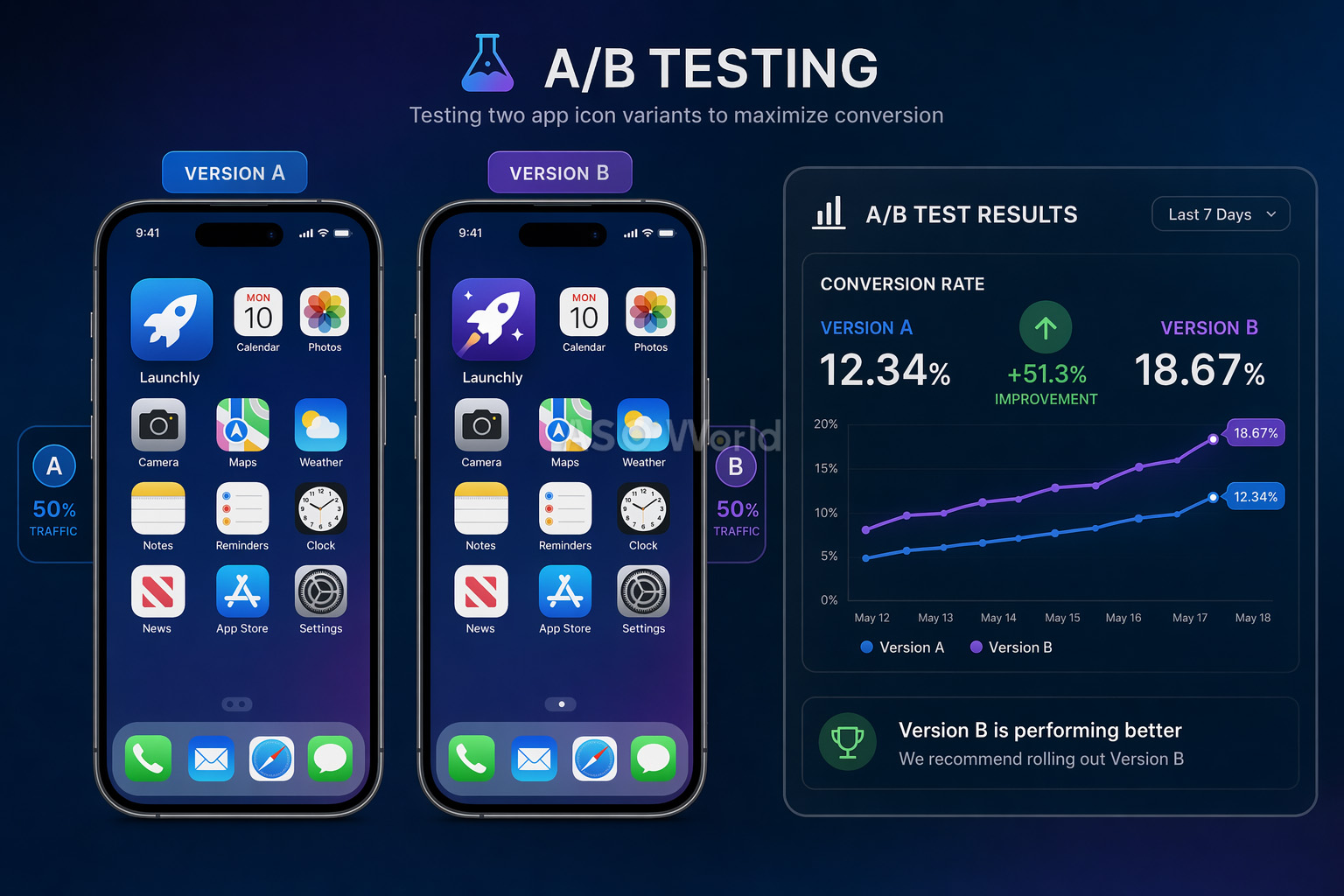
1. Google Play Consoleのストア掲載情報のテスト(無料)
GoogleのネイティブなA/Bテストツールでは、現在のアイコンに対して最大5つのアイコンバリエーションをテストできます。これはすべてのトラフィック(オーガニック+有料)でテストされ、アプリのアップデートは不要です。ただし、トラフィックが少ないアプリでは信頼区間(Confidence interval)が弱くなるという制限があります。
2. Apple プロダクトページ最適化 / PPO(無料)
Appleの同等機能である、プロダクトページ最適化(PPO)を使用すると、オリジナルに対して最大3つの処理をテストできます。テストは最大90日間実行可能です。主な制限事項として、アイコンのバリエーションはテスト前にアプリのバイナリ(ビルド)に含まれている必要があります。
3. サードパーティツール(GeekLab、SplitMetrics、StoreMaven)
これらのツールは、「ルックアライク(擬似)」のストアページを作成し、ローンチ前のテストのためにトラフィックを制御します。開発前や大規模なリニューアル前の市場調査(マーケタビリティ・リサーチ)に最適です。
| +8% Peak (脳トレアプリ)のアイコンテストによるコンバージョン向上 |
+3% Simply Piano のアイコン最適化によるコンバージョン増加 |
7日間 信頼性の高い結果を得るための最小テスト期間 |
陥りがちな罠: 1つのバリエーションが勝っているように見えるからといって、テストを早めに終了しないでください。初期の結果は信頼できません。統計的有意性には十分なサンプルサイズが必要であり、週間パターン(平日のユーザーと週末のユーザー)が結果を大きく変動させる可能性があります。
何千ものアプリストアのリスティングを分析した結果、コンバージョン率を損なう最も頻繁に発生しているアイコンデザインのミスは以下の通りです:
簡単な修正方法: アイコンを実際のデバイスサイズで印刷し、本物のアプリに囲まれたスマホの画面に貼り付けて、3フィート(約90センチ)後ずさりしてみてください。瞬時に識別できますか?もしできなければ、もっとシンプルにしましょう。
プロフェッショナルなアプリアイコンを作成するために、高価なデザインエージェンシーを雇う必要はありません。現在利用できる最高のツールをご紹介します:
適切なツールの選択は、単なる技術的な決断ではなく、戦略的な決断です。優秀なASOチームは、機能リストではなく、テストの速度目標とチームの規模に基づいて構築を行っています。ツールを評価する前に、大規模かつ成熟したASOワークフローの全体像を理解しておくと、自分たちが埋めるべき「ギャップ」が明確になります。
| ツール / ソフトウェア | 最適な用途 | 価格 |
|---|---|---|
| Figma | コラボレーティブなベクターデザイン、プロトタイピング、チームの作業ワークフロー | 無料プランあり |
| Adobe Illustrator | プロフェッショナルなベクターグラフィック、複雑なイラスト制作 | サブスクリプション |
| Sketch | Mac専用のアイコンデザイン、豊富なプラグインエコシステム | 月額$10〜 |
| Apple Icon Composer | リキッドグラスエフェクトを利用したレイヤー化iOSアイコン(2025年新機能) | 無料 (Xcodeに同梱) |
| Canva | 非デザイナー向けの素早いプロトタイピング作成 | 無料プランあり |
包括的なキーワード調査、競合分析、コンバージョン率に与えるアイコンの影響のトラッキングを行うなら、ASOWorldの無料ASOツールが最適です。データに基づくデザインの意思決定に必要なアナリティクスを提供します。
アプリアイコンは、マーケティング全体において最も過酷な働きをする資産です。検索結果、トップランキング、ホーム画面、通知、システム設定など、1日1ユーザーあたり何千回ものインプレッションを獲得します。これを正しく行うことは、アプリの成長のためにできる最も影響力の大きな施策の1つです。
申請の前に、最終的なデザインのチェックリストを確認しましょう:
忘れないでください。最高のアプリアイコンとは、社内のチームが最も気に入ったものではなく、最もコンバージョンを獲得したもの(ユーザーに行動を促したもの)です。意図を持ってデザインし、データでテストし、そして継続的に改善を続けましょう。
Get a good start for your app optimization with practical ASO guideline!
Want to get the latest Guides & Insights from ASOWorld?
関連するマーケティング ガイドライン