Financial and economic news has always been what most people want to pay attention to, whether it is personal investment, or catching up on hot news, or understanding the industry's point of view and analysis, everyone's will have one or more financial and economic Apps on their cellphone.
In 2021, with more and more people paying attention. You may be confused by the question as how to make your finance app be standing out and breaking the convention. Work with ASO World team to find the answer and get the ASO insight for your Finance category app.
How to improve your keywords coverage so the users could find your finance app easier
Developers and banking professionals need to take time to perform market research, create keyword and marketing strategies, and give their app a solid introduction to the world when it's first listed for download. That includes a competitive analysis and complete technological and marketing audit, including fully understanding customers and their needs. A strong start will help create momentum, drive keyword relevance, and push the app toward the top of search results.

Click "
Learn More" to drive your
apps & games business with
ASO World app promotion service now.
A Relevant app name kept your app in users’ mind
In the past years, a financial app might simply be called "Mobile Banking" or "Mobile Accounts". That era is bygone for a reason: It was simply too hard for a customer search to find the right application for their financial needs. In the modern era of ASO, the appropriate approach is to pick an app name that is inclusive of targeted keywords. Both the Apple's apple store and Google Play allows developers to submit an app with a short name for display on the home screen, and a longer name that is used for search discovery.
The short name should include the bank's name and a one-word description of what the application does. The longer name should use a few words to describe what the app does with keywords. A bank might use the following title: "My Bank Accounts -- a Delaware Valley mobile banking, check deposit, and payments app for Bank". Good keywords are localized, relevant, and descriptive, whether they're being used for SEO or ASO.
How to say more in the subtitle?
The subtitle is also very important, it is a supplement to the main title, then the title does not reflect the characteristics of the app, the role and some other aspects of information, can be added in the title. So a suitable subtitle is also very important. For example, the subtitle of a financial app can surface the direction the app focuses on, or the field it is involved in, and some of its features, all of which can be mentioned in just a few lines of the subtitle.
App description: simple, clear and easy to understand
The app description is not only a description of the key features, but also an important way to sneak targeted keywords into the app store listing. Carefully craft a useful, easy-to-read, keyword-rich app description when listing the app.
Don't be afraid to change this description over time, as many times as needed, to optimize its relevance and the app's ranking in targeted searches.
How to improve the user experience in app store?
How to impress users with the App icon?
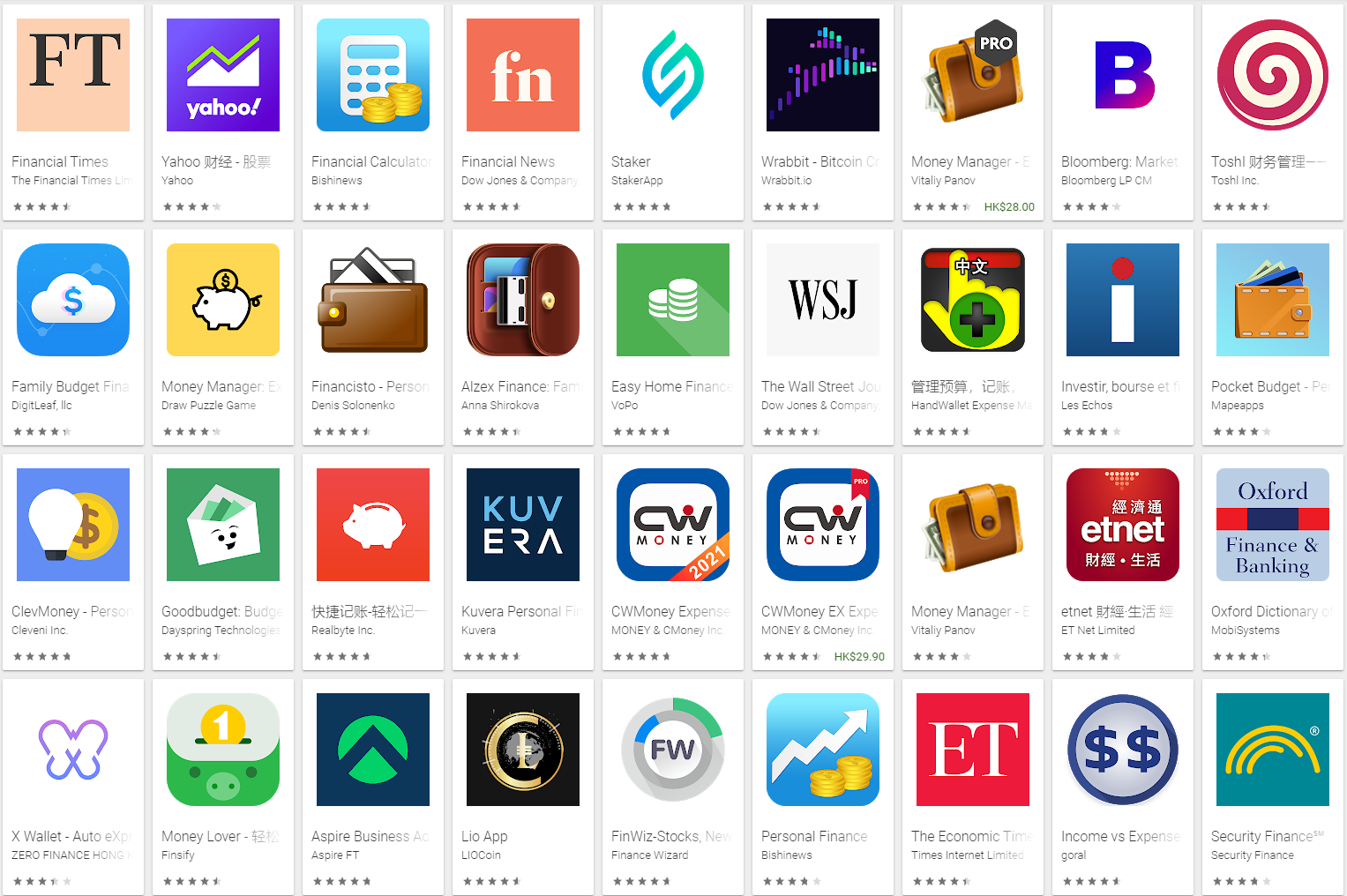
A plain white icon with a dollar sign is probably a terrible way to optimize an app for easy discovery. Instead, paint with a colorful brush, get creative and make the bank's logo front and center. The icon is one of the first things people look at. In fact, many people choose their banking apps based solely on the icon.
The most important job a bank has is to drive merchant loyalty and CRM. Provide this from a visual point of view as well. With color and a centrally placed logo, trust and relevance are established at first glance.

Ease of use make your app accessible for everyone
About 34.3% of apps are leading their app store page with a message around ease of use. Great. But is the app actually easy for everyone to use?
Consumer Finance is an area that intimidates many users who aren't tech or finance savvy. Users with limited tech or finance knowledge want to know that the product they're choosing will really be easy to use, will simplify their financial lives, and can untangle the complexities that come with managing finances. When you think about it, what might really bother users who will be driven by a message of "ease of use" would the sense of "superiority" that surrounds finance, combined with a strong feeling that you have to be savvy, to use Financial products.
So it's easy to see why conveying this message through showcasing app UI (unless the UI is phenomenal, unique, and really shows the ease of use) might be hurting conversion rates as these users still don't perceive it as accessible and easy. A few of the money transferring apps are conveying the same message by connecting it to users' lives/experiences and everyday use, which might work better for a less savvy audience.
By connecting the ease of use message to creatives that show the actual everyday use (eating with friends or having a birthday party and splitting costs) users could receive that message in a much better way. The UI in these screen-shots is simple and focuses only on the ease of use, showing you that you can send money/get started with one click.
A friendly financial: breaking the convention
Young people can be very confused when it comes to all things personal finance -- as if we "wanted" lifelong student loan debt, a housing affordability crisis, or economy in which well-paying jobs with benefits. While millennials are actually pretty savvy when it comes to money management and financial planning, or at least way more so than most people think. We budget and save almost as much as older generations do, and more than half of us have a savings goal. Plus, we can spot a bad value a mile away and we know a scam when we see one. Topics that relate to the trends contemporarily can be more friendly people would be more willing to get access to the app.
Still, there's always room for improvement in terms of setting and keeping your long-term financial goals. Maybe you're fresh out of college and having trouble creating a budget for your newly adult self, or you need some help opening an investment account. Whatever you and your hard-earned dollars need, there's probably an app for that.
A younger and more user-friendly interface can make it easier for today's people to operate these financial apps and make them more willing to download or continue using such an app.
The importance of choosing a finance apps' app store screen-shots
To understand the app store messaging strategy of top Finance apps, one can learn a lot by analyzing the message behind their screenshot galleries.
It's important to say there isn't a "right" or "wrong" messaging strategy, and different apps might have different audiences they would go after (e.g., more/less tech-savvy or, more/less finance savvy). The only scientific way to know which messaging strategies will lead to higher conversion rates (from the audience you care about the most) is to run controlled app store page tests.
Although the message conveyed to users through the first two screen-shots has a very significant impact on the probability they'll install, the way this message is delivered and conveyed through the design style is also important (70% of users will make their decision based on the first impression -- the above the fold area of an app store page -- where only two screen-shots are visible). The text in these screen-shots conveys ease of use and availability, by glancing at these screen-shots (which our research shows users do remember the whole ‘around 65%-70% of users decide whether to install or not in 3-6 seconds' bit), users still see a busy UI and could conclude it's actually unappealing to them.
Lifestyle images that more related to the users
One design trend that's lacking in the Finance category is ‘lifestyle.' Given the challenges with conveying accessibility, ease of use, and simplicity, using real people within the creatives can be the key to creating that all-important emotional connection. It can help convey the fact that this app is for everybody because they'll too need it at some point in their everyday life.
Only 16% of apps used this creative strategy which shows it's not only a great hypothesis to test ("showcasing real people using the app or enjoying its benefits will drive more users to understand it's accessible and trustable and install it") but that it's also an opportunity for differentiation as users compare different apps.
A good idea for when it's worth experimenting with a lifestyle design style is when the marketing message revolves around a narrative of "we're a product for humans." You can't connect with people any better than spelling it out with a real human who needs financial wise help. This means, as a proxy that banking is usually not for humans, this bolder messaging strategy again helps differentiate itself from the pack. But if that's the case, could an image of a real person convey that message better? It's worth trying out.
How to differentiate yourself from the pack
Social Proof
About 11% of apps in the Finance category are using social proof elements within the first impression. This shows the theme of Finance in general that people need trust in order to decide to use a financial product.
The question is whether the best way to convey trust is through the number of users using the app? It might be worth testing the combination of this message with a lifestyle design trend, to make it more powerful.
Security
very few apps are leading with a message around security (less than 6% of apps). Maybe it's the elephant in the room that nobody wants to mention or just seeing the word ‘secure' frightens users?
It's worth noting that several apps are perceived as more sensitive than others (investment/trading apps, bank apps, money transfer apps). It seems that according to the current trend, this isn't a prevalent message that the top apps lead with.
One approach that we've seen in the category is highlighting the Touch ID or Face ID features for secure access. Another approach is to speak directly about security without tying it to a specific feature (such as the right screenshot in the example above). But the social proof message basically serves that purpose. By showing that several million people are using the app, users are able to understand the app is likely to secure and can be trusted.


