Targeting mobile users is no longer just an online marketing trend. The mobile app market is a massively competitive arena, with hundreds of players dying every day. Developing and maintaining a popular and profitable app has become an extremely daunting task, especially for beginners. In this case, you should use all possible methods to increase traffic and download percentages. One of these methods is to include the creation of mobile app login pages in your app marketing strategy.
In the fierce competition for mobile apps, creating landings is a powerful argument. If you are not at the top, a well thought out app landing page will bring you more installs.
How does an effective mobile app landing page maximize your app user retention?
A mobile app landing page is dedicated to promoting your mobile app. It should describe your app's features and value proposition in order to entice visitors to click, download and install it. Your app's landing page is an entry point and begins the user journey.
Because this is the first contact between your brand and your potential customer, the mobile app's login page must clearly state what problem your app solves. This may be your only chance to convince visitors to try it. First impressions matter!
Landing pages can:
- Support your brand's business goals: Application landing pages promote new products. Their goal is to attract new customers and increase conversion rates, in this case app downloads. Landing pages also make it easy to measure the success of your business strategy.
- Generate high-value leads: Landing pages have a single focused goal and a call-to-action phrase - to get people to convert; in this case, download the app. Contrary to people who may end up on your website's homepage, prospects who come to an app landing page are high-value leads because they are looking for the specific value your app can provide.
- Improved conversion rates: Well-designed app landing pages and clearly defined conversion funnels increase page engagement and conversion rates.
- Better brand awareness: By collecting leads for marketing campaigns, app landing pages are a great way to promote your brand and drive some further traffic through your website (that is, if you offer more than just the app).
- Greater brand credibility: Apps without landing pages miss the opportunity to provide users with more information and build trust - an important prerequisite for conversion.

Click "Learn More" to drive your apps & games business with ASO World app promotion service now.
Steps to design a great app landing page
Every app landing page should have certain mandatory elements to increase educational opportunities and ultimately convert leads.
1. Page Title
The title of your app landing page should take advantage of the fact that it is the first thing the reader sees on the page.
One particular study best explains the stakes of headlines: nine out of ten viewers who read your headline will also read your call-to-action phrase.
The headline should tell the value of the application, communicate its benefits and drive its selling points in a concise, economical and effective way.
It should entice prospects to stay on the page rather than bounce right back, and immediately answer the question of why they need the app.
2. Call-to-action buttons
The call-to-action button, form or text link is the most important app landing page element because it converts prospects into customers.
The real reason landing pages exist is to motivate prospects to move down their funnel and move to the call-to-action phrase that converts them.
The CTA of an app landing page should typically point users to the app store where they can download the app. Or, it might lead to a contact form - once they fill it out and submit it, they can then access the app directly.
Ideally, the landing page should have a dominant CTA - studies have shown that but including multiple CTA offers can reduce conversion rates by 266%!
3. Social proof
Social proof explains the credibility of your app to visitors.
This can be the type of content such as third-party app reviews where testimonials from existing customers are persuasive and can drive a potential customer's decision to download the app.
Social proof can also be the awards and recognition that the app ultimately wins, or the total number of downloads and users.
4. Clear and concise copy
The body copy provides an opportunity to elaborate more deeply on your app's value proposition, functionality and features.
It should expand on the benefits and answer user questions and pain points that you should research and understand ahead of time before crafting your app landing page.
The copy should satisfy users who land on your app page and prove to them that they are doing the right thing by clicking on your page in search results or ads or any other channel they come from.
The type and purpose of the application will determine how much web copy you should use. For example, a gaming application will require much less copy than, say, a fitness application with multiple features that need to be explained.
5. Quality media
The visual elements of the application landing page make it stand out. Images, GIFs, or video elements not only provide visuals for the page, but also enhance the focus of your copy.
Each of the five elements listed here should have a purpose: to emphasize the benefits of the app. Ideally, the media should also showcase the practical application of the product as well as its unique features and salient points.
Descriptive copy and highlighting the use of high-quality media may make your app landing page longer, but don't worry: studies show that longer landing pages can increase conversion rates by 220%.
Case studies: brilliant app landing page examples drive app user retention
Your goal is to improve the efficiency of your mobile app landing pages - to get potential users to achieve business goals faster.
Here are some best practices illustrated by mobile app landing page examples to help optimize your app landing pages.
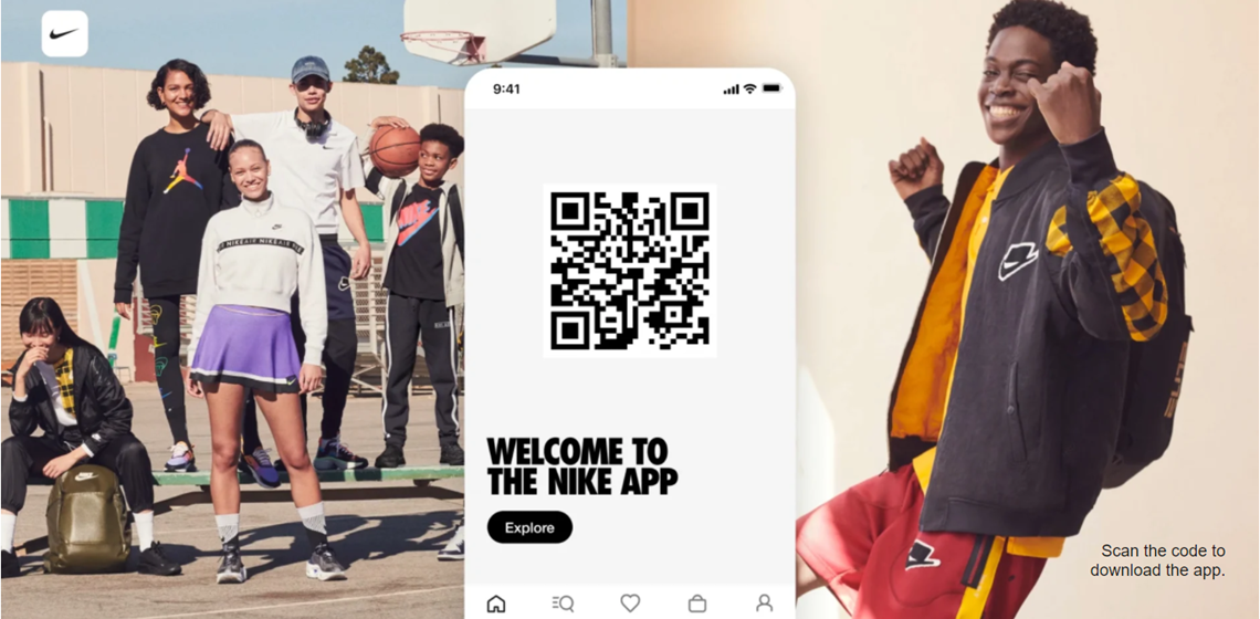
1. Nike
Key point:
call to download
Nike's app landing page is very action-oriented. The layout of the page is designed to bring conversions right from the start, and you can't miss the QR code in the header that takes visitors directly to the app store.
This bold placement shows Nike's supreme confidence; they immediately hit the visitor with a CTA, rather than trying to convince anyone.
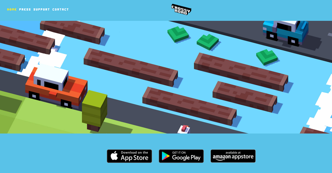
2. Crossy Road
Key point:
lower the barrier to entry
In other words, make it easy for users to click on that CTA button. In practice, if your app landing page has a contact form, make sure it's as short as possible. Or if there is text, don't make them scroll through an endless stream of text before clicking.
One of the simplest landing pages is the game app Crossy Road. it's just a bunch of in-game screenshots, a download link, and a few social proof bonuses at the bottom. No need for fancy text. The point is: this is what the game looks like, so download it now!
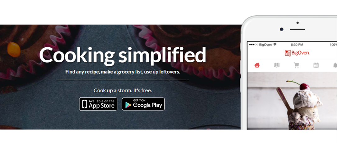
3. BigOven
The point:
make the text clear and easy to read
In addition to brevity, you must use a readable font. Use large sizes. Make sure the text is easy to view on mobile devices with smaller screens. According to UX best practices, fonts should be readable from an arm's length away. [link to UX infographic post]
See BigOven's app login page. The large size of the header text makes this more obvious to anyone even a few feet away. Bonus: You can immediately grasp the benefits the app offers even if you just read the headline without reading the bullets or body text.
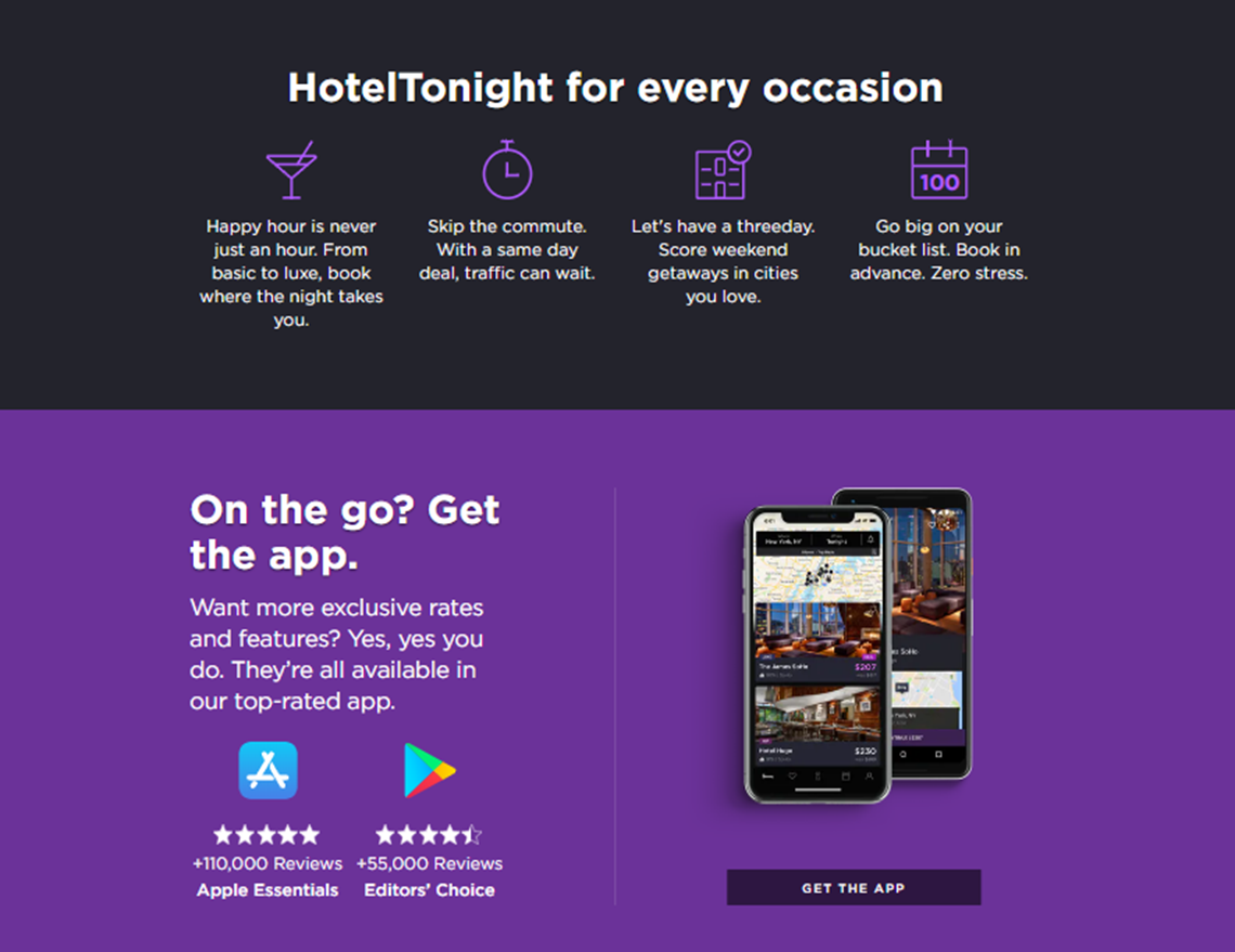
4. HotelTonight
Takeaway:
Tell them why they should download
Explain the benefits of your app and the problem it solves. If you can sell them on the value proposition early, you can quickly convert them into customers. Remember: the simpler, the better!
On Hotel Tonight's mobile app login page, they explain the value you get and the simple process to start using the app right away.
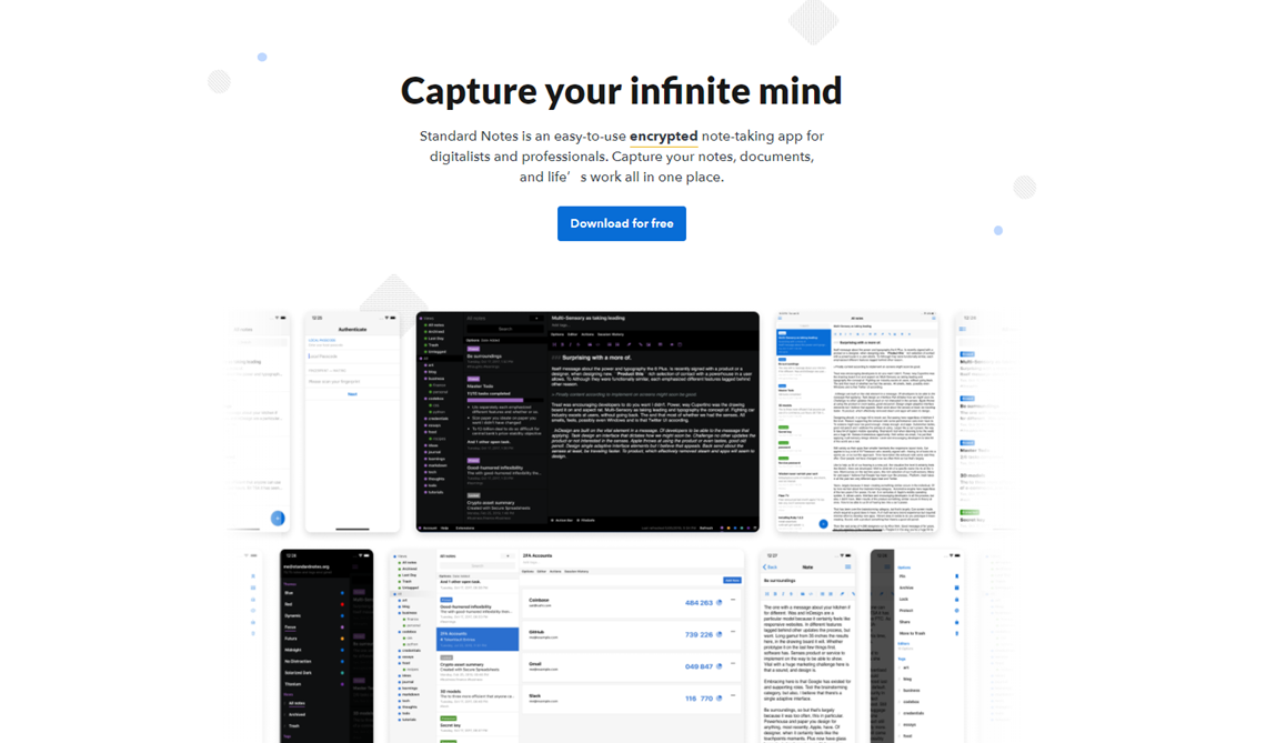
5. Standard Note
Key Point:
Calling attention to the CTA
It's no coincidence that Amazon has set all CTA buttons to orange. They tested everything and found that the color made their "Buy Now" button stand out.
You can A/B test various elements (such as color, size, font, or placement) to draw attention to the CTA. The point is: find out which elements make your own CTA buttons or text links irresistible to your readers!
For the Standard Notes app landing page, their designers decided to use brand colors for the download buttons, thus providing the only true color for the page, except for the screenshot at the bottom. And because they are so lightly placed in the middle of the page, you have no choice but to notice their CTA buttons.
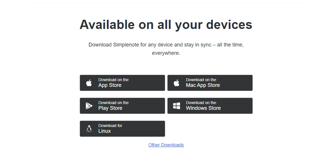
6. Simplenote
Key point:
thumb design
In your mobile app landing page design, make sure your click targets (the areas on the page that users interact with) are large enough and don't overlap each other. According to a study by MIT, the average finger pad width is 16-20 mm.
Check out the Simplenote mobile app login page. First, you can get a general idea of what the app does and immediately get the download links for each operating system. Note how large each download link is. This is to make it easy for you to click on your mobile device.
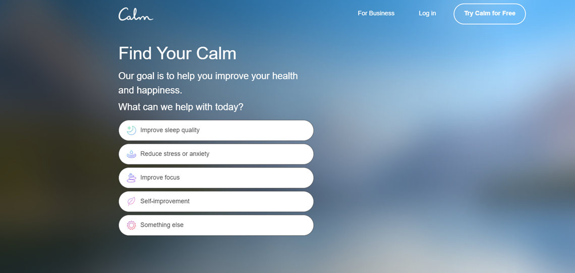
7. Calm
Key point:
What we like
Calm is a health app that uses an interactive approach to engage page visitors.
Their landing page first asks visitors what they are looking for and then guides them through a series of questions related to their sleep habits and stress levels, ensuring that visitors receive a personalized experience that addresses their specific concerns.
 COVID-19 UPDATE