An app subtitle is a piece of text to the right of the icon, below the app title in the Apple App Store. Finally, we see some differences in the categories!
Four types of subtitles are used: subtitles that define the app as a store, subtitles that highlight the benefits of the app, subtitles that target specific audiences, and subtitles that use random phrases/slogans. Of the 20 applications analyzed, 85% used definition or benefit-oriented captions.
Only one app, SHEIN-Fashion, uses viewer-oriented subtitles. This leads us to believe that audience-facing subtitles can be a great opportunity to differentiate your product from your competitors for such apps that cater to specific demographics!
* Shopping app subtitle tips: Try to stay away from profit-driven subtitle to differentiate yourself from the competition.
Shopping app video optimization
We found something interesting about video optimization for shopping apps: only 15% of the 20 shopping apps analyzed use video. They are Walmart, Nike and GOAT.
Our research shows that optimized videos can increase conversions by 20%. If you own a shopping app, consider creating a video that will not only allow you to improve your CVR, but differentiate your app from the competition.
Don't wait too long to see the "good stuff" since users only watch a video in the Apple App Store for 6-8 seconds. A poorly executed video can actually hurt your CVR, not boost it.
In fact, each of the three video-using apps in this analysis performed well with their video. Instead of wasting time on brand splash screens, none of them jumped right into the action.
Also, we noticed that while all three videos were in portrait mode, each took a different approach to messaging. For example, Walmart's video uses professional voiceovers and in-app footage to illustrate the benefits of its app.
If you turn on the sound, this will give Walmart videos a polished, professional feel. However, 98% of users watch App Store videos without sound. Since Walmart's videos rely on voiceovers to convey their message, this could affect their downloads.
Nike, on the other hand, prefers background music to voiceovers and focuses on the ease of use of its app. We noticed that the video focuses almost exclusively on women's products, which may indicate that more women than men use the Nike app.
* Shopping app video tip: Remember to start your video "quickly and clear". Don't waste time on your brand, users only spend 6-8 seconds on your videos.
GOAT uses background music instead of voiceover. But its videos focus on specific features like app exploration and AR. While this approach provides valuable information to the audience, it does not articulate why that information is important.
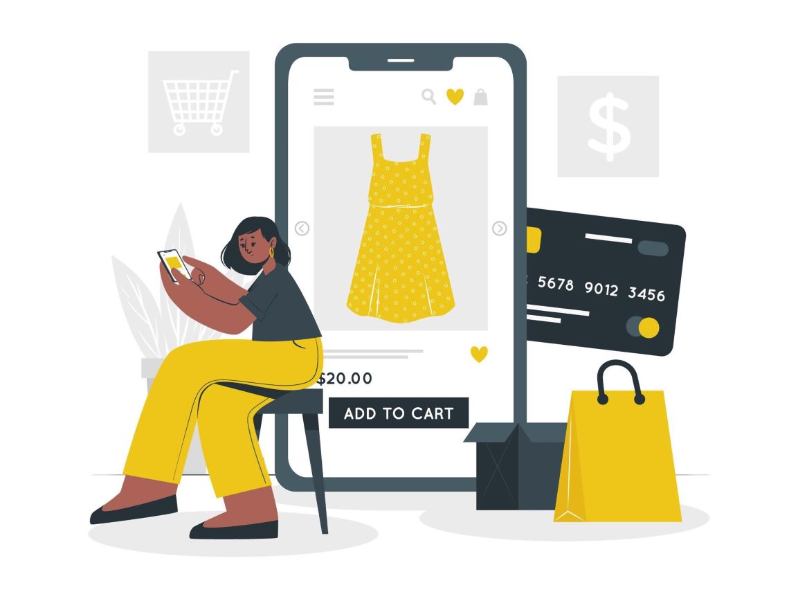
Shopping app screenshot optimization
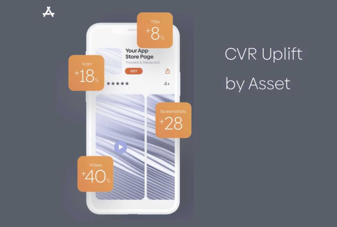
Did you know that optimized screenshots can increase conversions by 28%? Or untested screenshots cause downloads to drop by 15-25%? Obviously, the screenshots you choose for your app are critical to its success.
For screenshots of shopping apps, there are some strategies that work well:
● Choose portrait mode: 95% of the apps we analyzed use portrait-style screenshots.
● Say yes to subtitles: 95% of the apps we studied use subtitles to clarify benefits, demonstrate functionality, promote ease of use, and more.
● Benefits over features: Features are important, but only if their benefits are clear. That's why 80% of the shopping apps we analyzed used their first screenshot to communicate benefits.
● Number of screenshots: More than half of the applications we studied used eight or more screenshots. While it's true that few users will see the second and third screenshots in landscape orientation, it doesn't hurt to have more screenshots.
A few things stand out when it comes to screenshot types:
- Most developers in this category let their apps do the talking. The vast majority of images we analyzed depict the actual application flow. Lifestyle screenshots are rare.
-
Every app store creativity counts. However, it will rarely have as much of an impact on your conversion rate as your screenshots. This is because 60-80% of installs in the App Store come from search, where one to three images are immediately visible.
Add that to the fact that users are 10 times more likely to view screenshots than to read subtitles, and it's not hard to see why your app's imagery matters.
Summary: ASO Strategies for Shopping Apps
Many of the shopping apps we've covered in this article use a similar strategy for app store creatives. Because of this, we can easily deduce what works and what doesn't, and where you can differentiate your app from your competitors.
Key points need to be considered:
● Differentiate your app: Most shopping apps seem to follow a similar ASO strategy. By finding differentiating ideas, you can help your app stand out in a crowded market. Target your target audience in your captions, experiment with videos, and look for new screenshot ideas whenever possible.
● Remember the basics: You want to differentiate your application, but not at the expense of the basics of ASO. For example, App Store users can only watch videos of 6-8 seconds. Reloading your video and letting it end with a bang will make it unique, but your users will never see it because you ignore the basics.
● Know your audience: This is the foundation of all good marketing. If you don't know who your users are, you won't be able to optimize your App Store pages to increase conversions. Research the shopping app marketplace, then make sure your app's icons, videos, and screenshots speak directly to these people.
● Prioritize the benefits of your application: Of course, your application can do X, Y, and Z. But why should your users care? Use your app store creative to communicate benefits, not just features. You can do this with optimized captions, well-crafted videos, captioned screenshots, and more.
What works for one app doesn't necessarily work for yours. You need to test your app store creatives regularly to optimize them properly. Our research shows that leading apps test their creative assets 2-4 times before going live.
 COVID-19 UPDATE