It's no secret that mobile apps have a short shelf life. On average, users delete an app just 6 days after downloading it. With so much competition, users don't have the time (or space) to waste on apps they don't like or know they won't use. That's why the first user experience is such an important part of retaining users.
To engage users, developers should focus on the first time user experience. It's one of, if not the most critical part of any mobile app. This tutorial can help new users by convincing them that your app provides value, improves retention, and helps convert non-paying users into paying ones.
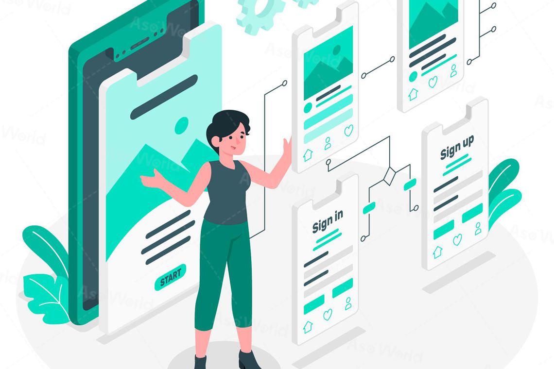
What is first-time user experience?
The first-time user experience, often referred to as FTUE, is the first impression of your app's users.
Once they download and open the app for the first time, what do your users see? Do you offer a quick tour of the app or prompt the user to create a profile? Everything from colors and images to call-to-action phrases and language affects the FTUE and ultimately whether your users stay.
The first user experience is a subset of UX and refers to the first few minutes of a new user's experience with your product. Those first few minutes are critical, as a good first impression will help increase engagement and retention. This is especially true for mobile apps, where if users are not satisfied, they can simply swipe your app straight into the trash within 60 seconds.
If your FTUE is too ambiguous or too complex, users will leave. Retaining users after the first week is all about asking users for what you need so you can successfully deliver what they want from your application.
Click "
Learn More" to drive your apps & games business with
ASO World
app promotion service now.
What does FTUE include?
Typically, the first user experience includes (but is not limited to):
● First impressions for new users
● Understanding of product functionality
● Level of user engagement needed/expected
Just try to find out the answer about the questions, you may easily get your FTUE optimization start.
First impressions for new users:
1. What do your users see once they download and open the app for the first time?
2. Do you offer a quick tour of the application or prompt the user to create a profile?
Understanding of product functionality:
1. Is everything clear and logical?
2. Is this easy to use?
3. Is the language in your product copy immediately understandable?
4. Is the onboarding process intuitive?
5. Can everyone use your product?
Level of user engagement needed/expected:
1. Do you offer self-service onboarding? Or, is there an in-product tour?
2. How long has it been going on?
Keep in mind that our latest benchmark report shows that one-step product tours have a 75% completion rate, while tours with five or more steps fail the 50% completion rate benchmark.
How does FTUE enhance your app user retention?
First, let's explain what user retention is. It is the percentage of users who use an app or product at least once a day for a specific period of time after installing it. Did you know that by increasing your retention rate by just 5%, you can achieve a profit increase of over 25%?
In order to keep the number of engaged users greater than the number of users who are inactive or exit the product altogether, you need to perform well in FTUE. Why? Because making the experience enjoyable can be the determining factor in retention rates.
In other words, don't make the product easy and practical. Make them different. Instead of helping your users get their work done, make them do it with a smile on their face.
If your product doesn't improve your users' lives in a meaningful way, they may consider leaving it to someone who can.
5 steps to optimize first-time user experience(FTUE)
1. Be clear about what you want them to do
Everyone downloads apps for a reason. Whether it's to listen to music, make a delivery, or pass the time, users want to achieve a specific goal when they download your app.
The most successful user guides help users achieve their goals by delivering value as quickly as possible. A common mistake apps make in the first user experience is to prematurely request personal details like email addresses or location access without giving them a reason why they need it. 82% of users say they want apps to provide a clear reason for requesting personal information.
Instead, consider that your users already know what personal information they need to provide to you.
If you're a food delivery app, they know they need to provide their address. If you're a travel app, they know they have to provide you with their target destination and estimated travel dates. Asking for this information ahead of time can help users see value almost immediately.
2. Personalization
If we've learned anything from social media apps like Facebook and Instagram, it's that users love to share opinions.
Asking for likes and dislikes is a way to engage new users while further personalizing their experience. Especially for streaming services and content management apps, letting users choose their preferences during the lead-in process allows them to choose what they want from your app.
You can learn more about your users, and they can learn more about the topics they care about. Everyone wins!
3. Show them what will happen
For some applications, the first user experience is to set expectations with a product tour. This familiarizes users with the look and feel of the app and helps them assess whether they will actively use it.
This strategy is recommended for applications with strong UX design and product experiences with complex themes, such as banking. Users can feel overwhelmed if you put them in a banking application with complex terminology and a complicated UI.
4. Encourage and reward activities
The best first user experiences often encourage users by rewarding them when they complete an action.
According to the goal gradient effect, the closer people get to their goals, the more intrinsically motivated they become. For example, people are more likely to contribute to a charitable activity if it is close to achieving a goal.
Profile milestones, checklists and progress bars are great ways to visualize progress and motivate users to keep going.
5. Understand what makes them stay ...... Get rid of the things they don't like
Users want to be told what to do when they open your application. If they are asked to do too many things, they get lost and leave.
Tracking engagement can help you discover which actions cause users to abandon during the onboarding experience. Are you asking for too much information too soon? Are users adding items to their cart but not purchasing?
A great way to visualize a conversion channel where users are being shed. Once you define the specific stages you want to see in your funnel, the conversion funnel will show you how users are progressing through those actions.
Learn what makes it easy for your users to move through the channel by understanding which actions are important. If they don't use it, throw it away.
Case study: games with a good first-time user experience
Let's take a look at June's journey that did well in terms of player onboarding.
The first user experience in June's Journey
This game from Wooga is the market leader in hidden object games. Games in this sub-genre don't usually get high retention rates on day one. For this reason, they need to put a lot of effort into the first player experience. Here's how they did it.
Pre-game
When players first launch June's Journey, they experience a not-too-long screen load time.
During this time, players get to see the game's main character and get short tips on how to play the game. This is a common practice used in many mobile games.
With it, you can let the player know what your game is about. On top of that, you make loading screens more interesting. Of course, many players won't read these hints, but for those who do, it's definitely better than the word "loading".
Next, players can choose between two options - play as a guest or log in with their social media accounts. They are not forced to do anything, which is a good choice. After clicking the play button, the game begins.
Story
One of the main attributes of this hidden object game is its storyline.
For this reason, the developers of Journey to June immediately tried to engage players with an immersive story.
It comes in the form of transitions and animations and brings the story of a family from a hundred years ago. It's not just a story - it's a murder story. In it, players meet the protagonist Joan and find out why they need to play the game - to solve the murder mystery.
This narrative is designed to keep players emotionally invested while also giving meaning to their actions.
Later, the story will continue during the player's session to help keep them engaged.
Tutorial and gameplay
After engaging with the story, it's time to engage the player in the heart of the game - solving the hidden object scenario.
Understanding the mechanics of this game is really simple, and at Wooga, they realize that. For this reason, the game explains to the player the minimum to get them started.
Players don't know much about the game's features either. The whole experience is logical and intuitive.
However, the game does introduce players to the in-game market. This is a subtle introduction to the game's economy.
To get players up to speed, the game rewards them with a large amount of currency and they don't feel like they are missing anything.
Overall, the first session of this game is a very positive experience for the player. They can try out the game's currency and have fun with it. At the same time, the game is challenging enough to keep things interesting.
 COVID-19 UPDATE