COVID-19 UPDATE

중요 공지:파트타임 채용이나 ASO 수익 앱 활동을 위해 ASOWorld의 이름을 사용하는 사기에 주의하세요. ASOWorld는 파트타임 직원을 채용하지 않습니다. ASOWorld가 게시한 공식 정보만 신뢰하세요.

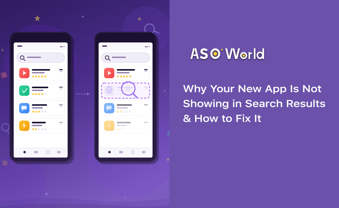
앱스토어를 마지막으로 둘러보았던 때를 떠올려 보세요. 각 검색 결과를 살펴보는 데 얼마나 많은 시간을 쓰셨나요? 연구에 따르면 사용자가 앱 목록을 훑어보고 결정을 내리기까지 걸리는 시간은 **3초 미만**입니다. 그 짧은 순간에 앱 아이콘이 모든 핵심적인 역할을 수행합니다.
앱 아이콘은 단순히 예쁜 그림이 아닙니다. 아이콘은 일종의 **전환(Conversion) 머신**입니다. 검색 결과, 인기 차트, 에디터 추천 등에서 사용자가 가장 먼저 마주하는 시각적 요소입니다. 설명글을 단 한 단어도 읽기 전에 앱의 목적, 품질, 브랜드 아이덴티티를 전달합니다.
| +100% 아이콘 리디자인 후 설치 증가율 (Azur Games) |
90% 색상만으로 이루어지는 순간적인 판단 비율 |
+62% 아이콘 단순화 후 전환율 상승 |
3초 사용자가 각 앱 목록을 훑어보는 평균 시간 |
데이터는 명확합니다. **아이콘 최적화는 앱스토어 최적화(ASO) 활동 중에서 가장 높은 수익률(ROI)을 제공합니다**. 잘 설계된 아이콘 리디자인은 코드 한 줄 바꾸지 않고도, 사용자 확보(UA)에 마케팅 비용을 추가로 쓰지 않고도 설치 수를 두 배로 늘릴 수 있습니다.
실제 사례 연구: 한 생산성 앱은 복잡한 '할 일 목록(To-do)' 일러스트였던 아이콘을 파란색에서 보라색으로 이어지는 그라디언트가 적용된 단순한 체크 표시 하나로 바꿨습니다. 그 결과, 전환율이 4.2%에서 6.8%로 치솟았습니다. 이는 62% 증가한 수치이며, 월간 약 35,000건의 추가 설치로 이어졌습니다.
독특한 실루엣을 가진 아이콘은 인식률이 34% 더 높으며, 앱의 기능을 명확히 전달하는 아이콘은 추상적인 디자인에 비해 클릭률(CTR)이 49% 더 높습니다. 즉, 전략적인 아이콘 디자인은 선택 사항이 아니며, 효과적인 앱 마케팅 전략을 위한 필수 요소입니다.
💡 현재 귀하의 아이콘이 경쟁사와 비교해 어떤 수준인지 알고 싶으신가요?
→ [ASOWorld에서 무료 ASO 감사(Audit) 실행하기]
몇 분 만에 키워드 순위, 전환 벤치마크 및 경쟁사 아이콘 분석 데이터를 얻어보세요.
위대한 앱 아이콘들은 일련의 기본적인 디자인 원칙을 공유합니다. 피트니스 앱이든 모바일 게임이든, 다음의 5가지 핵심 기둥이 다운로드를 유도하는 성공적인 아이콘을 만들 수 있도록 안내할 것입니다.
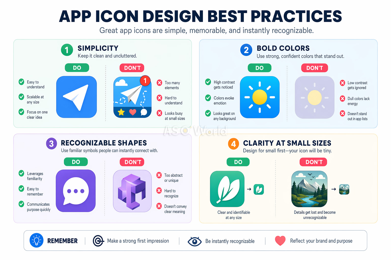
당신의 아이콘은 아주 작은 29×29px의 알림 배지부터 1024×1024px의 앱스토어 목록에 이르기까지 모든 크기에서 선명하게 식별될 수 있어야 합니다. 이는 개발자들이 가장 흔히 간과하는 부분입니다. 디자인 캔버스에서는 매력적으로 보이던 아이콘이 실제 스마트폰 화면에서는 알아볼 수 없는 뭉개진 이미지로 변할 수 있습니다.
가장 성공적인 앱 아이콘은 초점으로 단 하나의 명확하고 굵직한 심볼을 사용합니다. Instagram의 카메라 모양 글리프나 Spotify의 곡선 세 줄을 떠올려 보세요. 지나치게 복잡한 아이콘을 단순화할 경우 A/B 테스트에서 전환율이 최대 27%까지 향상되는 것으로 나타났습니다.
이것은 인지 부하 이론(Cognitive load theory)으로 설명할 수 있습니다. 복잡한 디자인은 훑어보는 사용자에게 '결정 피로감(decision fatigue)'을 유발합니다. 수십 개의 검색 결과를 확인할 때 눈길을 끄는 것은 결국 가장 단순하고 스캔하기 쉬운 아이콘입니다.
아이콘은 앱스토어 검색 결과와 앱이 빽빽하게 찬 홈 화면 모두에서 즉시 식별할 수 있어야 합니다. 즉, 독특한 도형, 남다른 색상 조합, 그리고 앱의 기능을 직관적으로 암시하는 시각적 은유(메타포)를 채택해야 합니다.
경쟁사의 아이콘을 철저히 조사하고, 의도적으로 차별화를 시도하세요. 카테고리 내의 모든 '할 일(To-do)' 앱이 파란색 체크 표시를 사용하고 있다면, 그것이 바로 당신이 다른 시도를 해야 할 완벽한 타이밍입니다.
아이콘은 앱 내부 인터페이스와 자연스럽게 연결된 연장선처럼 느껴져야 합니다. 브랜드 색상 팔레트, 디자인 언어, 시각적 스타일이 하나로 조화를 이루어야 합니다. 이러한 일관성은 제품에 대한 만족도를 높이고, 사용자 유지율(Retention)을 끌어올리며, 브랜드 상기도를 상승시킵니다.
앱 아이콘에 글자를 넣는 것은 대부분의 경우 최악의 선택입니다. 작은 크기에서는 읽거나 알아보기 힘들고, 다국어 현지화(Localization) 작업도 어려워지며, 시각적 복잡성만 배가시킵니다. 닐슨 노먼 그룹(Nielsen Norman Group) 연구에 따르면 텍스트가 포함된 아이콘은 참여도가 26% 낮습니다. 어차피 모든 앱스토어 목록에서 아이콘 바로 아래에 앱 이름이 노출되므로, 아이콘 안에 이름을 욱여넣을 필요가 전혀 없습니다.
프로 팁: 텍스트가 허용되는 유일한 예외는 페이스북(Facebook)의 "f"처럼 텍스트 그 자체가 브랜드의 심볼일 때뿐입니다. 이 경우에도 한 글자 또는 모노그램 형태로 극도로 제한해야 합니다.
색상은 아이콘 디자인 툴킷에서 가장 강력한 무기입니다. 캐나다 위니펙 대학교의 연구 결과에 따르면 사람들은 제품에 대한 순간적인 판단의 최대 90%를 오직 색상에 의존하여 내립니다. 결론적으로 아이콘의 색상 선택이 전환율의 성패를 좌우하게 됩니다.
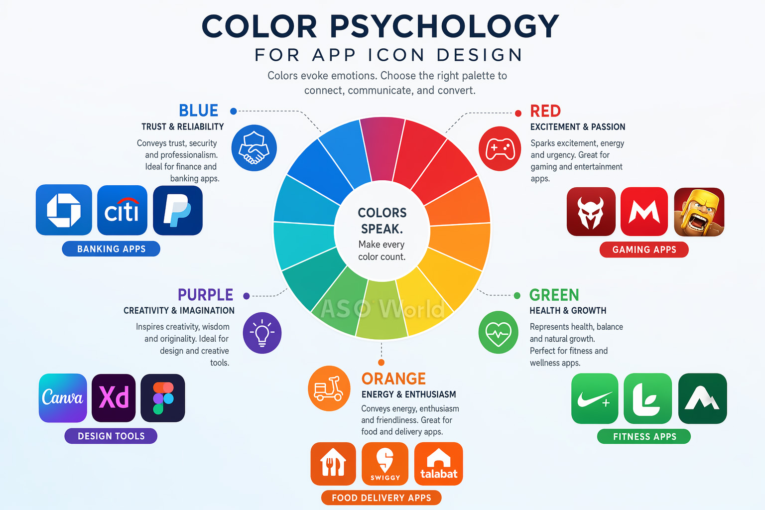
대다수의 개발자들이 놓치고 있는 핵심 전략이 있습니다. 해당 카테고리의 일반적인 색상 패턴을 연구하고 의도적으로 이를 깨뜨리세요. 피트니스 앱의 72%가 파란색이나 초록색을 사용할 때, 주황색-빨간색 톤의 그라디언트를 적용하면 가시성을 폭발적으로 높일 수 있습니다.
사례 연구: 한 피트니스 앱은 카테고리 내부의 공식을 깨고 아이콘을 기존 파란색에서 주황색-빨간색 베이스로 전면 교체했습니다. 결과적으로 탭 전환률(Tap-through rate)은 31% 상승했고, 카테고리 둘러보기를 통한 발견율은 24% 향상되었습니다. 파란색-초록색 바다처럼 보이던 경쟁자들 사이에서 단지 튀는 것만으로 엄청난 추가 설치를 확보했습니다.
이러한 "카테고리 역행(category zigging)" 전략은 ASO 최적화에서 가장 활용도가 낮은 꿀팁입니다. 단순히 아이콘뿐만 아니라 앱스토어 전체 등록 페이지에서 어떻게 경쟁 우위 차별화를 구축할 수 있는지 궁금하다면 다음 가이드를 확인하세요: 실질적인 성과를 이끌어내는 경쟁사 ASO 분석 실행 방법.
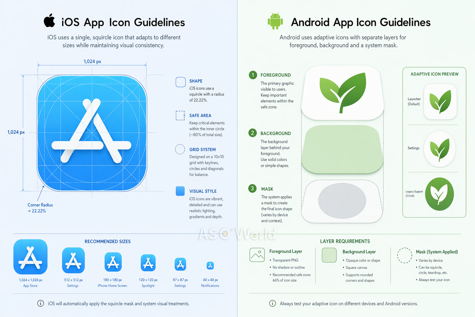
훌륭한 디자인을 결정짓는 핵심 원칙은 보편적이지만, 애플(iOS)과 구글 플레이(Android) 환경은 요구하는 아이콘 기술 사양이 전혀 다릅니다. 이 점을 실수하면 스토어 등록 거부(리젝), 시각적 결함 발생, 전반적인 UX 저하로 이어질 수 있습니다.
최근 iOS 앱 제품 페이지 전략은 아이콘 스펙을 훌쩍 능가하는 수준에 도달했습니다. 애플의 검색 알고리즘은 앱 내 이벤트(In-app events), 프로모션 텍스트, 현지화 에셋 등 목록의 완전성과 크리에이티브의 다양성에 지속적인 가산점을 부여하고 있습니다. 자세한 동향은 전략 가이드를 통해 확인하세요: 2026년 앱 랭킹 요인: iOS 앱스토어 알고리즘 업데이트 분석.
| 특징 요소 | iOS | Android |
|---|---|---|
| 기본 형태 (Shape) | 스쿼클 (시스템 강제 적용) | 기기 UI별 자동 적응형 다변화 |
| 제출 기본 사이즈 | 1024×1024px | 108×108dp / 512×512px (스토어) |
| 레이어 구조 | 배경 + 전경 (리퀴드 글래스 지원) | 배경 + 전경 (어댑티브 모드) |
| 안전 영역 (Safe zone) | 중심 위치 및 균형 권장 | 아이콘 내부 66% 한정 |
| 다크 모드 정책 | iOS 18+ 필수 파생 모드 지원 요망 | 별도로 강제하지 않음 |
크로스 플랫폼 개발 스튜디오 팁: 최초 콘셉트는 하나로 가되, 최적화 렌더링은 에셋별로 각각 다르게 제작하십시오. iOS에서는 애플 특유의 3D 렌더링을 강조하고 안드로이드에선 어댑티브 레이어를 적극 활용한 게임 앱의 경우 iOS의 우수한 퍼포먼스를 그대로 둔 채 안드로이드 전환율만 38% 상승하는 쾌거를 이루었습니다.
각 플랫폼별로 사고하고 기획하는 마인드가 곧 성숙한 ASO의 지표입니다. 리소스를 양 플랫폼에 분배시키는 요령에 대한 더 깊은 통찰은 크로스 플랫폼 ASO 최적화 전략 가이드에서 확인하실 수 있습니다.
완벽한 아이콘을 디자인하는 것은 여정의 절반에 불과합니다. 남은 과제는 체계적 A/B 테스트를 통해 그 디자인이 진짜로 사용자들의 터치를 유도한다는 걸 데이터로 증명하는 것입니다. 팀 내에서 만장일치로 '가장 예쁜 아이콘'이 실제 사용자들의 다운로드를 이끌어내는 최고의 아이콘과 일치하지 않는 경우는 너무나도 흔합니다.
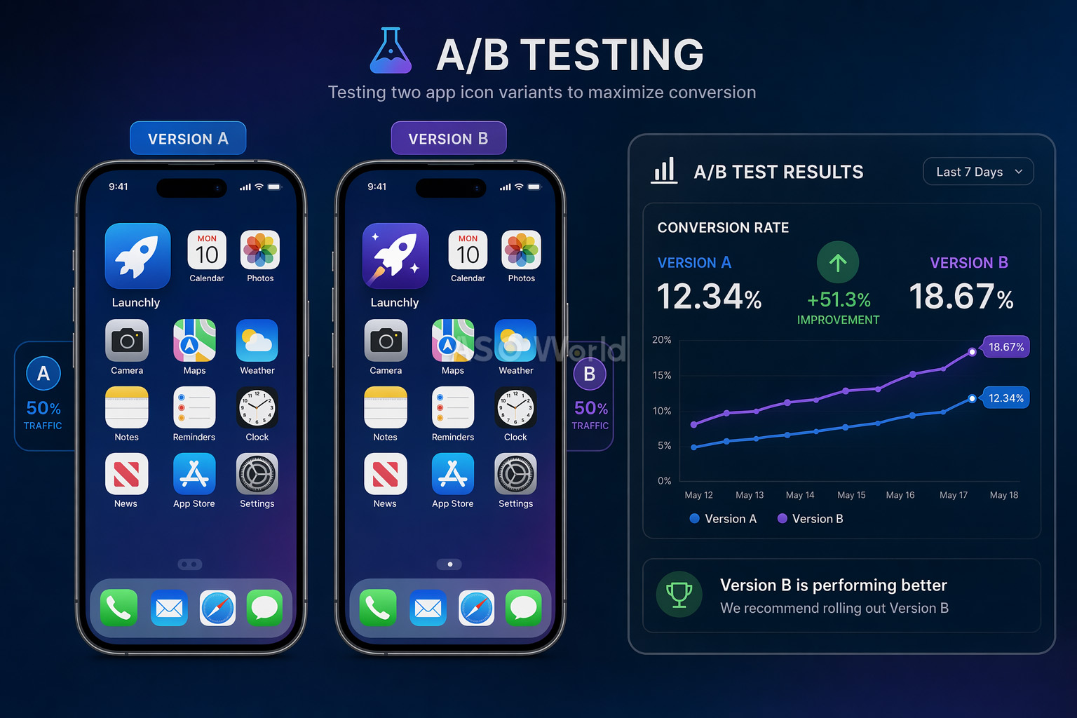
1. Google Play 스토어 등록정보 실험 (무료 지원)
구글이 제공하는 자체 도구로 원본 아이콘 1개와 최대 5개의 대체 변형(Variant)을 결제 없이 테스트해 볼 수 있습니다. 앱 업데이트 없이 오가닉/유료 트래픽 전체를 아우릅니다. 단점은 아직 트래픽이 낮은 앱의 경우 신뢰할 수 있는 구간(Confidence interval)에 도달하기 어렵다는 것입니다.
2. 애플 PPO (Product Page Optimization) (무료 지원)
iOS에서도 원본 대비 최대 3종의 추가 디자인을 올려 트래픽을 나눠 테스트할 수 있습니다. 최대 시한은 90일입니다. 구글과의 결정적 차이점은 변형 아이콘이 앱 바이너리에 이미 컴파일되어 포함된(업데이트 버전) 상태에서만 진행이 가능하다는 점입니다.
3. 고급 서드파티 플랫폼 (GeekLab / SplitMetrics / StoreMaven 등)
앱스토어와 완벽하게 동일하게 생긴 "가짜 웹페이지"를 만들어 페이스북/구글 광고를 통해 실험용 트래픽을 쏟아붓습니다. 개발 전인 앱의 잠재성 분석이나 전면적인 디자인 개편 전에 리스크를 방지하기 위해 탁월한 방식입니다.
| +8% Peak Brain Training 아이콘 테스트로 인한 전환율 증대 수치 |
+3% Simply Piano 아이콘 컬러 변경으로 누적된 이익 상승분 |
최소 7일 신뢰도를 갖춘 데이터를 산출하기 위한 필수 테스트 기간 |
가장 흔히 빠지는 함정: 출시 후 1~2일 만에 특정 아이콘이 압도적으로 이기는 듯 보인다고 테스트를 허둥지둥 종료하고 확정 짓지 마세요. 주중 고객과 주말 고객은 완전히 다른 클릭 패턴을 보여주는 경우가 매우 허다합니다.
수천 개 이상의 앱스토어 프로필을 컨설팅하면서 찾아낸, 다운로드 전환율을 야금야금 갉아먹는 치명적 실수 10가지를 정리했습니다.
가장 빠른 처방전: 시안을 폰에서 쓰이는 실제 29px 크기로 종이에 출력한 후 배경화면 앱들 틈에 임시로 붙이세요. 세 발자국 뒤로 물러나 보았을 때 본인 앱의 아이덴티티가 1초 만에 캐치되지 않는다면, 즉각 디자인을 훨씬 과감하게 단순화하십시오.
돈을 퍼부어 최정상급 에이전시를 쓰라는 뜻이 아닙니다. 지금 우리 손안엔 강력한 접근성을 겸비한 막강한 도구들이 즐비합니다.
자사에 도입할 크리에이티브 도구를 결정하는 건 단순히 기능 리스트를 비교하는 자리가 아니라 향후 팀의 생산 스피드를 가늠하는 자리입니다. 도구 탐색 전에, 앞서 나가는 경쟁사들의 확장 가능하고 성숙한 ASO 워크플로우 통찰 가이드를 가볍게 훑으며 우리 팀의 빈틈이 무엇인지 정확히 진단해 보세요.
| 도구명 | 핵심 포지션 및 장점 | 비용 정책 |
|---|---|---|
| Figma | 탁월한 실시간 협업, 화면 프로토타이핑 검증 | 무료 이용(플랜별 상이) |
| Adobe Illustrator | 업계 표준. 극도로 디테일한 퀄리티의 마스터 벡터 산출 | 구독 과금 |
| Sketch | 아이콘 장인을 위한 가벼움, 앱 스토어 전용 템플릿 플러그인 군단 보유 | 월정액 (약 $10/월) |
| Apple Icon Composer | 애플의 신규 리퀴드 글래스 이펙트를 쉽게 구축(25년 업뎃) | 무료 (개발자 Xcode 연동) |
| Canva | 마케터나 기획자가 빠르게 A/B 목업 시안을 찍어낼 때 극강의 효능 | 무료 지원 모델 |
우리 아이콘이 카테고리 내에서 키워드 순위나 성과, 경쟁사 대비 얼마나 활약 중인지 모니터링하고 정밀하게 분해하십시오. ASOWorld가 제공하는 무료 ASO 분석 툴 모음은 데이터 기반의 똑똑한 액션을 안내하는 필수 파트너가 되어줄 것입니다.
당신의 앱 아이콘은 마케팅 세계관에서 가장 과로하는 불쌍하고도 고마운 존재입니다. 검색 결과 리스트업, 인기 상단 차트, 사용자의 폰 홈 화면, 하루 수십 번 울려대는 알림창까지. 단 한 명의 유저가 하루에만 이 아이콘에 반응하는 순간은 헤아리기 조차 힘듭니다. 이 첫 단추를 제대로 꿰어내는 일은 당신 회사의 앱 스케일업(Scale-up) 여정 중 가장 거대한 파도를 가져다줄 핵심 열쇠입니다.
저작물을 마켓에 업로드하기 전 단 한 번 진행해야 할 파이널 체크리스트입니다.
이 영구 불변의 사실 하나만 기억해 주세요. 위대한 앱 아이콘은 당신의 팀원들과 디자이너가 가장 예쁘다고 극찬한 이미지가 아니라, 가장 많은 클릭과 방문 빈도(Conversion)를 창출해 낸 이미지라는 사실을요. 데이터가 입증할 방향을 믿고, 전략을 기획하며 쉴 새 없이 최적화하고 진화하십시오.
Get a good start for your app optimization with practical ASO guideline!
Want to get the latest Guides & Insights from ASOWorld?
관련 마케팅 가이드라인