COVID-19 UPDATE

중요 공지:파트타임 채용이나 ASO 수익 앱 활동을 위해 ASOWorld의 이름을 사용하는 사기에 주의하세요. ASOWorld는 파트타임 직원을 채용하지 않습니다. ASOWorld가 게시한 공식 정보만 신뢰하세요.

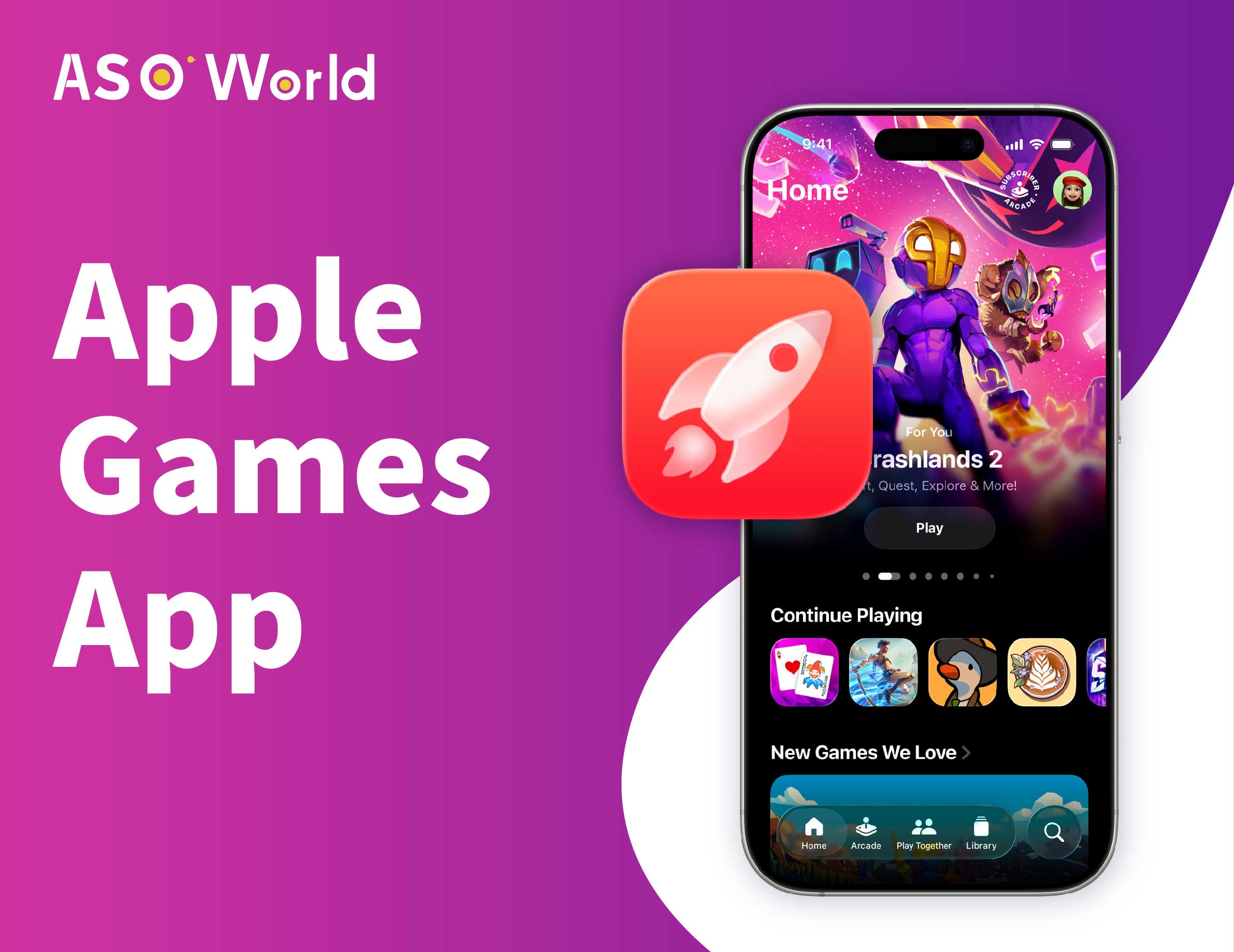
Apple의 공식 디자인 킷을 사용하여 Liquid Glass 디자인 언어에 맞춘 iOS 26 앱 아이콘을 최적화하는 방법 배우기.


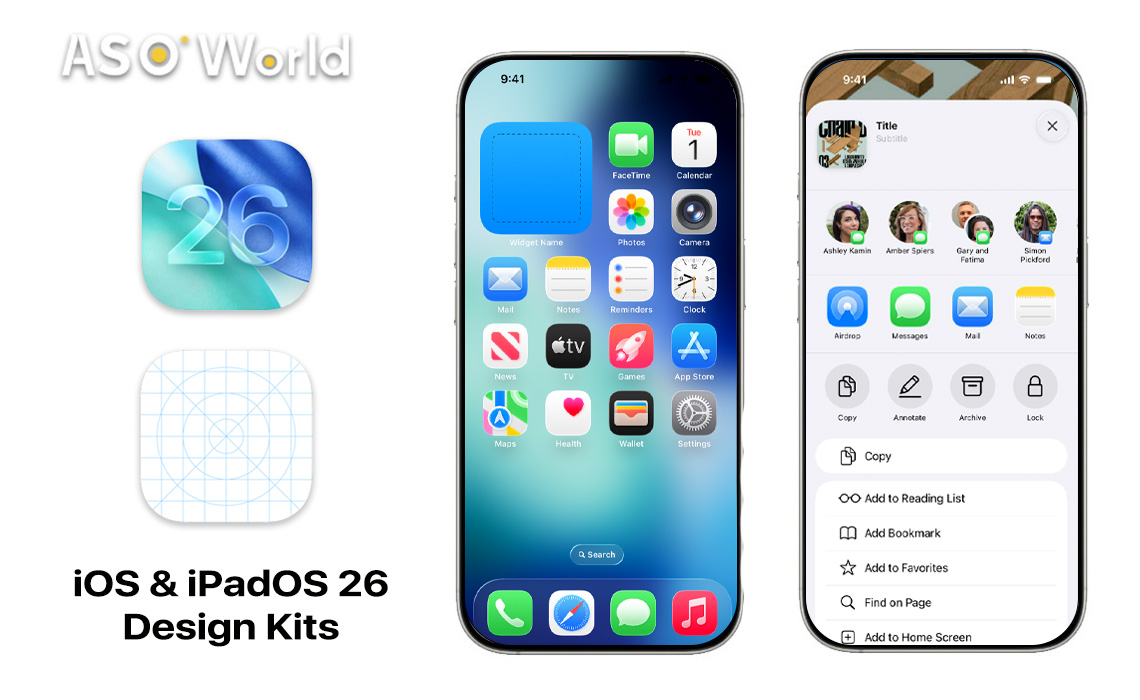
iOS 26이 도래함으로 Apple은 디자인 진화의 혁명적인 새 챕터를 공개했습니다: 액체 유리 디자인 언어. 이 혁신적인 미학은 iPhone과 iPad 인터페이스에 반투명하고 빛나는 품질을 불어넣어 현대적인 단순함을 촉진하며 촉감적이고 물성적인 깊이를 결합합니다.
이 변화를 수용하기 위해 디자이너와 개발자들을 지원하기 위해 Apple은 iOS 26 및 iPadOS 26에 맞게 특별히 제작된 Figma 및 Sketch용 공식 UI 디자인 키트를 출시했습니다. 이 리소스들은 창조자들이 우아하고 빛나는 액체 유리 스타일과 조화롭게 어우러지는 앱 아이콘 및 인터페이스를 제작하는 데 필요한 모든 것을 제공합니다.
iOS 26의 출시로 Apple의 디자인 방식은 대담한 변화를 띄우게 되었습니다. 액체 유리 언어는 평면 디자인의 명확성과 물성적인 깊이 감을 결합하여 직관적이면서도 현대적인 인터페이스를 전달합니다. 반투명 요소, 섬세한 빛나는 효과 및 신중히 선택된 색감 강조는 이 디자인을 정의하며 사용자들에게 더 강한 시각적 계층 구조를 제공합니다.
앱 아이콘은 이제 더 많은 유연성을 지니며 빛, 어두운, 음영, 그리고 "완전 투명" 모드와 같은 사용자 지정 옵션을 제공합니다. 이 응집된 디자인 접근 방식은 시스템 기능과 타사 앱 모두에 걸쳐 경험을 향상시켜 시각적 우아함에 새로운 기준을 제시합니다.
👉 iOS 26 액체 유리: 시각적 매력과 사용자 경험을 향상시키기 위한 앱 아이콘 최적화 방법
Apple의 공식 UI 디자인 키트인 Figma와 Sketch는 iOS 26의 비전을 현실로 만드는 데 중요한 도구입니다.
Figma 키트는 2025년 7월 17일에 업데이트되었고, Sketch 키트는 2025년 6월 9일에 새롭게 제공되었으며 둘 다 118.3MB의 리소스를 포함하고 있습니다. 디자이너들은 여기에서 모든 표준 컨트롤과 뷰를 위한 구성 요소뿐만 아니라 디자인 템플릿, 텍스트 및 색상 스타일, 자료 및 레이아웃 가이드를 찾을 수 있습니다.
이러한 키트는 프로토타이핑 및 디자인 과정을 간소화하며 모든 작품이 Apple의 최신 디자인 원칙과 완벽하게 호환되도록 보장합니다.
iOS 26를 위한 앱 아이콘을 제작하는 것은 액체 유리 미학을 완전히 수용하기 위해 Apple의 업데이트된 가이드라인 및 도구와 협업해야 합니다. 여기서 중요한 자원은 Icon Composer입니다. 이 도구는 light, dark, tinted, fully transparent 모드와 호환되는 아이콘을 간단하게 만들도록 Apple이 새로 도입한 도구입니다. 투명성을 고려하여 디자인할 때는 아이콘을 명확하고 인식하기 쉽게 유지하는 것이 중요합니다. 굵은 모양이나 깨끗한 선을 활용하여 이를 달성할 수 있습니다.
아이콘의 표준 크기는 PNG 또는 JPEG 형식의 1024x1024 픽셀이지만 Spotlight 검색을 위해 120x120 픽셀과 같은 작은 변형도 필요합니다. 모든 디스플레이 모드에서 테스트하는 것은 여러 설정에서 아이콘이 빛이나 투명한 유리 효과까지 빛을 발할 수 있도록 보장합니다.
ASOWorld 첫 구매 할인
첫 주문 시 50% 할인받고 앱 성장을 시작하세요!
iOS 26의 등장과 디자인 키트는 모바일 창조성을 위한 전환점을 알리는 바입니다. 액체 유리 미학은 운영 체제의 외관만 높이는 것이 아니라 디자이너들이 형태와 기능을 어떻게 조화시킬지 다시 생각하게 합니다. 이러한 공식 자원을 제공함으로써 Apple은 개발자 커뮤니티에게 실용적이면서도 멋진 앱을 구축할 수 있는 권한을 부여하며 사용자들에게 원활하고 기쁜 경험을 전달합니다. 이 디자인 변화가 앱 개발과 상호 작용에 미치는 장기적인 영향은 펼쳐짐에 따라 주목할 가치가 있습니다.
Get FREE Optimization Consultation
Let's Grow Your App & Get Massive Traffic!
All content, layout and frame code of all ASOWorld blog sections belong to the original content and technical team, all reproduction and references need to indicate the source and link in the obvious position, otherwise legal responsibility will be pursued.