COVID-19 UPDATE

중요 공지:파트타임 채용이나 ASO 수익 앱 활동을 위해 ASOWorld의 이름을 사용하는 사기에 주의하세요. ASOWorld는 파트타임 직원을 채용하지 않습니다. ASOWorld가 게시한 공식 정보만 신뢰하세요.

After your app has been created and received ad placements, this article provides 6 tried-and-true suggestions for increasing downloads by adding features to the app icon.


Many people will ignore the optimization of the app icon in the app promotion process. However, when we think of our favorite mobile app, what comes to mind? The app icon, according to many people.
"Your app's first impression - make it unforgettable with a powerful icon." Let's imagine, when our app ranks at the top of the app store, after our series of efforts, how can visitors discover your app and love it at a glance among many excellent apps.
Key Insights:
Even though an app icon is small and simple, its power should not be underestimated. It's the first thing most people see when they search for apps in the app store. Based on a combination of lines, symbols, and colors on a graphic smaller than a postage stamp, they decide whether they want to learn more or download your app in a split second.
So, how do you get the most bang for your buck in such a small space? How to design a powful App Icons for your app to grab customers' attention.
Let's get to know the app icons step by step.
As we all known, app icon design is crucial to app store optimization (ASO) and app growth.
 Click "ASO World" to drive your apps & games business with the ASO World app promotion service now.
The app icon is the first thing that potential users see when they search for apps on the app store. A well-designed app icon can create a positive first impression and increase the likelihood that a user will click through to learn more about the app.
A visually appealing and professional-looking app icon can help to convey the quality of the app and make it stand out in a crowded app store. This can encourage users to download and use the app, leading to increased growth.
The app icon is an important element of branding and can help to create a strong brand identity for the app. A consistent app icon design across different app store listings can help users to recognize and remember the app, which can contribute to increased downloads and user engagement.
The app icon is often the first thing that users see when browsing the app store, and can influence their decision to download the app. A well-designed app icon can encourage users to click through and read more about the app, ultimately resulting in more downloads.
Once the app is downloaded, the app icon can continue to play a role in user engagement. A memorable and easily recognizable app icon can make it easier for users to find and open the app, leading to increased usage and engagement.
A well-designed app icon can also help with user retention. When users have a positive experience with an app, they are more likely to return and use the app again. A memorable app icon can help users to find the app more easily and remember it over time.
Finally, the app icon can impact app store optimization(ASO) by improving the click-through rate (CTR) of an app. When an app has a high CTR, it signals to the app store algorithms that the app is relevant and popular, which can boost its rankings and increase visibility in the app store.
In summary, app icon design is an important element of ASO and app growth. A well-designed app icon can create a positive first impression, convey the quality of the app, strengthen brand identity, improve user retention, and boost app store rankings.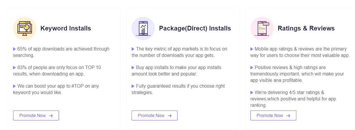
* Grow with our app growth solutions - choose a Guaranteed Keyword Ranking Service for TOP 5 app ranking acquirement, and maximize your app traffic. Or click the "Promote Now" above (to Buy App Installs ).
Designing a powerful app icon is crucial to grabbing customers' attention and encouraging them to download and use your app. Here are some tips on how to create a great app icon:
A good app icon should be simple and easy to recognize. Avoid clutter and excessive detail that can make the icon look busy and hard to identify.
Choose colors that are attractive and that complement your app's theme. Use bold and bright colors to make your icon stand out.
Your app icon should be unique and easily distinguishable from others. Avoid using generic shapes or elements that might be confused with other icons.
Your app icon should be designed with your target audience in mind. Think about the age group, gender, and interests of your potential customers, and create an icon that will appeal to them.
Test your design with a sample of potential users to see if it stands out and if it accurately reflects your app's purpose. Make adjustments as needed.
Update your app icon periodically to keep it fresh and relevant. Your app icon should be consistent with your app's overall branding, including colors, fonts, and messaging. Consistency will help your app stand out and be more memorable to users.
It is critical to understand the specifications. But everyone is working with the same square - how do you create an app icon that represents your brand and stands out in a crowded marketplace? Following are some tried-and-true best practices to consider:
Your app icon must stand out among the millions of apps available in the app store, particularly among competitors in relevant search results. Aside from driving downloads, it should make it easier for users to find your app on their home screens, increasing the likelihood that they will open and use it frequently.
Examine your competitors' app icons to see what features they all have in common. Consider their graphic elements, color palettes, and symbols to learn how they elicit emotional responses from their audience. Your app icon should be distinct, but share some characteristics with others in the same category, so that users can associate your app with specific functionalities.
You must strike a balance: your app icon should not be overly simple and bland, but it should also not be so complex that it drowns out the key message. But how do you achieve simplicity without losing recognition or becoming monotonous? The key is to eliminate distracting elements in order to make the main design component stand out even more.
When done correctly, simplicity can help you gain instant recognition. Consider major brands (such as Target, Spotify, and YouTube) and their app icons, which use only a few bright colors and simple shapes. A simple design also scales well, so it remains legible and consistent across all platforms and devices.
Remove any background patterns and only use gradients sparingly. Text or images crammed into a tiny app icon can make the graphic look busy at best and illegible at worst. Experiment instead with symbols that have universal meaning and are instantly recognizable, such as Instagram's camera icon.
Every operating system (OS) has its own set of design principles that govern all user interactions. On Android phones, an app icon that looks great on iOS may stand out like a sore thumb. Such visual inconsistency can have an impact on the user experience and make people feel uneasy.
To improve brand recognition, use the same design elements (such as a symbol and color) on all of your app icons. However, to ensure that the final design fits in with the overall user experience, you may need to apply slightly different treatments to each platform's assets.
App icons vary in size depending on the device. Because most platforms employ raster graphics, which do not scale as well as vector images, you should test and preview your icon in all required sizes before submitting it. Maintaining legibility across platforms and devices can be improved by keeping your app icon design simple.
Consider how your icon will appear against different colored and patterned background wallpapers. While it is impossible to cover all bases, you can test your design against the most popular OS wallpapers to ensure that your app icon does not blend into the background.
Transparency should be avoided because it can cause the icon to become lost on dark, bright, or multicolor backgrounds. You could also try putting a contrasting border between the wallpaper and the graphic.
An app icon must visually communicate the unique value of the solution while also representing your brand. Although it is not the same as a logo, it should follow your company's guidelines and be consistent with your overall brand image. It should also be consistent with your brand's other online and offline touchpoints to provide a consistent experience.
If your company has multiple apps, consider having a "throughline" (or design language) that connects all of your app icons. You can use the same color palette, incorporate a specific symbol or graphic element, or use the same stylistic treatments. Companies that create multiple games, for example, may use the same illustration style to make their app icons instantly recognizable to their fans.
Even the most talented designer cannot conjure up the ideal app icon from thin air. Getting early and frequent user feedback is critical to nailing your design and evolving it to meet shifting consumer trends. To evaluate multiple design options, conduct focus groups and A/B tests. Android developers can also use Google Experiments to help with testing.
Continuous improvement is essential for meeting market expectations. Examine leading brands for insights into general design trends, and keep an eye on competitors to see where your industry is heading. A new app icon can help your brand stay current while also signaling to users that you're committed to improving their experience.
Is your current app icon inadequate? Don't worry, keeping up with consumer trends and rebranding app icons is standard procedure for well-known brands.
For example, the redesign of Google Play Store made the app icon more recognizable while also aligning with the brand's product suite. Instagram's latest iteration is the epitome of "simple, but memorable". Meanwhile, Yubo's rebranding makes its icon more distinct while remaining true to its roots.
In July 2022, Google updated the Google Play store app icon. The color scheme is more vibrant to help the icon stand out, and the removal of the gradient gives it a more modern appearance. To provide a consistent brand experience, the palette matches the creative direction shared by the company's other products, such as Search, Assistant, Gmail, and Photos.
Instagram debuted a new app icon in 2016 that proved to be ahead of its time. Despite being significantly simplified from the previous design, the icon still communicates the app's core function. The vibrant colors make the graphic stand out while also representing the diverse and colorful community that it fosters.
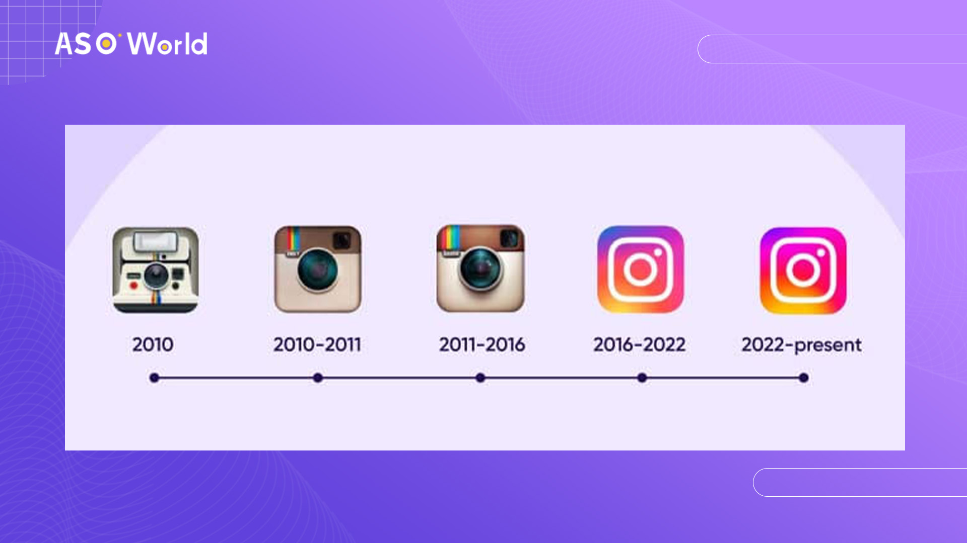
The app icon for Instagram has withstood the test of time. The 2022 update kept the recognizable design but increased the brightness of the background color to make it stand out even more - a strategic move to grab attention, given that most users' home screens are cluttered with app icons vying for their attention.
Yubo's old app icon shared a color scheme with its main competitor, Snapchat. The company chose a warmer shade of yellow in the 2021 update to differentiate itself from its competitor while maintaining a consistent experience. The addition of black to the original white and yellow color scheme makes the icon instantly more recognizable and memorable.
Get FREE Optimization Consultation
Let's Grow Your App & Get Massive Traffic!
All content, layout and frame code of all ASOWorld blog sections belong to the original content and technical team, all reproduction and references need to indicate the source and link in the obvious position, otherwise legal responsibility will be pursued.