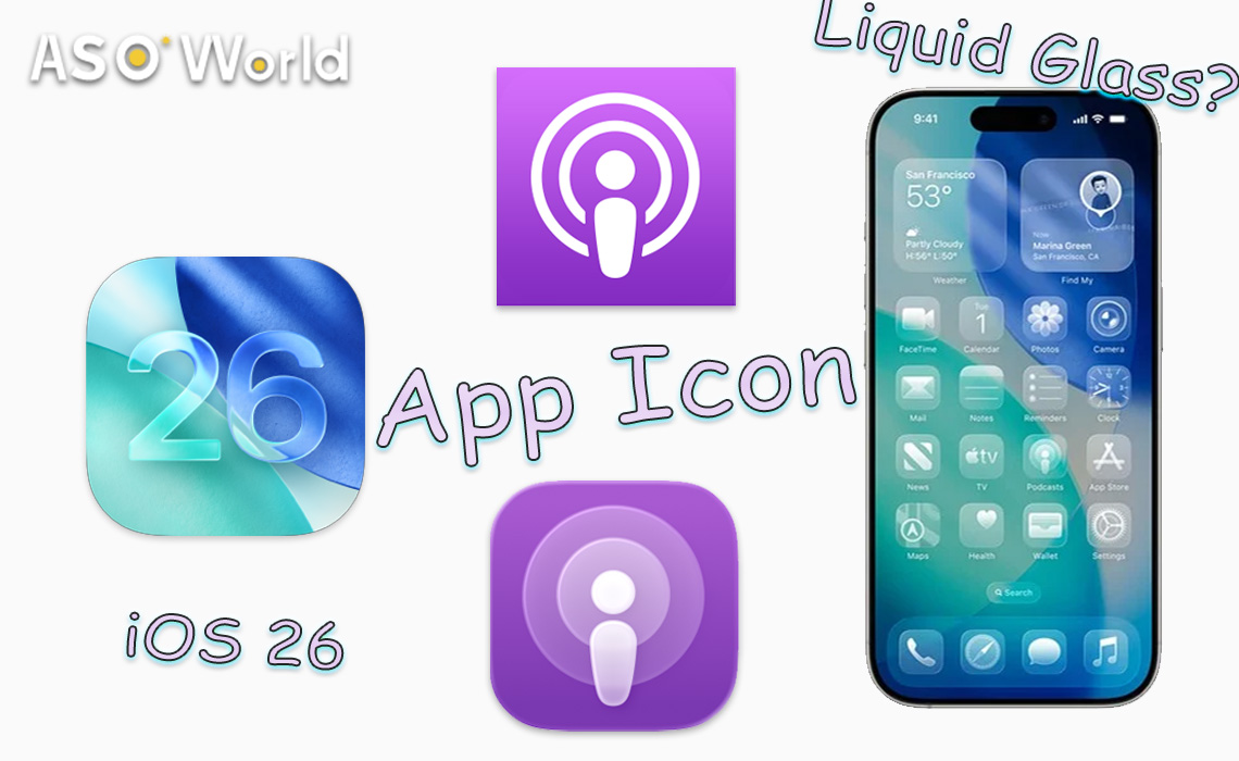
At WWDC 2025, Apple unveiled iOS 26, introducing the innovative Liquid Glass design language that redefines app interfaces, with a particular focus on app icons. This update brings a fresh visual paradigm, blending translucency and reflective effects, and presents both opportunities and challenges for iOS developers seeking to optimise their app icons for this cutting-edge aesthetic.
👉 What’s New in iOS 26 Beta 1: Liquid Glass, Live Translation, and More
Implications for App Icons
The rise of Liquid Glass offers developers an opportunity to refine the aesthetic quality of their app icons. The new transparency features allow for more subtle design choices—such as incorporating gradients or delicate details—that were not possible in previous iOS versions. This enhanced visual appeal can improve the overall user experience, making apps feel more aligned with Apple’s sleek and modern design ethos.
However, these aesthetic enhancements bring new challenges. Developers must ensure that their icons remain clear and legible despite the added transparency. A visually striking icon can quickly become cluttered or hard to recognise if not carefully designed. Striking the right balance between visual appeal and icon functionality will be crucial for app success on iOS 26.
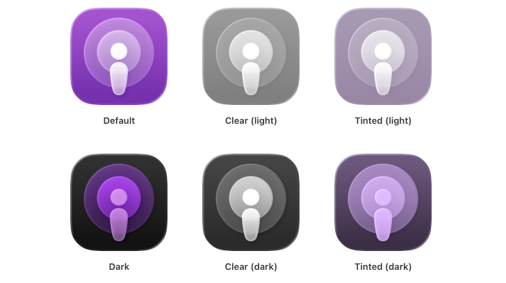
Comparative Analysis
The shift to Liquid Glass represents a significant departure from traditional icon design. Below is a comparison:
|
Aspect
|
Traditional Icons
|
Liquid Glass Icons
|
|
Appearance
|
Flat, 2D, static
|
Translucent, 3D, dynamic with highlights
|
|
Modes
|
Light, bug fixes
|
Light, dark, tinted, clear
|
|
Design Tool
|
Standard image editors
|
Icon Composer
|
|
Performance Impact
|
Minimal
|
Potential lag with complex designs
|
|
Accessibility
|
Basic contrast checks
|
Enhanced contrast for clear mode
|
Developer Tools and Resources
To support this transition, Apple provides Icon Composer, a dedicated tool designed for crafting Liquid Glass icons. Developers can fine-tune attributes such as translucency, blur, shadows, and specular highlights, ensuring icons align with the new design ethos.
Seamlessly integrated with Xcode, Icon Composer also allows real-time previews under dynamic lighting conditions across devices and provides export options for marketing assets, streamlining the design workflow.
Best Practices for Icon Optimisation
Optimising app icons for Liquid Glass requires a considered approach. Key recommendations for iOS developers include:
Design for Multiple Modes
Ensure icons remain visually impactful and consistent across light, dark, tinted, and clear modes.
(Credit: Apple Developer)
Use Layering
Employ multiple layers to create depth and dimension, enhancing the 3D glass effect.
Maintain Icon Recognisability
Keep the primary symbol distinct and recognisable, even with added translucency and reflections.
Optimise Performance
Simplify designs where feasible to minimise lag from real-time rendering.
Prioritise Accessibility
Ensure sufficient contrast, particularly in clear mode, to comply with accessibility standards.
Adhere to Apple’s Design Guidelines
Follow Apple’s design principles for a cohesive appearance within the iOS ecosystem.
👉 App Icon optimisation: A practical guide to boost app conversion rate
Insights & Predictions for iOS Developers
The Liquid Glass update exemplifies Apple’s commitment to visual sophistication, distinguishing iOS in a competitive market. This development hints at a future where app icons may become more interactive and immersive, potentially incorporating animations or contextual adaptations.
Developers who adopt this design language early will gain a competitive advantage, delivering polished, forward-looking user experiences that align with Apple’s evolving vision.
 COVID-19 UPDATE