What Are the Key Elements of Designing an App Icon?
As users quickly scroll through the App Store, an app icon must be visually compelling, conveying its purpose at a glance. Color, text, and imagery are crucial components that blend to form a memorable and effective icon.
In the Food & Drink category, these elements take on specific trends that align with consumer expectations and brand identity.
In the highly competitive app market, the icon is a crucial element for making a first impression on users. Therefore, understanding how to cleverly design an icon to stand out among thousands of competitors is essential.
Before beginning the icon design process, an in-depth analysis of similar products in the category is indispensable. Carefully studying the icons of competitors, identifying the prevailing color trends in your field, or noting their icon update frequency can all provide key insights.
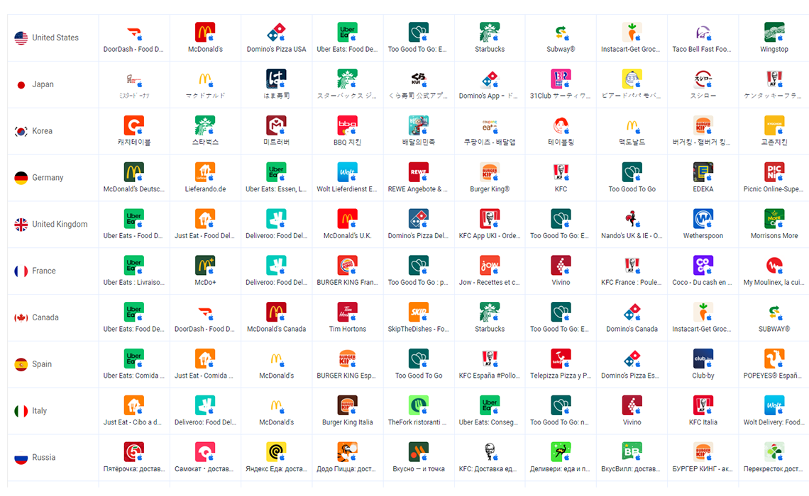
Thus, this article offers an analysis based solely on the current top 10 Food & Drink applications in the app market, providing developers with valuable references.
Main Colors
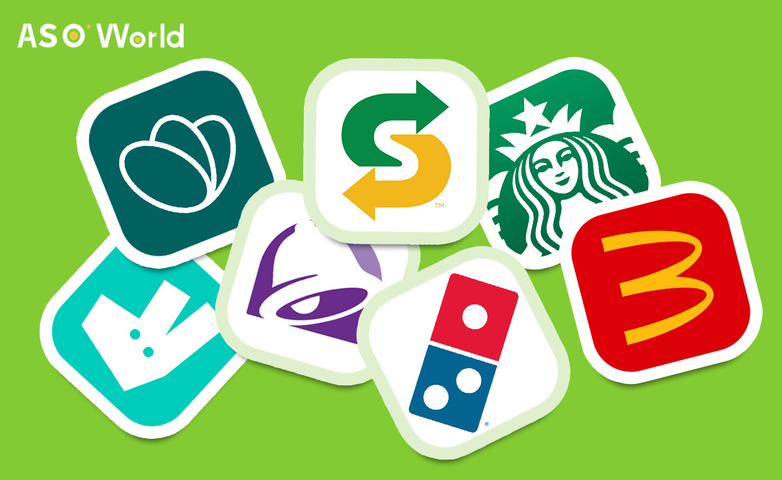
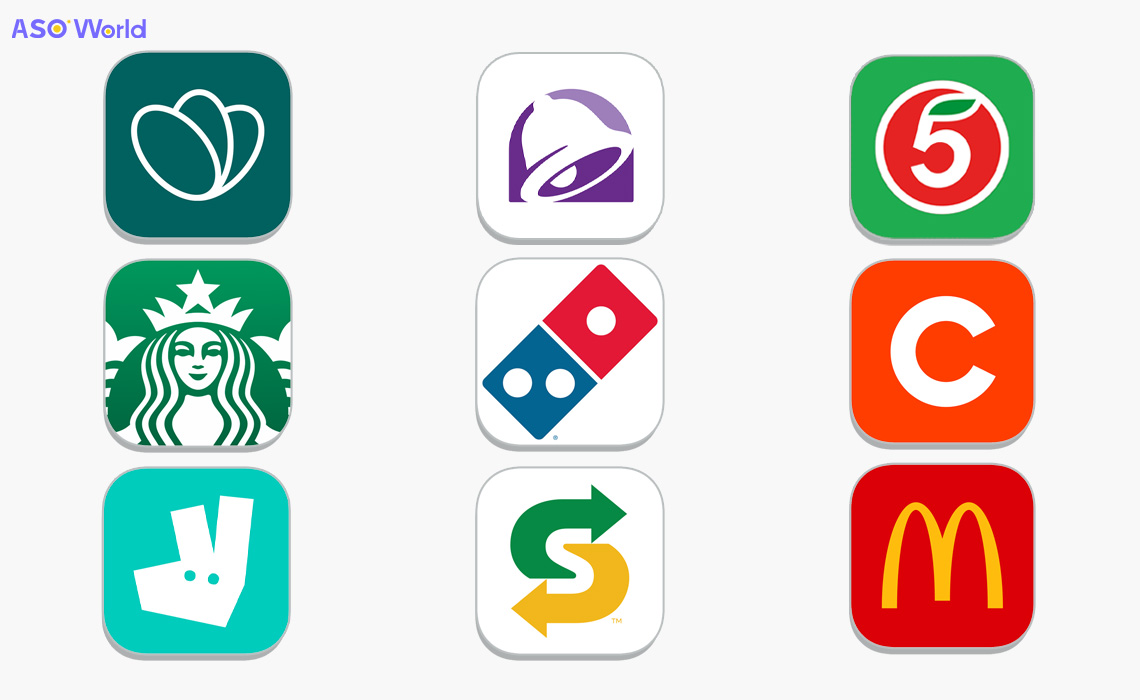
In the realm of Food & Drink app icons, the predominant color palette includes green, white and red.
- Green often symbolizes freshness and health, appealing to users interested in wholesome food experiences or organic options.
- White is frequently used for its clean, minimalistic appeal, which suggests a clutter-free and user-friendly app interface.
- Red is associated with appetite and excitement, a color that can stimulate hunger and grab attention.
Design Style
The trend towards simplicity in icon design is evident in the Food & Drink category, with many icons featuring simple lines against a solid color background.
This minimalistic approach not only makes the icons more recognizable and scalable but also ensures they remain effective across different device resolutions and contexts.
Text & Figure
Surprisingly, direct imagery of food or drinks is often absent in the icons of popular Food & Drink apps. Instead, the focus is on brand-related symbols or logos that have strong recognition value.
This approach is intentional, as a unique brand symbol can be more effective at conveying the app's identity and essence within the limited space of an icon. The goal is to create an image that is so closely associated with the brand that it nearly replaces the need for words altogether.
These brand symbols are crafted to be simple yet memorable, ensuring that they are easily recognizable even at a glance. For example, the golden arches of McDonald's, the domino piece for Domino's Pizza, and the iconic image of Colonel Harland Sanders for KFC.
These icons serve as a visual shorthand for the brand, communicating its core values and focus to users without the clutter or complexity that text or multi-elements imagery might introduce.
By concentrating on brand symbols, Food & Drink apps can foster brand recognition and loyalty, as these icons become synonymous with the user experience they offer.
This strategy aims to make the app icon a powerful ambassador of the brand, one that stands out in the crowded App Store and immediately connects with the target audience.
Event Icon
An event icon serves as a visual beacon, encapsulating the essence of an event in a single, impactful image. It must be both eye-catching and informative, often blending dynamic shapes with a harmonious color scheme that reflects the event's theme or mood.
Whether it's for a music festival, a tech conference, or a cultural fair, the icon should convey the event's energy and purpose at a glance. Symbols are chosen for their immediate recognizability and are stylized to evoke excitement and curiosity, inviting potential attendees to learn more.
The icon's design is not only pivotal for marketing across digital platforms but also for creating a memorable brand experience that resonates with participants long after the event concludes.

Click "Learn More" to drive your apps & games business with the ASO World app promotion service now.
Conclusion
In conclusion, the App Store icons in the Food & Drink category are characterized by their use of specific color schemes, simplicity in design, and a focus on brand-related imagery rather than direct representations of food and beverages.
These trends reflect a deeper understanding of brand identity and user psychology, where recognition, emotional response, and clarity of purpose are key to standing out in a crowded marketplace.
The strategic use of color, minimalist design, and iconic brand imagery combine to create app icons that are not only visually appealing but also instantly convey the essence of the app to potential users.
>>>> How to Win From Food and Drink App Category on The App Store?

It's worth noting that while these trends are currently prevalent, the landscape of app icon design is always evolving. As new design philosophies emerge and user preferences shift, we can expect to see these trends adapt and change.
However, the core principles of clarity, brand consistency, and visual appeal are likely to remain central to the success of Food & Drink app icons in the App Store.
Developers and designers must continue to innovate while maintaining the delicate balance between uniqueness and familiarity. By doing so, they ensure that their app not only captures the attention of users but also retains it, encouraging downloads and engagement in an increasingly competitive digital ecosystem.
Whether through subtle design tweaks or bold visual reinventions, the app icons that resonate with users are those that tell a brand's story in a single, impactful glance.
 COVID-19 UPDATE